
Why Using Too Many Borders Hurts Your UI
How to use surface shading
There’s a bad design practice you might not know you’re doing. It’s so subtle that most designers aren’t aware of this problem. Using too many borders is hurting your user interface.
When you have borders within borders, there’s more visual noise that interferes with the user’s viewing experience. The borders are harsher on the eyes and become a distraction as users scan for information. Not only that, but the UI looks less like a finished design and more like an incomplete wireframe.

Borders are actually visual elements that receive fixations. When you have a lot of them together, they can slow down scanning. It’s harder for users to decide what to look at because there are too many elements competing for attention.
That’s why it’s better to use surface shades over borders. Surface shades are easier on the eyes because they lack harsh edges and blend more easily with the background. Instead of hard lines to distinguish elements, it uses subtle depth to make a two-dimensional design feel three-dimensional.

The best way to create surface shades is to derive them from your accent color. Take your accent color, decrease the saturation to 0, and increase the brightness to 100. Now incrementally add a little saturation and reduce the brightness to create a light shade. From there, add a bit more saturation and reduce the brightness slightly to create a dark shade. Play around with it until you fight the right balance.
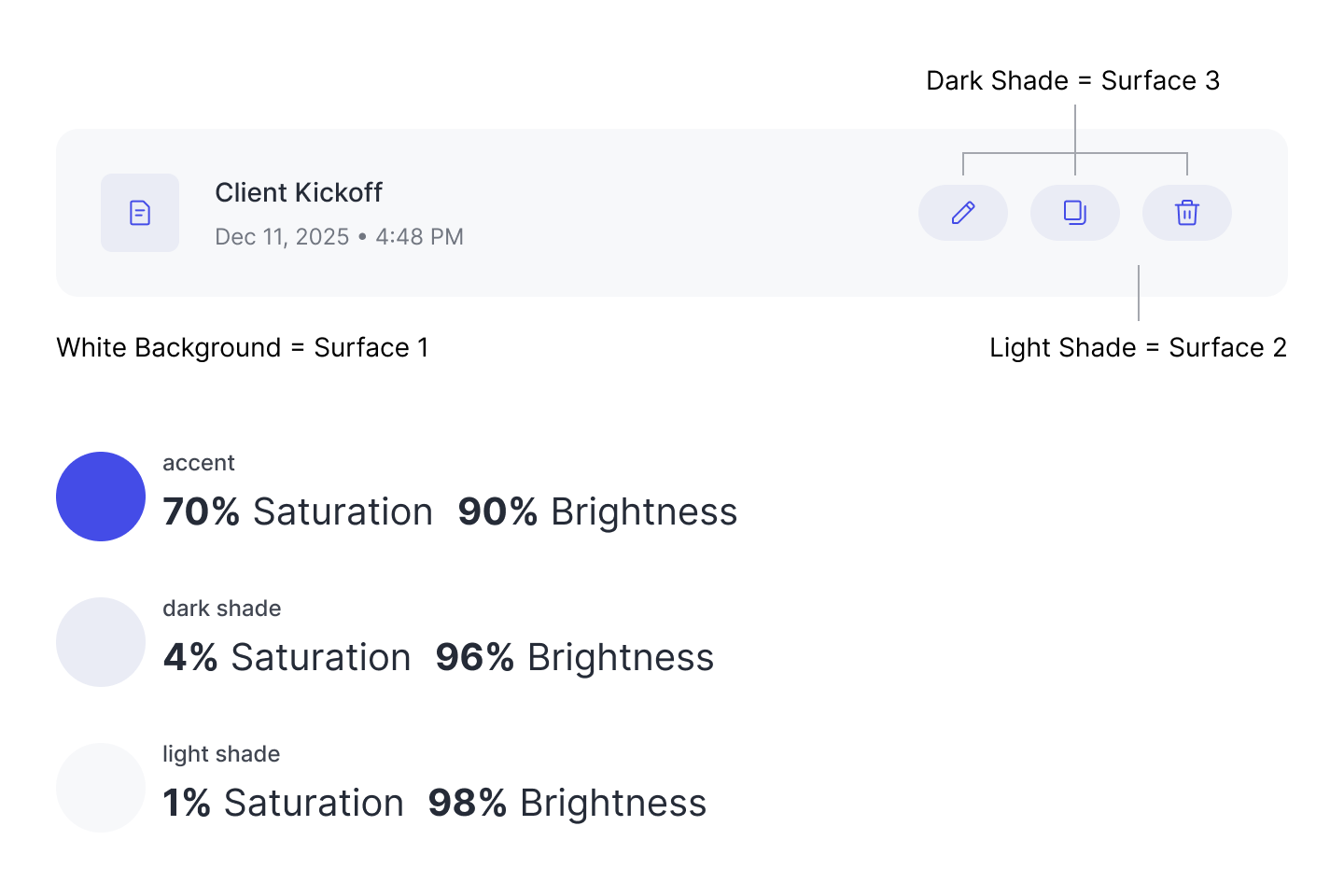
As you can see, the saturation and brightness of the shades vary in tiny increments. You don’t need much variance, since the surface shades are meant to be subtle. On a white background, the light shade should be the first surface layer you use. Any other elements placed on top of the light shade element should use the dark shade. Stacking these surfaces create depth for a better visual experience.

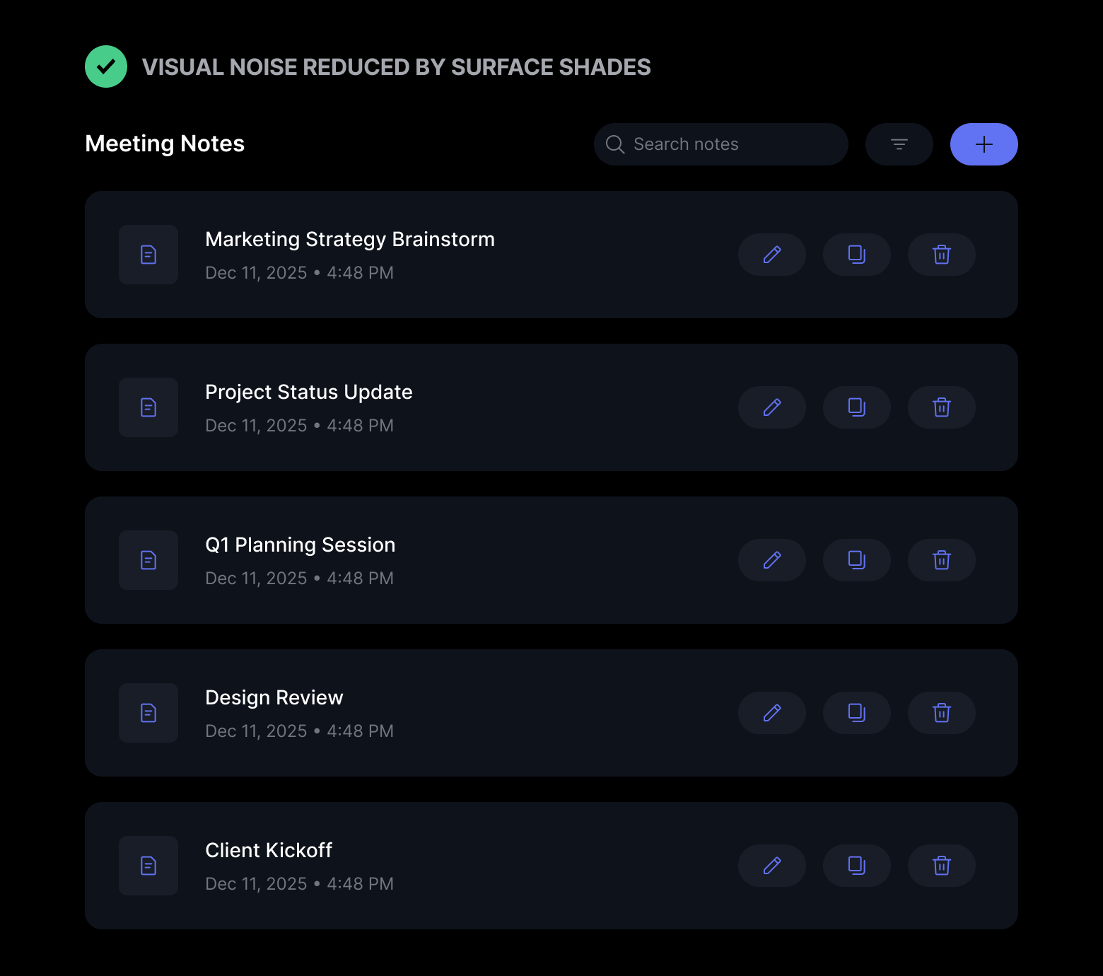
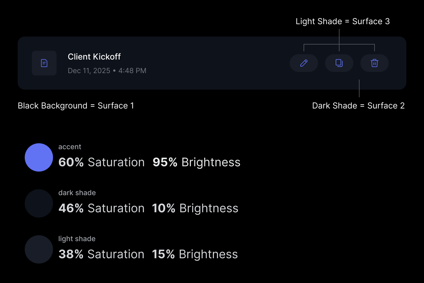
The same principles apply to interfaces with a dark background. The many borders create visual noise, making it difficult to distinguish the different elements. Every element looks like a button, but that’s not the case.
Surface shades solve this by separating the groups with depth. Now users can see the surfaces that make up the data cards, along with the buttons stacked on top of them. They can also see that the global elements in the top bar differ from the ones in the data cards.
If you examine the saturation and brightness levels of the shade, you can see that the dark shade has incrementally more saturation and less brightness than the light shade. This same pattern also exists with the shades used for a white background. Also, the difference in the values is only a few percentage points.
It’s okay to use borders on your design, especially when you need to divide and group content. However, when you have borders wrapped around borders, it’s too much. A better approach is to use surface shades to create a more visually appealing and easier-to-scan interface. All it takes is three surfaces and two shades to level up your design.
There’s a reason the words inter-face and sur-face include the word “face”: they’re both intended to present something to the viewer. In other words, a design with only borders lacks a proper face for presentation and viewing.
Do these shades meet contrast rules for accessibility? I find the dark mode poorly differentiated.
I agree with the general sentiment, but I’m skeptical that this is usable across devices and abilities. And I wonder if it was at a minimum contrast level, whether it would be visually cluttered again.
Or to say it a different way: I think the challenge of the design is too many controls and a lack of clear hierarchy of actionable intent. Tho of course everything is trade offs and sometimes you don’t have infinite degrees of freedom in what you can change or can’t.