
Why Toasts Aren't the Best for Button Feedback
The benefit of inline tooltips
What should you display to the user after they click an action button? They need visual confirmation that their action has been accepted by the system. If you don’t display feedback correctly, users will be left confused and uncertain.
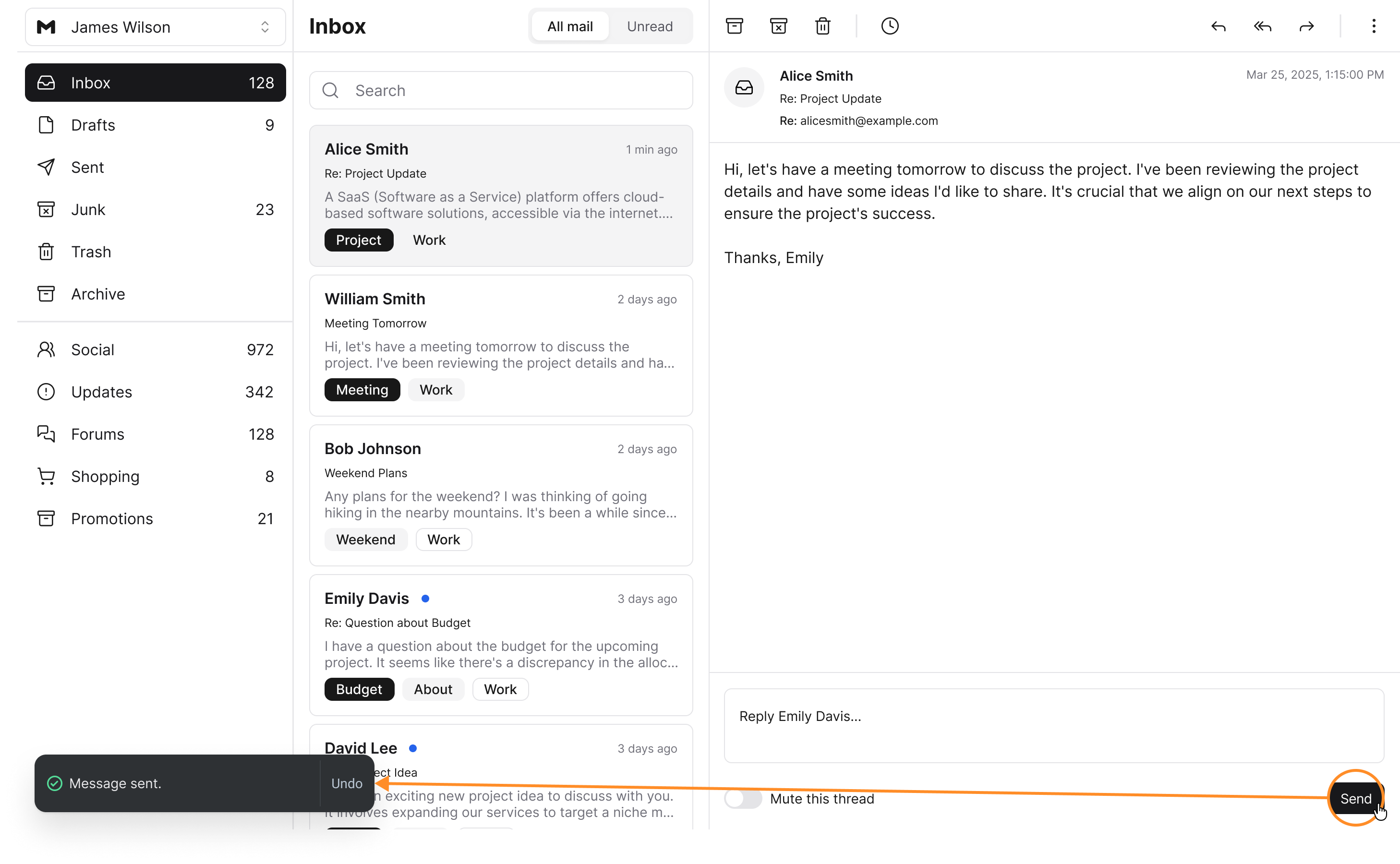
A common approach is to use toasts to confirm the user’s action. Toasts are little notification boxes placed in the corner of the screen that state the action that was performed. However, there’s a UX problem with them that most designers miss.
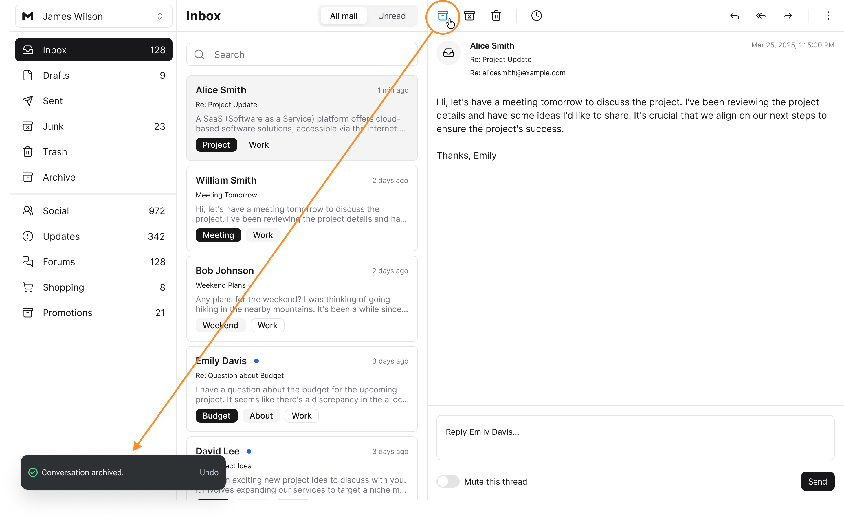
These toasts are too easy to overlook and ignore on desktop screens when they are far from the button. Users will view them too late, as they disappear from the screen, and fail to interact in time. In other words, there’s a disconnect between the toast and the button after the interaction.
A more effective way to provide users with feedback after a button action is to use inline tooltips. These tooltips are better because they are displayed closer to the button. Users will no longer have to look across the screen to recognize the feedback.
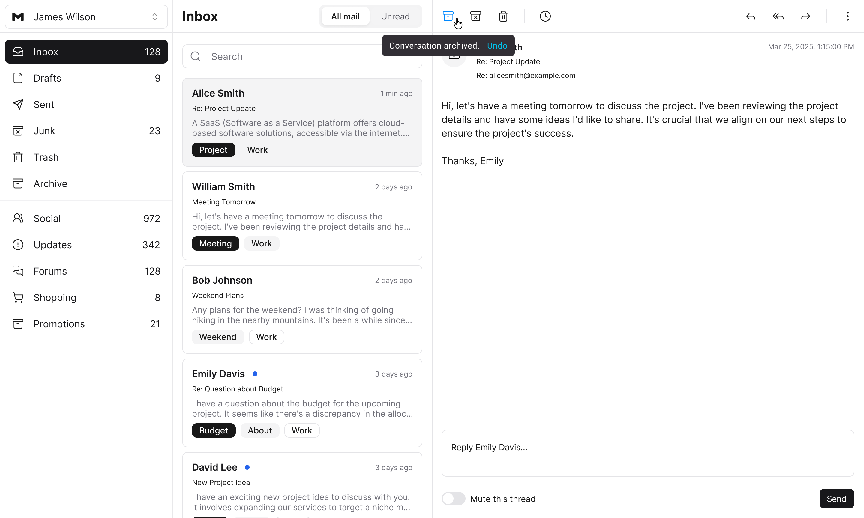
The tooltips can also contain actions, such as an “Undo” button, like a toast. They also disappear after a few seconds. However, one important difference is that they are much smaller in size and don’t require animation.
Toasts need to be large and animated to capture the user’s attention. Since these tooltips appear inline with the button, a larger size and animation aren’t necessary. These minimalist attributes make it easier for developers to code and implement them.
The most suitable context for using these tooltips is on buttons that remain persistent after interaction. In other words, after users click the button, the system doesn’t send them to another page. Instead, the button stays visible on the screen.
You’ll often see these situations with icon buttons in an action bar. However, you can also encounter them with primary call-to-action buttons. If there’s no page change after the click, you should use the tooltip for feedback.
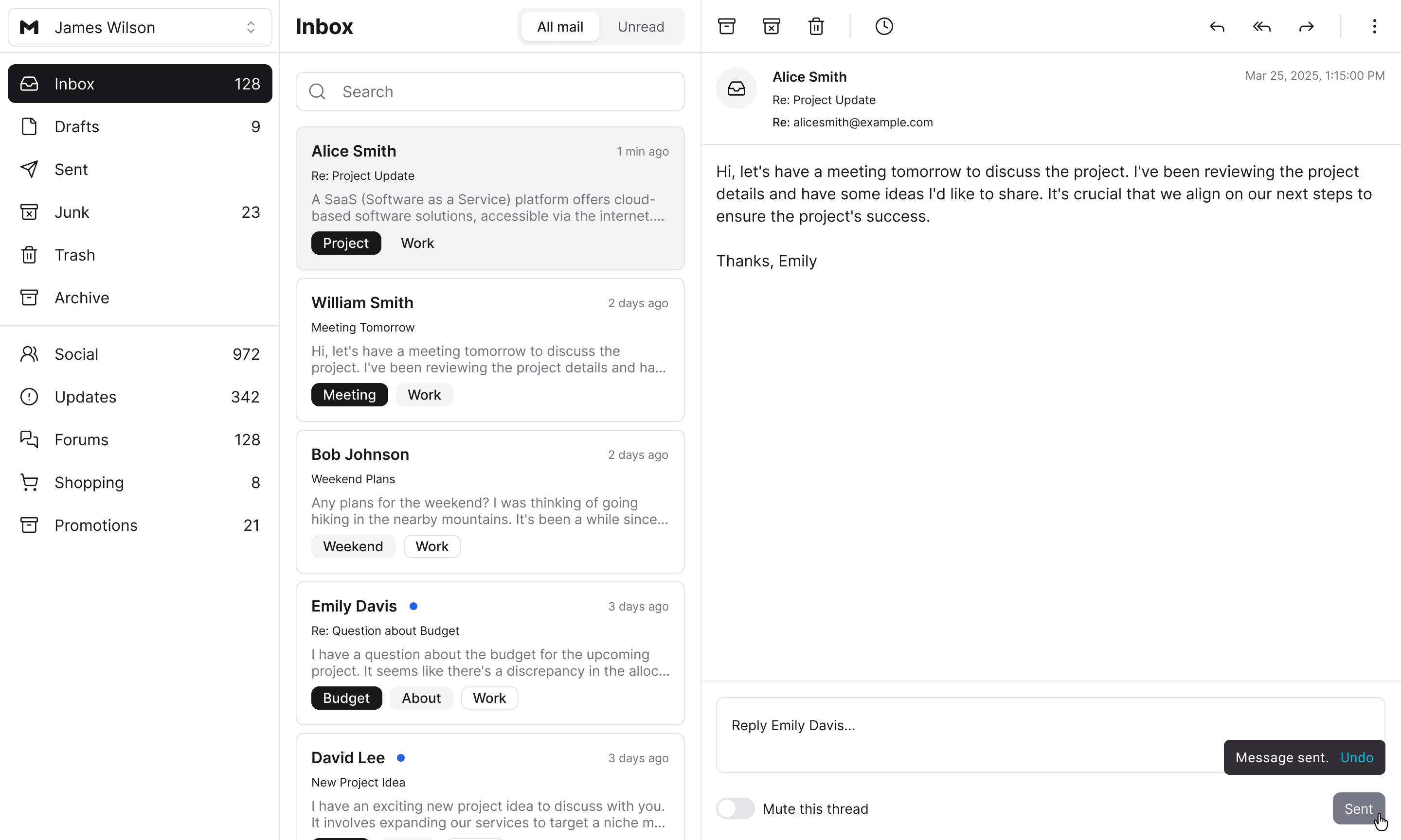
For example, the “Send” button for sending messages doesn’t change the current page after users click it. A tooltip informing users that the message has been sent is all that’s needed to do the job. Users won’t miss it because of its close proximity to the button. Additionally, you can label the button from “Send” to “Sent” to provide further assurance.
Toasts are a poor choice for button feedback because they are so far away from where users take action. Inline tooltips are closer to the action for a stronger connection and much improved user experience.
Inline tooltips are a cool idea!
What are your thoughts on displaying this same feedback with dynamic buttons themselves instead?
I think this is quite a pragmatic design