
Why Your File Uploader Needs a Drag-and-Drop Zone
Design the perfect file uploader
Locating files on a computer can be a challenging task for anyone. With countless folders, hidden directories, and scattered documents, it's easy to lose track of where things are. Now imagine the amount of effort it takes when a user needs to upload not one, but multiple files.
Traditional uploaders force users to navigate through file trees and click multiple times to perform the task. The result is a frustrating, high-cognitive-load experience that slows users down. For a better user experience, your file uploader should have a proper drag-and-drop zone.
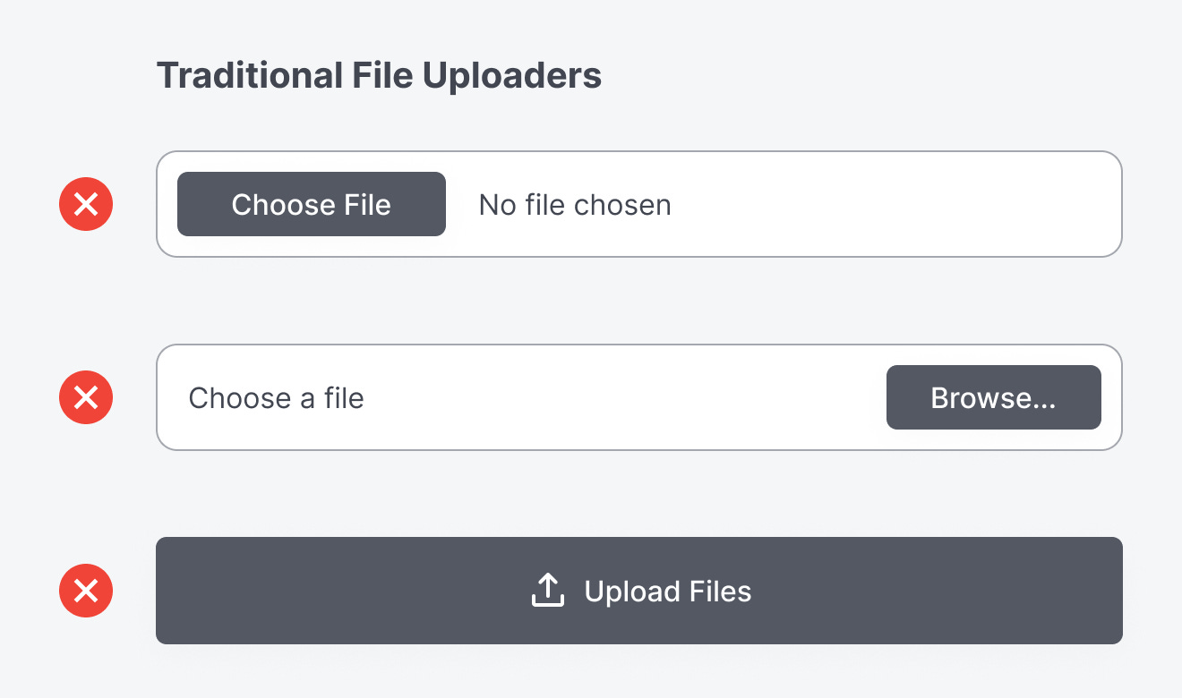
A drag-and-drop interaction reduces friction and streamlines the workflow in ways that a standard browse-and-select uploader can't match. With drag-and-drop, users no longer have to hunt for nested folders or repeat the same file-picker process. Instead, they can pull files directly from their desktop and drop them into a designated zone.
This is especially valuable for batch uploads. Whether a user needs to submit job application files, upload a media library, or share large project folders, a drag-and-drop zone shortens the process from minutes to seconds.
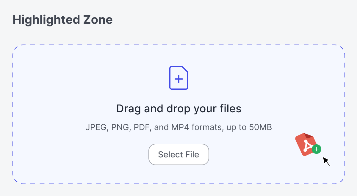
Beyond reducing time and effort, drag-and-drop zones offer something equally important: immediate visual feedback. As soon as a file is hovered over the drop area, the uploader visually responds with a highlighted state. The zone surface, border, and icon are all highlighted with a vibrant accent color.
Once released, a loading spinner or progress cue reassures users that their action was successful. These subtle touches build trust and confidence, letting users know the system is "listening" to them.

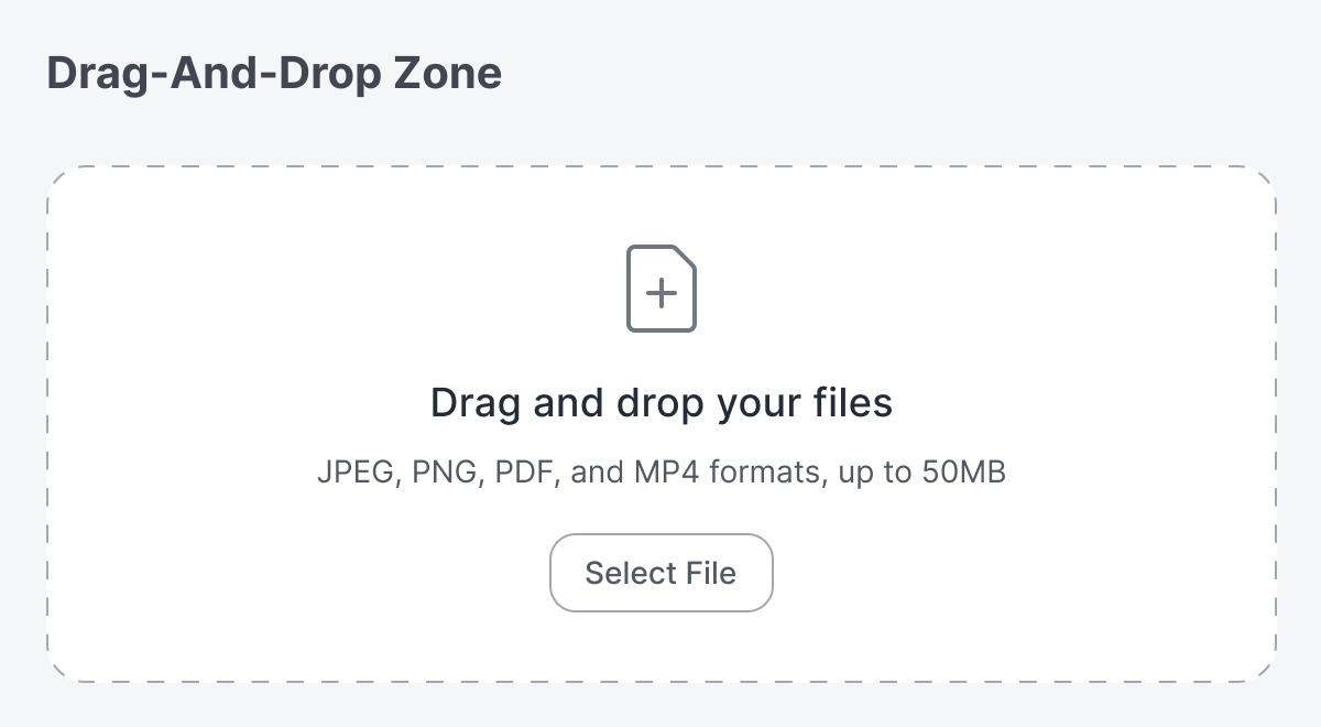
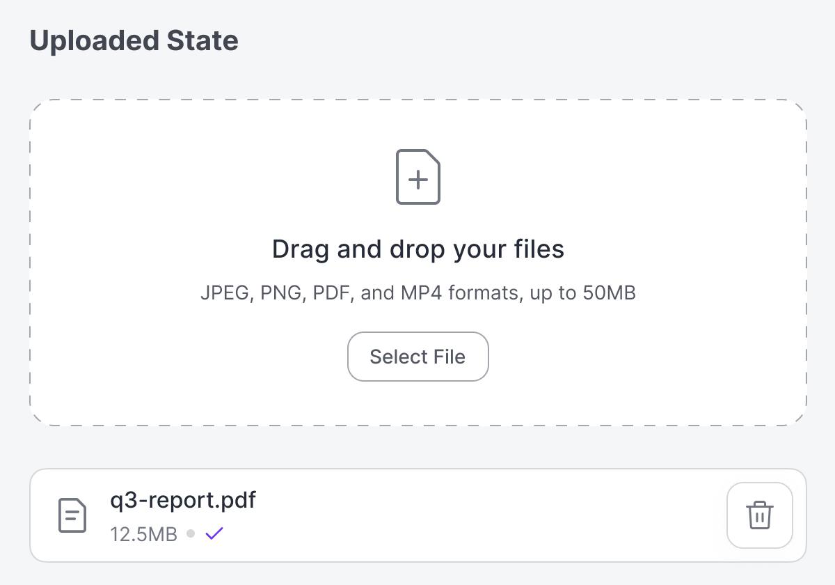
Another benefit is clear and consistent validation. The drop zone can indicate the file requirements by displaying the acceptable sizes and formats upfront. If a user attempts to upload an incompatible file, the uploader will reject it with a red error message. If the file meets requirements, it confirms acceptance with a visible checkmark next to the file name.
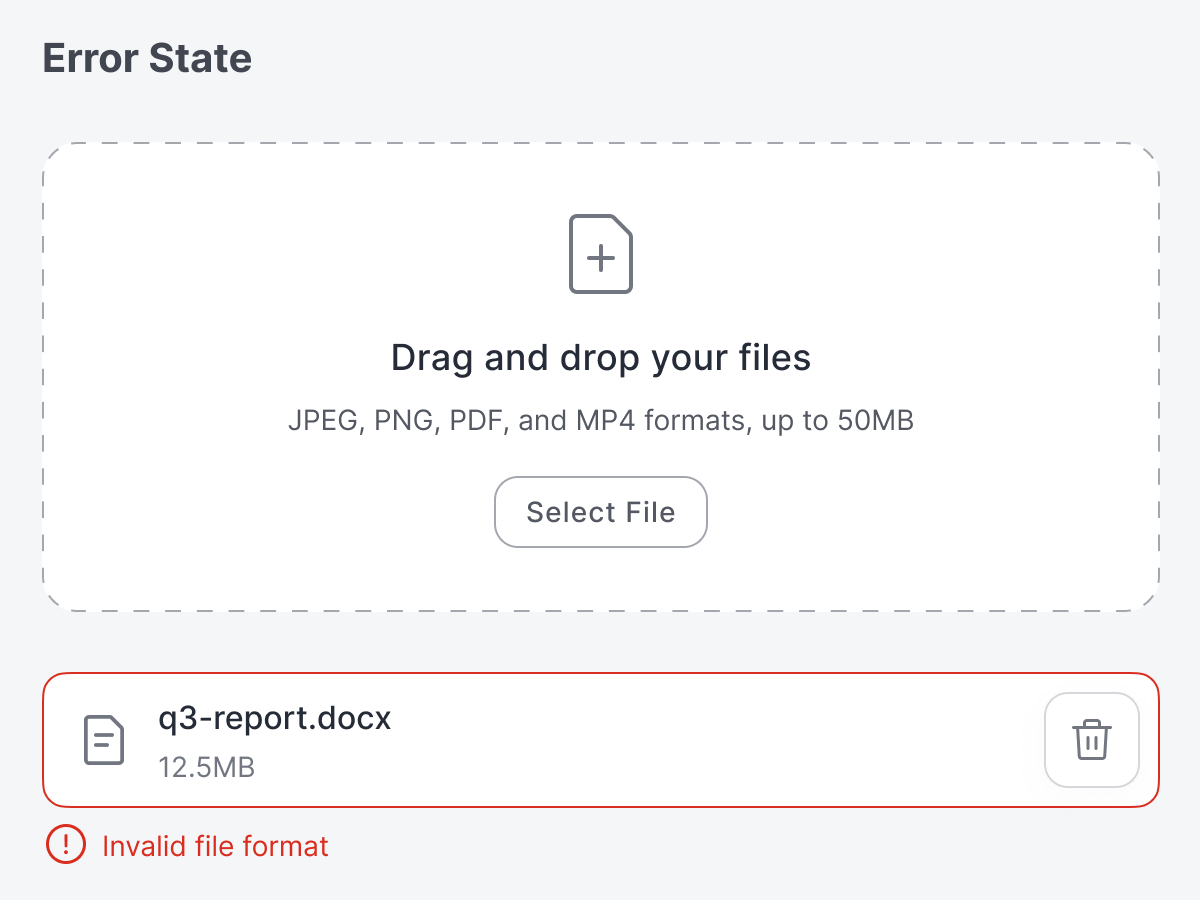
Since users can upload the wrong file, they need to be able to correct their mistakes. A small trashcan button next to each file name allows users to delete the wrong file with a click. This action prevents errors from piling up and keeps the interface clean.
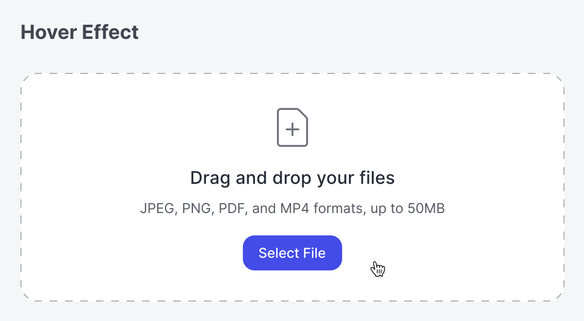
When users hover their mouse over the zone, the "Select File" button should be highlighted to indicate that they can click the zone to select a file. Some users may prefer to manually select files over using drag-and-drop, so your design must take that into account.
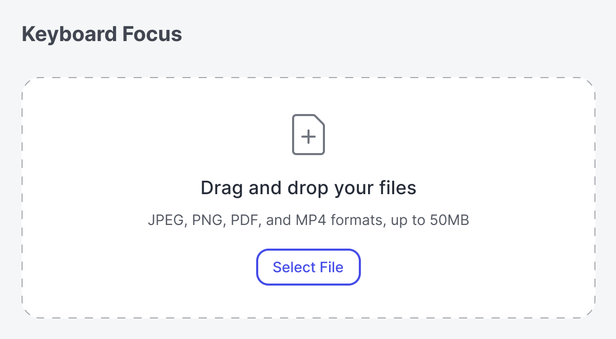
For accessibility, it's important to accommodate users with motor disabilities who struggle with performing drag-and-drop actions using a mouse. The drop zone should include a "Select Files" button that highlights when it receives keyboard focus.
In short, a drag-and-drop zone transforms uploading from a clunky, tedious process into a smooth, lightweight interaction. By reducing cognitive effort, you not only create a faster workflow but also a more satisfying user experience.