
Why Radio Buttons Should Always Have Borders
Improve user input selection
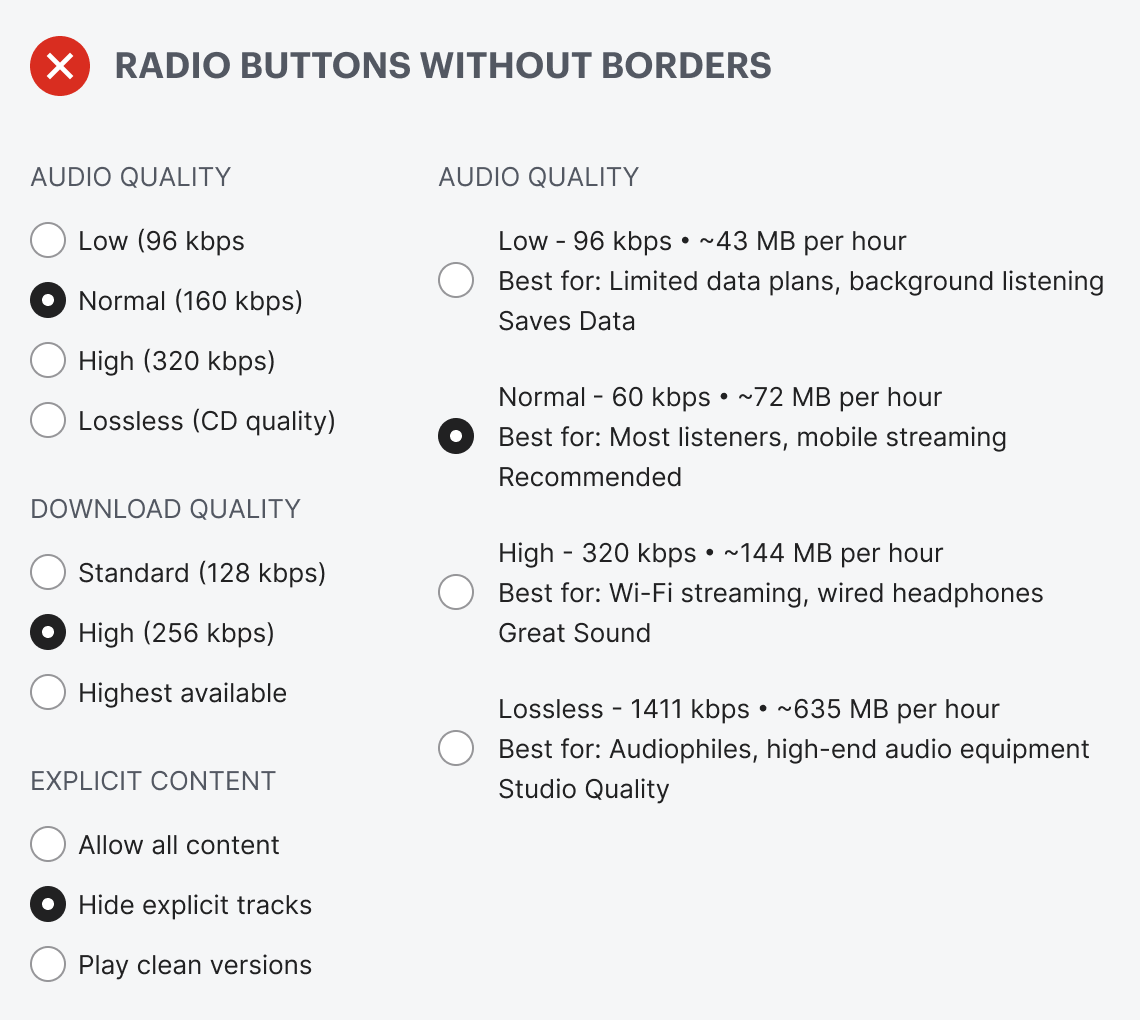
Do your radio buttons have the best user experience? Chances are, they don’t because they don’t have borders. If they don’t have borders, you’re likely making it hard for users to select options on forms and in settings.
Borderless radio buttons have no container for the text label. This makes the radio buttons harder to notice, read, and click. Just take a look at the example below. The options look like a cluster of mangled text scattered across the screen. You have to hone in on the details to read and process each option. Selecting an option shouldn’t require this much cognitive effort.
Making your radio buttons easier to read and click is simple. Add a border and surface around each option. Notice how the border creates ample whitespace between each option for better readability. It no longer looks like a disorganized cluster of text.
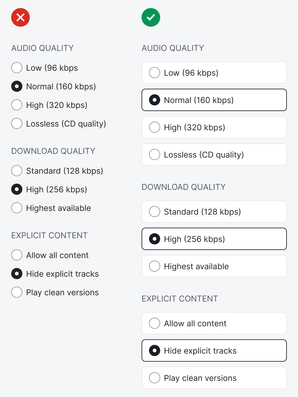
Also, the selection cue is much more apparent. Instead of only a filled-in circle, you can highlight the border surrounding the selected option. In addition, it’s easier to click because the button surface acts as an interaction cue.
Typically, users would click the circle or the label. However, the target is so small that it’s hard to hit consistently. Also, the text label sometimes isn’t made clickable and can vary in length. The border and surface allow users to click every option with consistent accuracy.
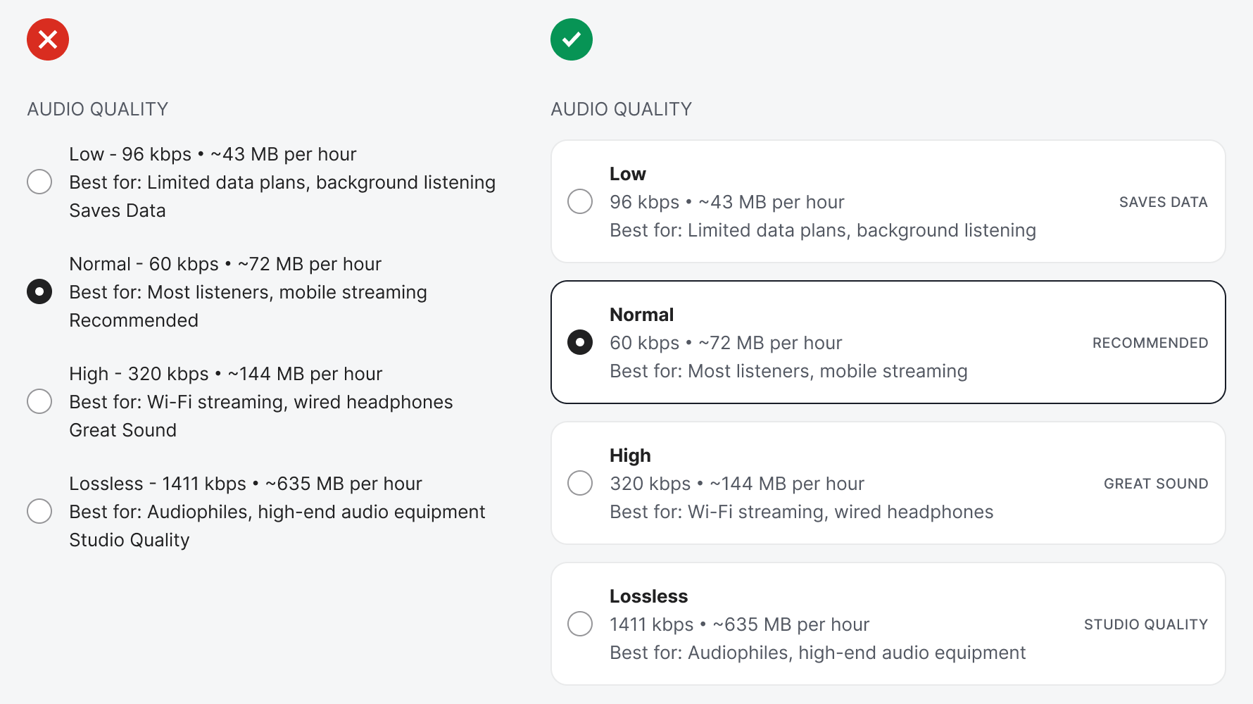
A border and surface are even more essential when you present options with more than a single string of data. Sometimes you’ll have options that display data, metadata, and descriptions to help users make the best selection. This text is too complex to read because everything is clustered together. In other words, there’s no visual hierarchy to help differentiate the primary information.
Adding borders and surfaces to each option creates a hierarchy for better readability. You can use the left and right sides of the container to place different data, as well as the top-to-bottom locations. Instead of reading the data like a lengthy paragraph, users can scan the hierarchy and process the information more quickly.
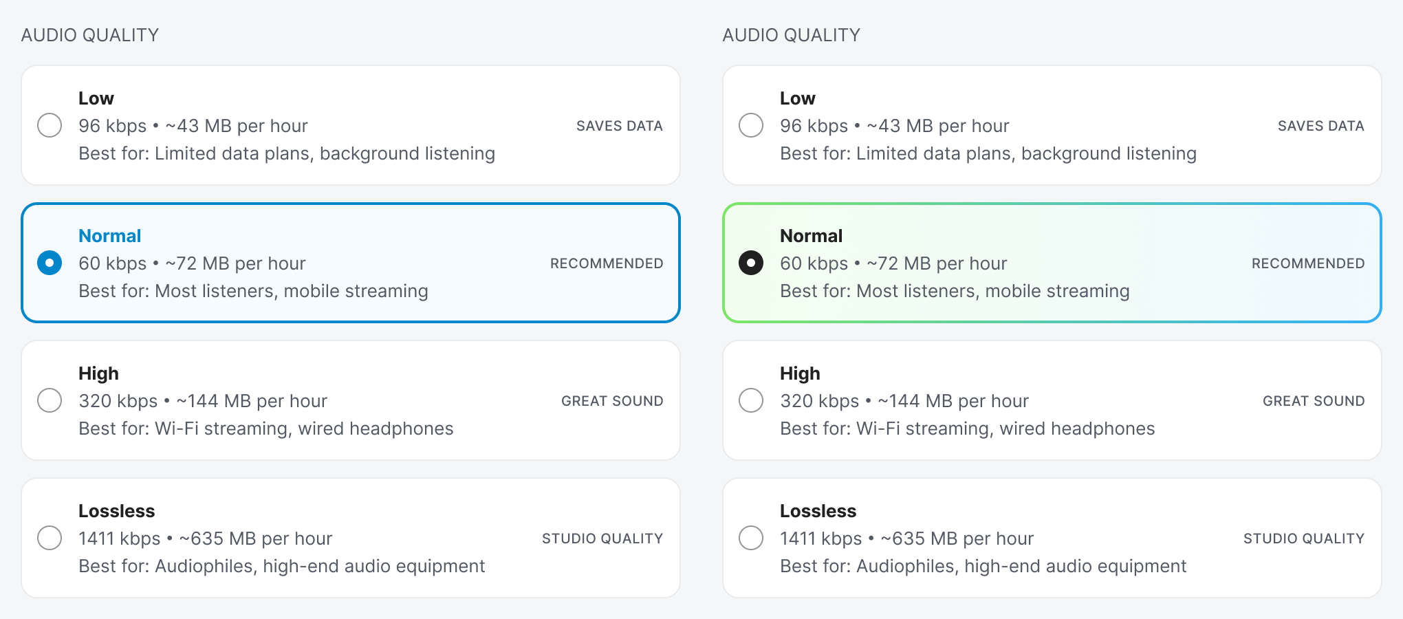
Borders and surfaces also allow you to style your interface. You can add your brand color to the selection cue to make it more appealing. You can use a solid color or a gradient to make the experience more pleasant.
Your radio buttons should always have borders. Any radio button without one is incomplete in its design. Users should always be able to notice, read, and click radio buttons with ease when selecting their input. You can only achieve this by adding a border around them.