
Why Modal Dialogs Should Have 4 States
Improving user decision-making
A modal dialog is more than just a confirmation message. It’s an intermediary to help guide users toward the most appropriate action. However, displaying modal dialogs as single-state components doesn’t help users make the right decision. Unfortunately, you’re probably making this mistake on your interface.
Most designers will display every modal dialog the same way. It’ll have a confirmation message with a couple of buttons contained in a floating box. The problem with this approach is that not every message has the same severity. It’s necessary to indicate these differences in the design so users never take the wrong action.
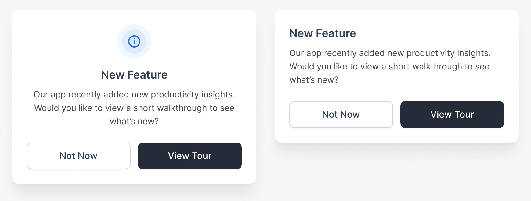
Informational State
The first state a modal dialog can have is informational. This is indicated by a blue “i” icon. When users see this, there’s no sense of urgency because the actions have no consequences. Therefore, they can act casually without the fear of clicking the wrong button.
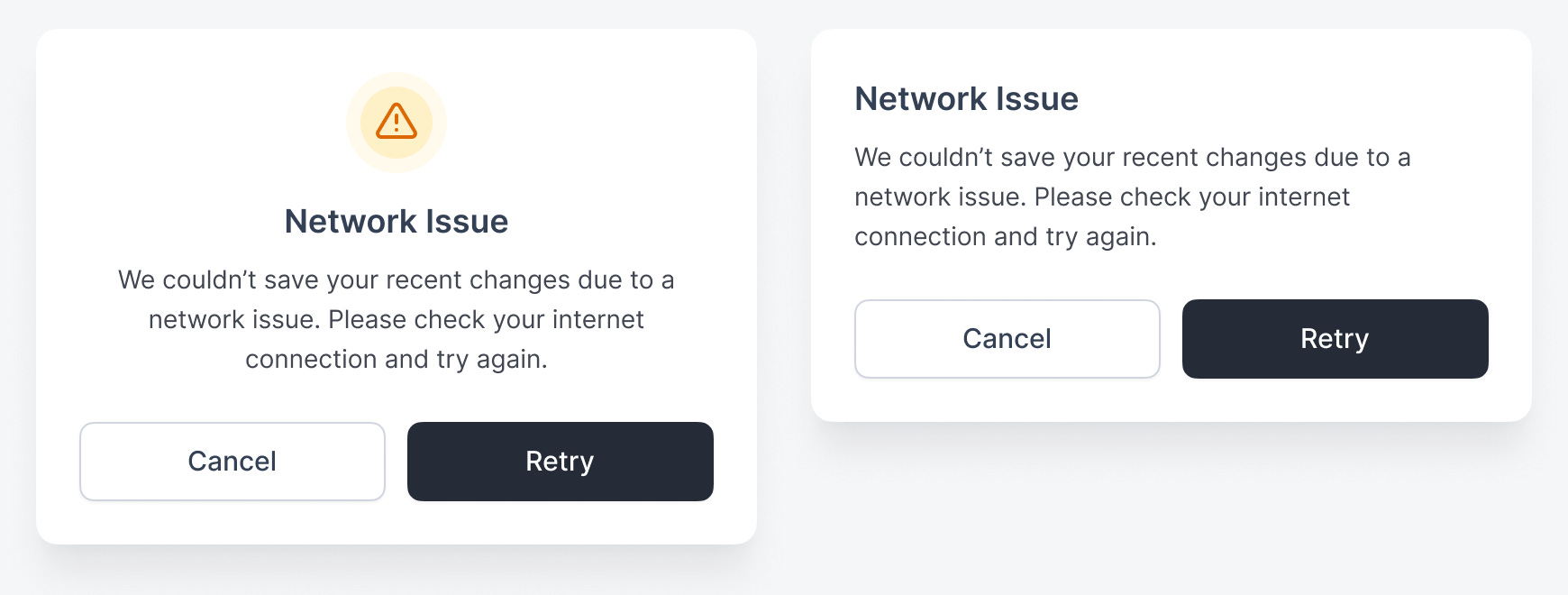
Warning State
In contrast, the warning state alerts users to proceed with caution. It has an exclamation mark icon with an orange/yellow color. Use this state to save users from a potentially destructive action.
For instance, if a document couldn’t save the changes due to a network issue, you can warn users and let them retry their connection. Instead of allowing the destruction to happen, the “Retry” button gives them a chance to avoid data loss.
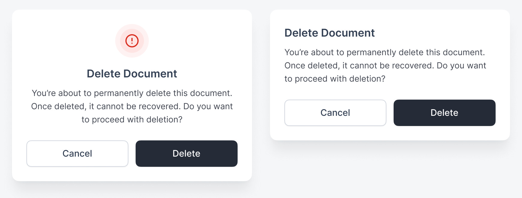
Danger State
However, a state that’s more severe than the warning state is the danger state. It also has an exclamation mark icon, but it’s red. Use this when the action will directly result in data loss.
For example, a confirmation to delete data results in the destruction of the data. It’s not a warning state because the “Delete” action isn’t trying to save users from an accident. Instead, it’s intentionally deleting the selected data.
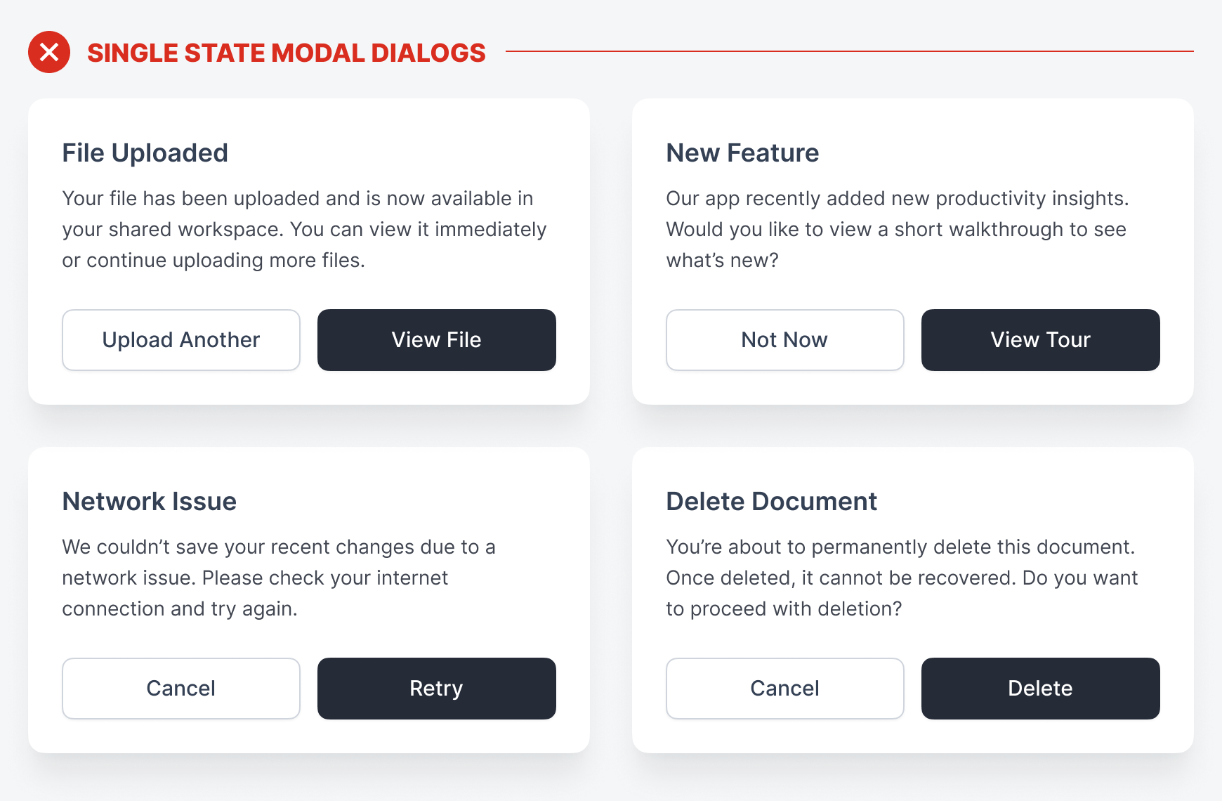
Success State
The safest state that allows users to act without severity is the success state. It has a green checkmark icon. When users see it, it signals that a task has been successfully completed. The primary action guides them to the next natural step, while the secondary one keeps them on the current page.
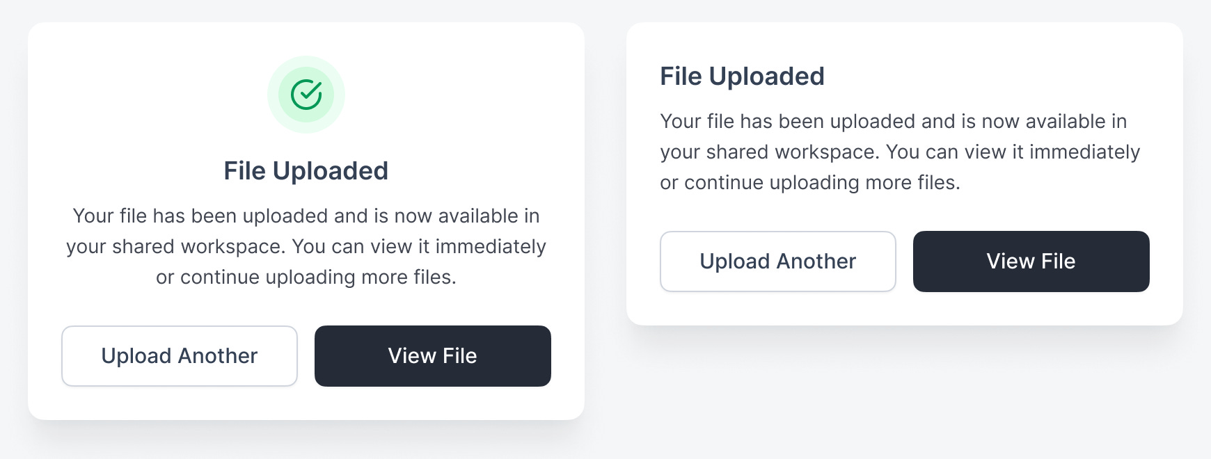
An example of this is uploading files. The modal dialog in a success state informs users that the file has been uploaded and offers the option to view it. This is the next natural step most users would want to take after an upload. However, some may want to continue uploading more files, which is why “Upload Another” is the secondary action.
Conclusion
These four states signify the severity level for each modal dialog. Higher-severity states demand more attention and consideration so users can always take the appropriate action without error.
-
Success - Very low severity
-
Informational - Low severity
-
Warning - Medium severity
-
Danger - High severity
Without these four states, each modal dialog looks the same. As a result, users treat them all the same when making a decision, which can lead to mistakes. Sometimes it’s no big deal, but other times it can cost users a lot of time and money. Therefore, it’s imperative to indicate these four states in your modal dialogs using the proper colors and icons.
Interesting approach. I can see its validity. This could also prevent people from using dialogs as substitutes for entire pages in an app, which happens quite often, unfortunately.
I use these 4 states for alerts/toasts, so it makes sense to apply this approach to modals as well. Thanks!