
Why a ‘Mad Libs’ Form Gets You More Leads
A new form design for higher conversions
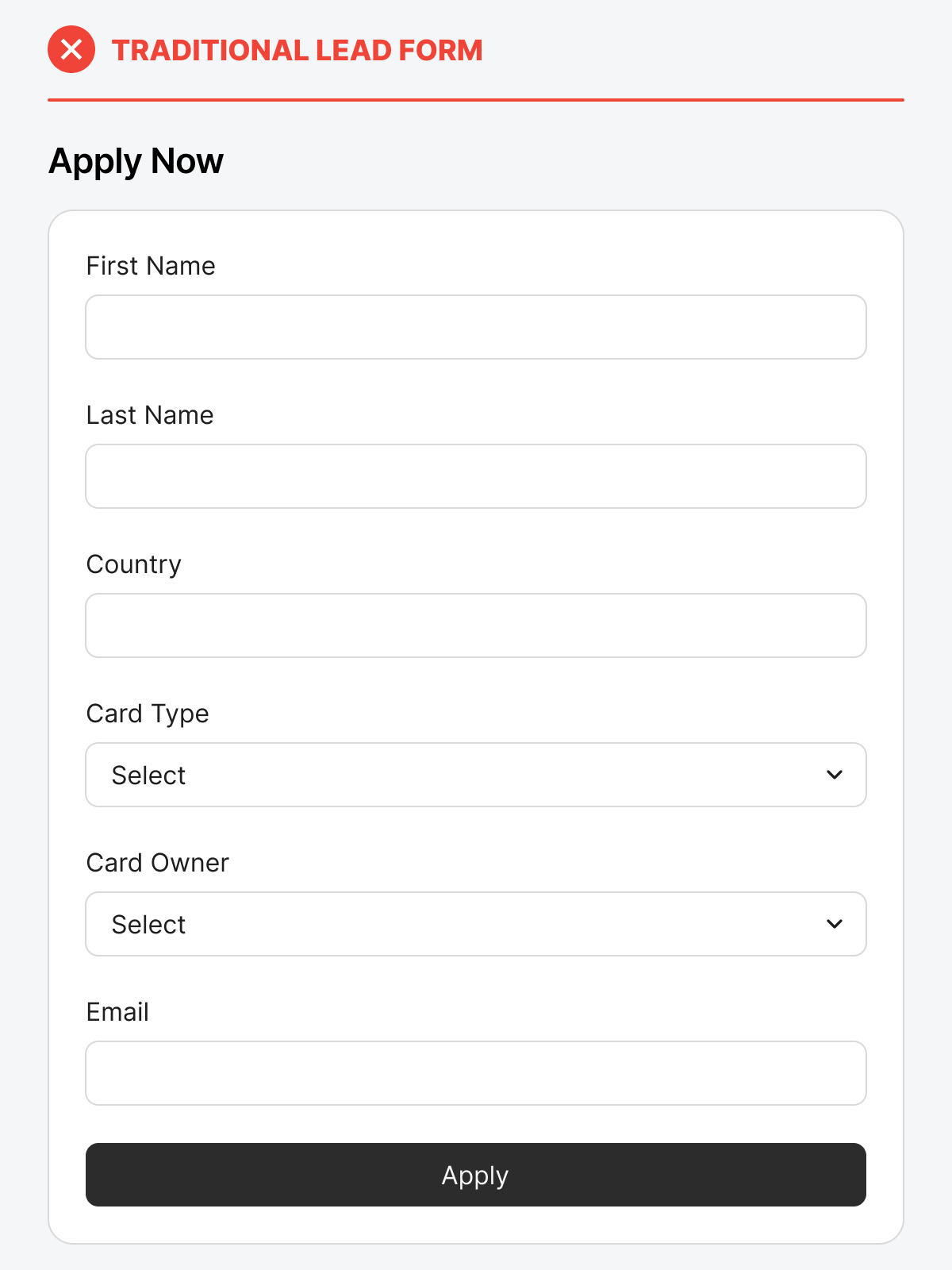
When it comes to lead capture forms, most companies are still using the traditional format: stacked labels with boxes that users must fill out one by one. While this approach may seem standard, it often kills the user’s motivation to complete the form. Why? Because traditional forms look like too much work.
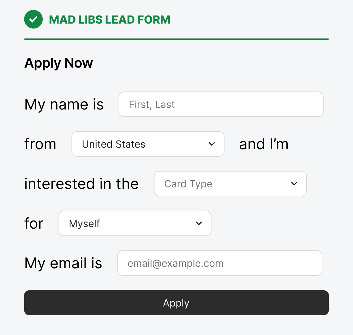
Mad Libs forms transform this boring process into an engaging interaction that feels effortless. By structuring form fields inside conversational sentences, you make people feel like they’re filling in a story rather than completing a task. Research shows this simple design change can lead to significantly higher completion rates.
Forms with stacked fields feel overwhelming at first glance. All users see is how many blank fields they need to fill out. This initial friction often causes form abandonment right at the moment you need them to continue. In other words, you are losing many potential leads when users land on your form.
A ‘Mad Libs’ style form reframes data entry as part of a narrative. The fields blend into story-like text to reduce cognitive load. It creates a seamless reading flow that makes the form feel more human and personal. Users can process structured sentences faster than isolated inputs, and they don’t feel overwhelmed by them.
Engagement Leads to Higher Conversions
Engagement is the difference between someone typing three fields and giving up versus completing the entire form. Studies comparing ‘Mad Libs’ forms to traditional ones have found significant improvements in completion rates. One test saw a 25% increase in conversions , demonstrating that these design changes can get you more leads.
Both traditional and Mad Libs forms collect the same data, but the perceived effort is what changes the outcome. A Mad Libs form feels shorter because users read through it like a story, not a spreadsheet. By presenting the data fields in a more user-friendly format, you reduce their resistance to completing the form.
Designing the Mad Libs Form
A crucial technique in designing a Mad Libs form is using a clear typeface with a large font size. The writing should also be straightforward and concise in providing context to the fields.
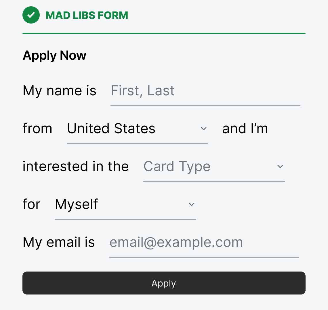
You can use your standard input fields, but this could create a visual mismatch between the Mad Libs text and input. You would have large paragraph text paired with a much smaller input text. To establish a consistent visual language, consider underlined input fields. These fields remove the borders, allowing for a free-form style that integrates well with the text.
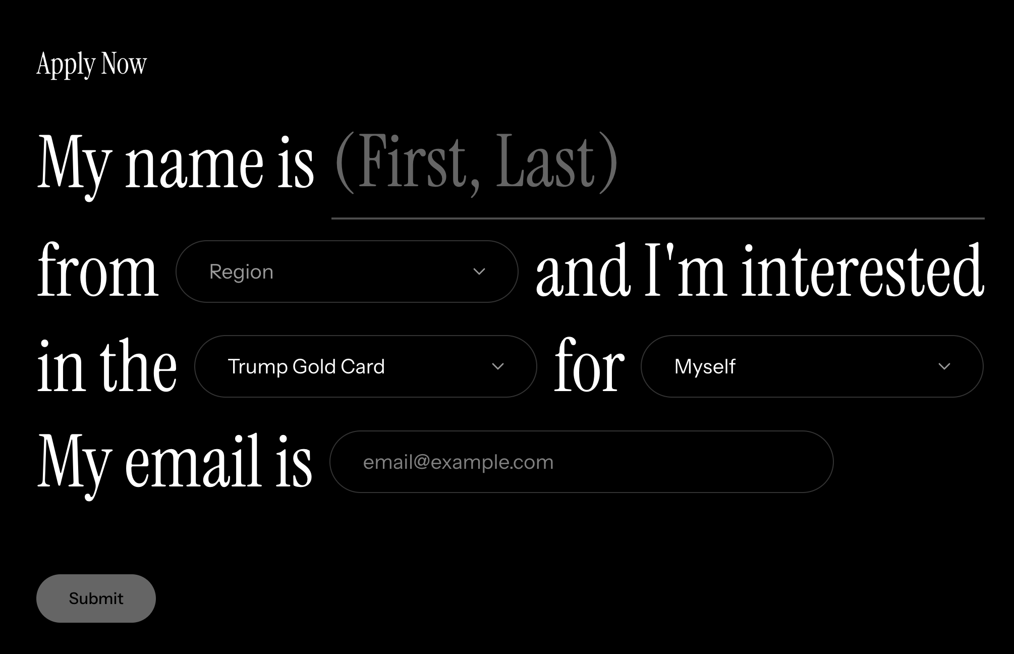
Here’s a live example of a Mad Libs form in the wild.
A Mad Libs form is a new and powerful way to capture leads where trust and first impressions matter. A playful, conversational tone communicates personality and makes your form feel relatable and human. That emotional connection is something a sterile, traditional form can never provide.
Holy crap. Trump Gold Card!?
I’m 50/50. I also see the value. However, would utilize the method on specific use-cases and if it’s relatable to the brand/tone of the product - sometimes traditional is expected = trust.