
When You Should Cancel the "Cancel" Button
The cancel button confusion
The “Cancel” button has always been present on modal dialogs. You know what it means, but in certain contexts, it can greatly confuse users. When users get confused, they’ll exert extra cognitive effort to make a decision. Sometimes they can click the wrong button and get an unexpected result. This is far from a pleasant user experience.
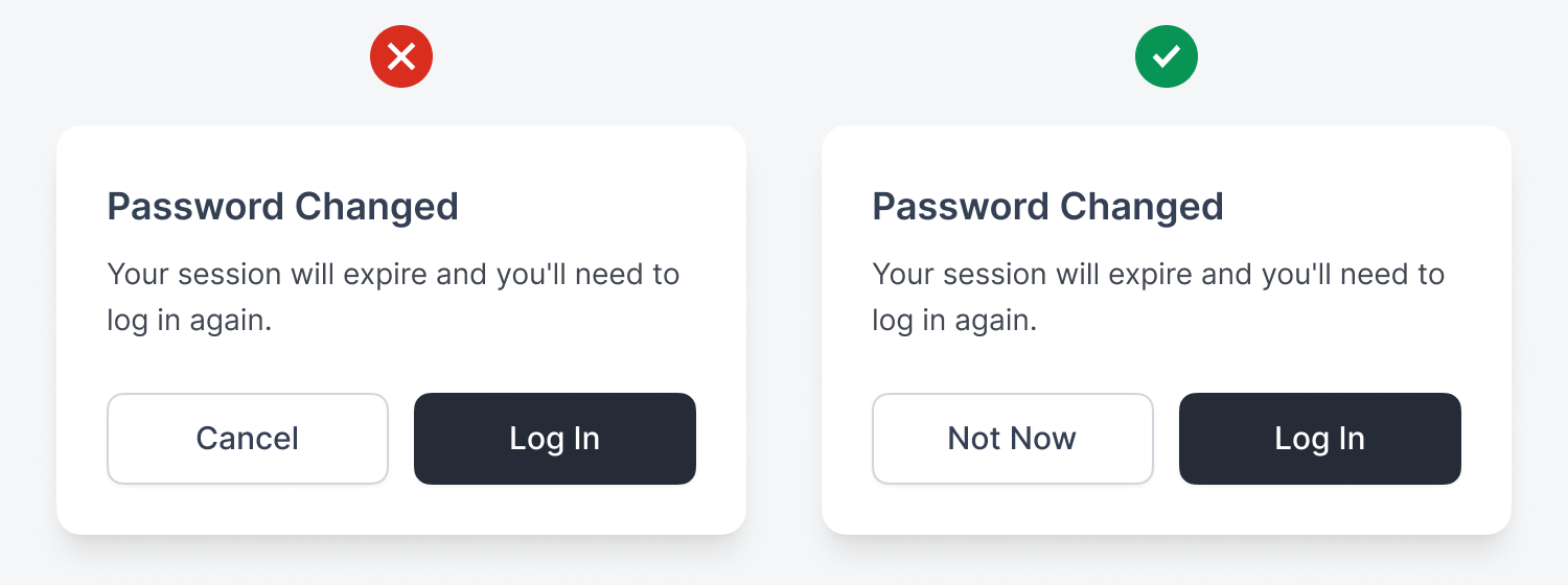
In a password change flow, users may see a modal dialog that says, “Your session will expire and you’ll need to log in again.” Users might think “Cancel” abandons their password change, but they already changed it. This step just warns them that their session will expire. A clearer label to use is “Not Now,” so users don’t think they’re reversing the password change.
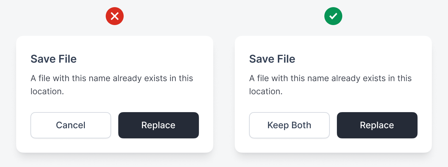
When saving a file that already exists, a modal dialog may say, “A file with this name already exists in this location.” Does “Cancel” cancel the process entirely, or just the replacement? A better label is “Keep Both,” so users know they created an extra file.
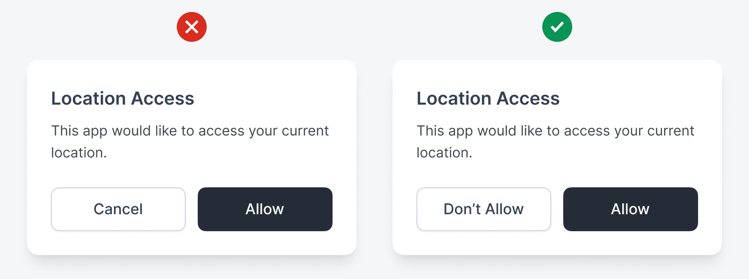
In a permission request, users may see a modal dialog that says, “This app would like to access your location.” Does “Cancel” deny permission or just dismiss the dialog? A better button label would be “Don’t Allow” to make it clear that they’re denying the request.
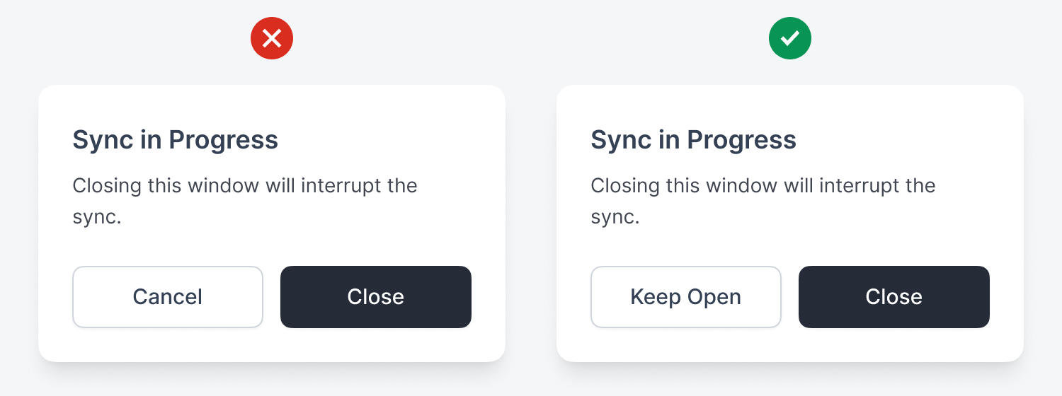
In a background process warning, the modal dialog might warn users that “Closing this window will interrupt the sync.” Does “Cancel” cancel the window close or the sync? A better label for the button is “Keep Open” to avoid users thinking they’re canceling the background process.
For upgrading a subscription, a modal dialog may say, “You’ll be charged $99 today and billed monthly.” Does “Cancel” mean don’t upgrade or cancel their current subscription? A clearer label is “Nevermind,” so users won’t think the button will cancel their current plan.

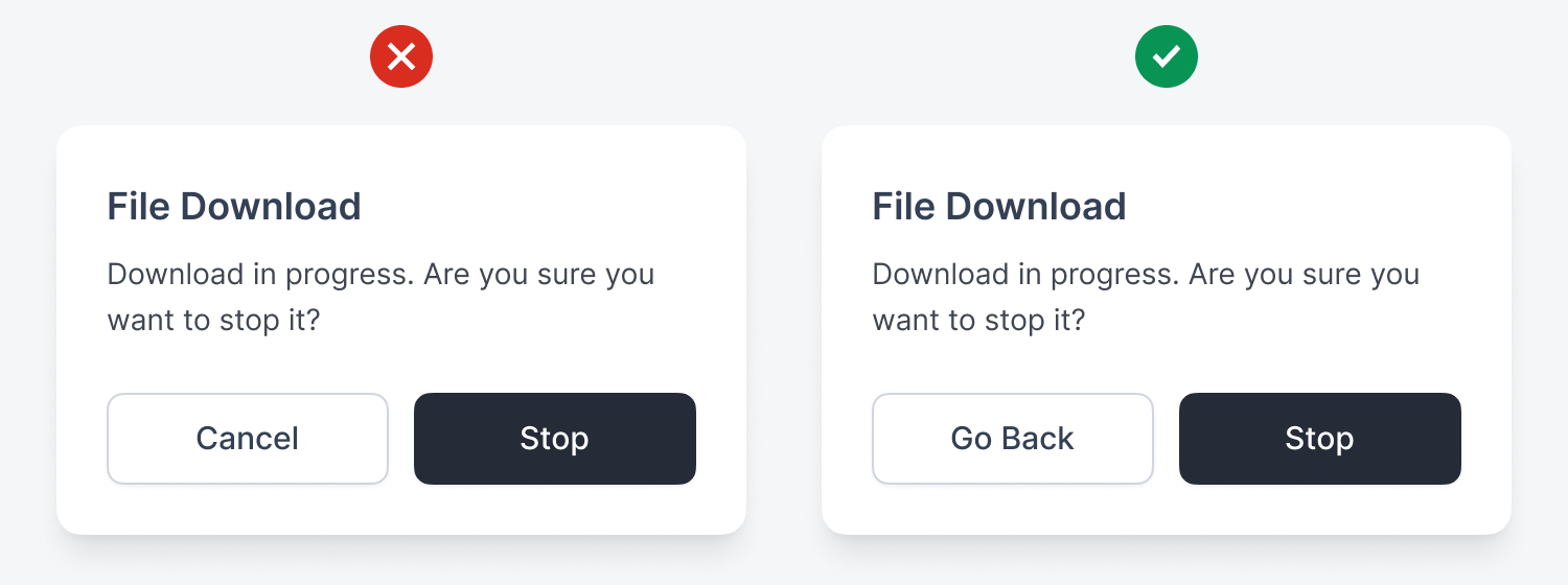
If users try to exit an app, the modal dialog may say, “Download in progress. Are you sure you want to stop it?” Users could think that the “Cancel” button cancels the entire download. A clearer label would be “Go Back,” to prevent the exit and let users know their download won’t be interrupted.
Conclusion
As you can see, there are many contexts where the “Cancel” button can confuse users and increase cognitive load. Instead of using the same label to dismiss every modal dialog, consider an alternative that better suits the context. Here’s a list of other dismissal labels that may work better than “Cancel.”
-
“Keep [X]”
-
“Go Back”
-
“Return to [X]”
-
“Continue [X]”
-
“Don’t [X]”
-
“Stay [X]”
-
“Nevermind”
-
“Not Now”
-
“Maybe Later”
Interestingly, I found these a bit harder to follow than ‘Cancel’, as the new labels don’t seem to flow naturally from the titles
I liked the author's approach to a problem that is common in all management software that I know of. The cognitive overload of the ‘cancel’ button is really relevant for a user who spends hours in front of software.