
Why Bright Button Colors Fail Accessibility
How to fix poor color contrast
Are you using a bright color on your buttons? You might not know this, but your users could be having trouble reading the text labels. If they have difficulty reading them, they won’t feel comfortable clicking them to complete their tasks.
Brightly colored buttons with white text labels are inaccessible to users with visual impairments. This includes color blindness and low vision, which commonly affects the elderly.
To check your button accessibility, use an online color contrast calculator to calculate the contrast ratio. It needs to be 4.5 or higher to meet the level AA accessibility standard. Unfortunately, most bright button colors fail the test.
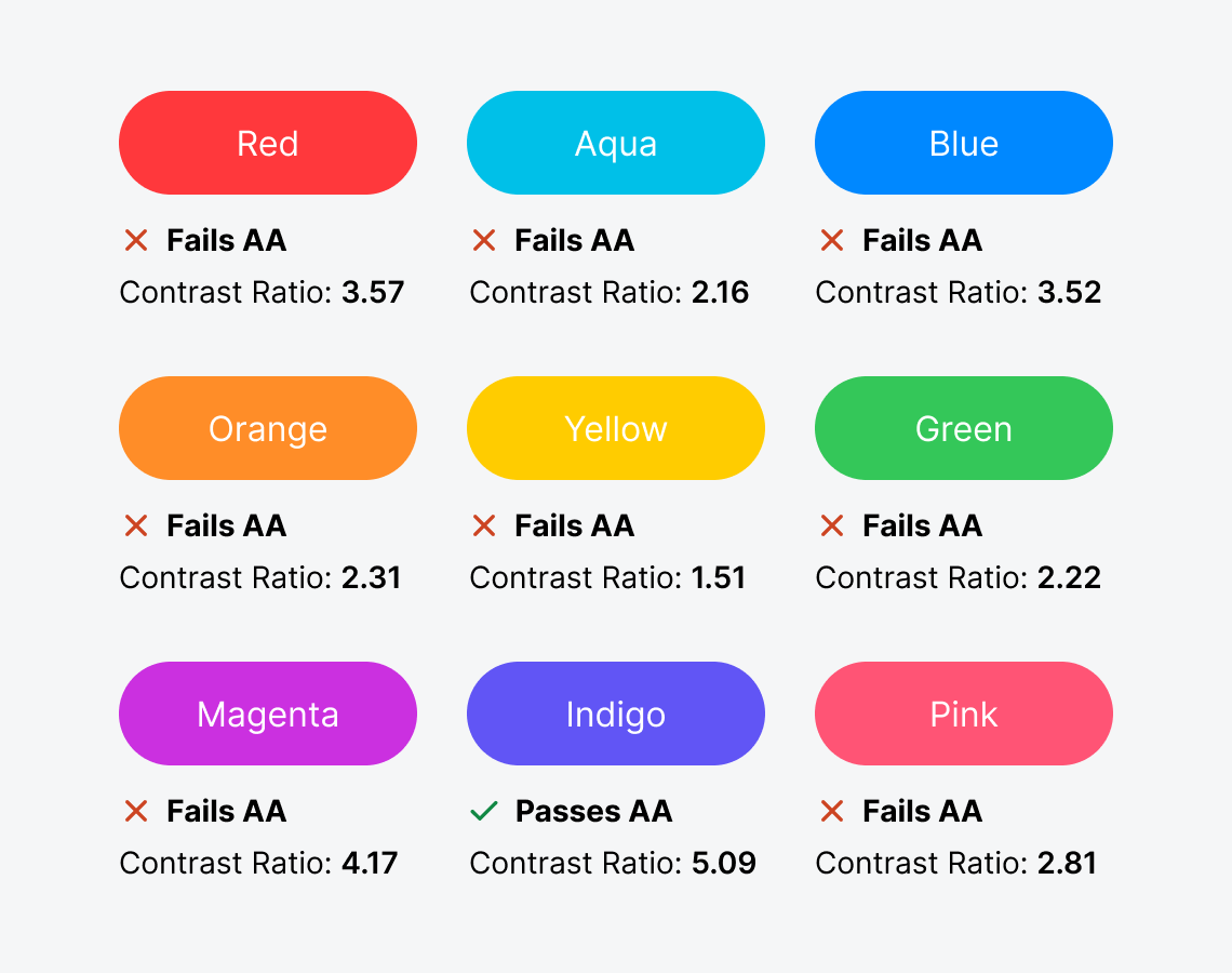
As you can see, every bright color except indigo fails the AA standard. This means you need to tweak the colors to fix the accessibility issue. There are a couple of ways to do this.
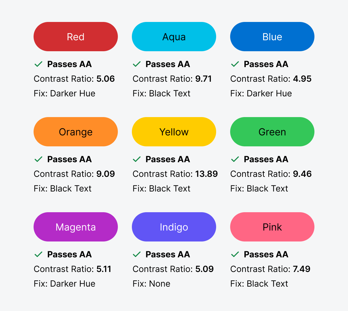
You can either use a black text label or darken the hue. Certain colors fare better with one approach over the other. For instance, to fix a red, blue, or magenta button, it’s best to darken the hue. On the other hand, to fix a green, pink, yellow, orange, or aqua button, it’s better to use a black text label.
When your buttons pass the AA standard, they’ll be accessible to visually impaired users. To put it to the test, this example demonstrates how darkening the hue and using a black text label improves readability.
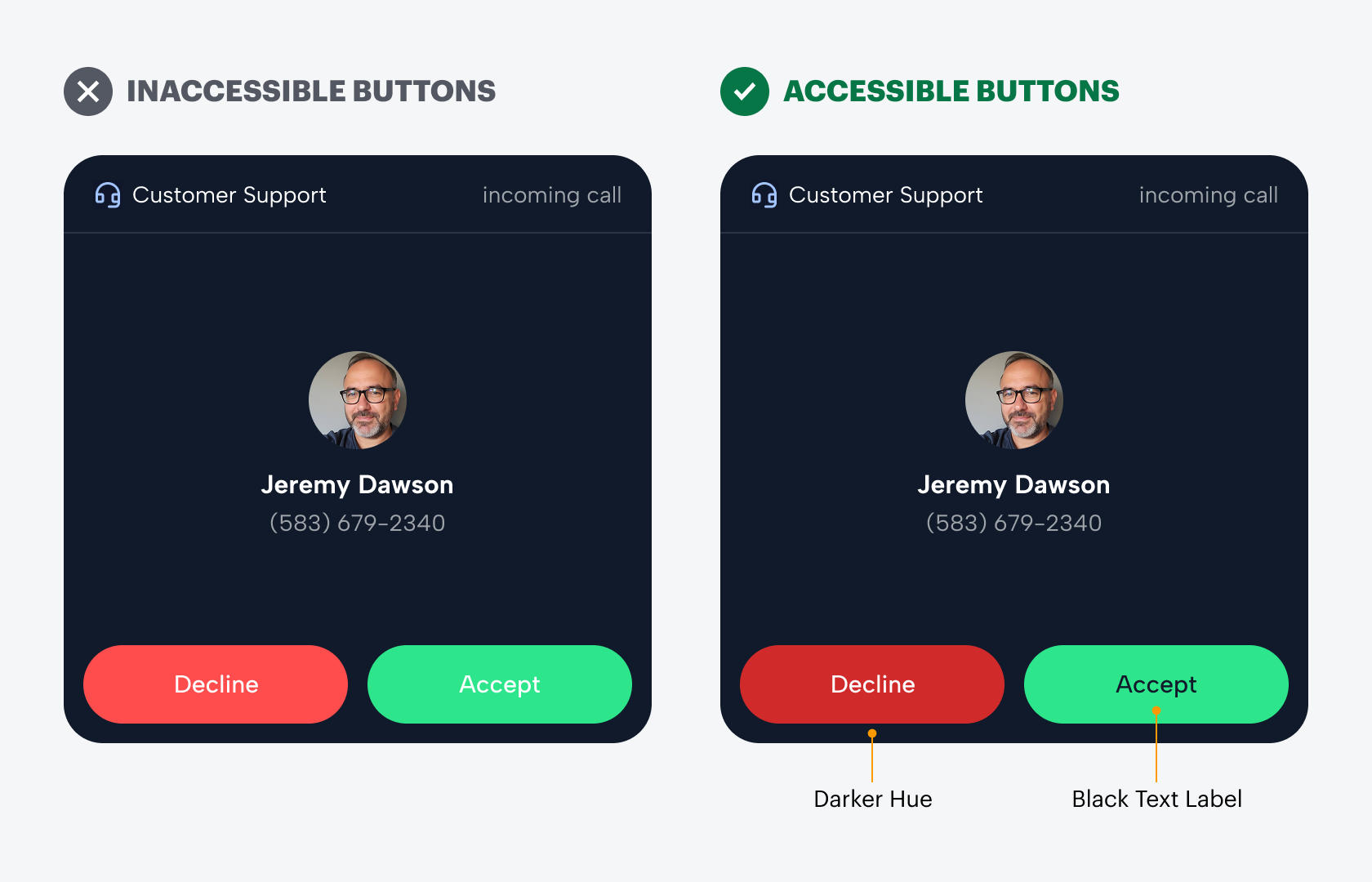
Now, when users perform an action, they won’t hesitate or second-guess themselves. Instead, they’ll be able to click the buttons with more certainty. Next time you use a bright button color with a white text label, check whether it passes the AA standard. If not, you know what to do.