
Why Account Menus Work Better in the Sidebar
The best location for account menus
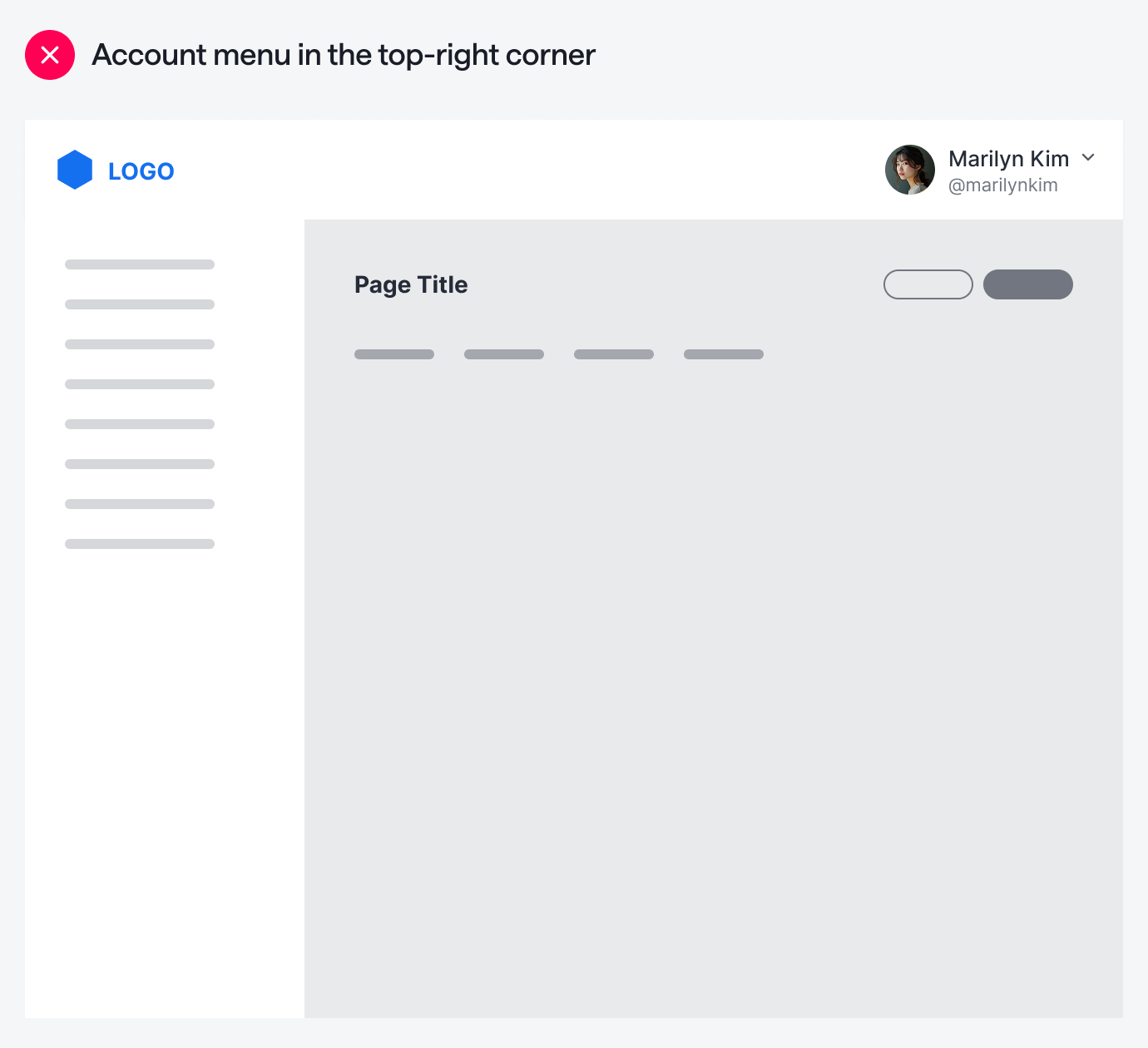
Where is the user’s account menu located on your app? If it’s in the top-right corner of the screen, it’s not in the optimal position. With so many clickable elements on the screen, users will get confused about where to look to manage their account.
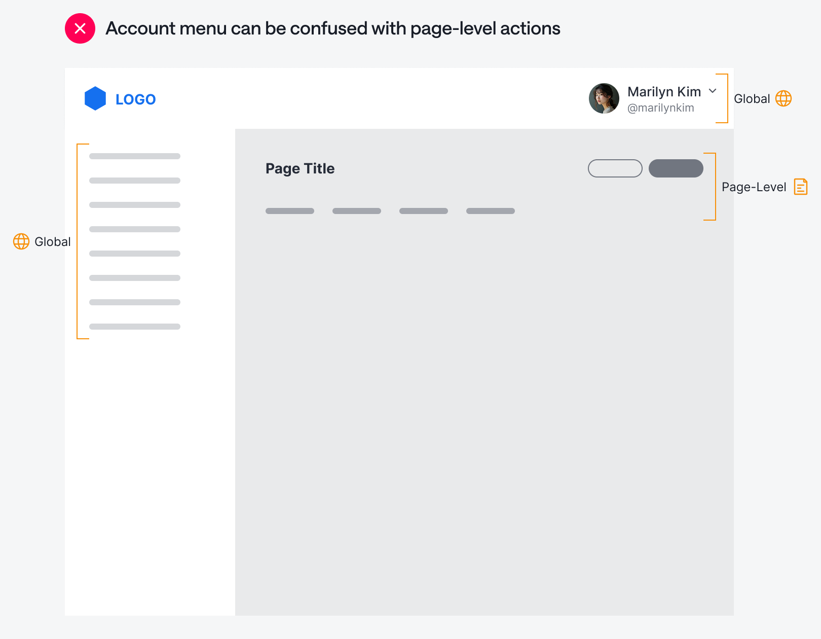
One reason for this confusion is that the account menu is in the same area as the page-level actions. The account menu is a global control with actions that apply system-wide. Placing it close to page-level actions can lead users to think the account menu is also page-level, which can cause interaction issues.
Not only that, but when you put the account menu at the top, you’re creating two separate locations to access global controls. When users perform global tasks, they’ll have to scan both the sidebar and the navigation bar to find the right item. Is the item on the left or at the top?
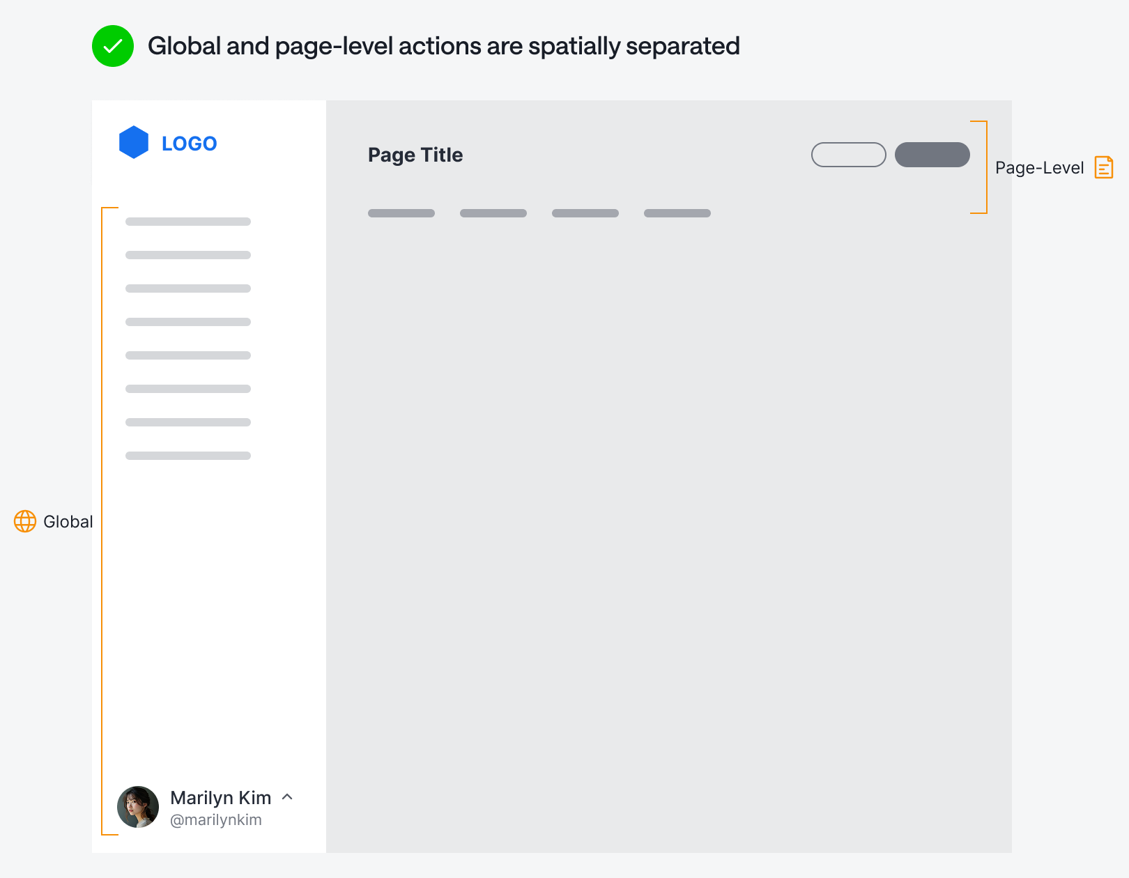
A much better location for the account menu is at the bottom of the sidebar. When all global actions are on the left, it allows a more dedicated space for page-level actions. Users will know for sure that the buttons at the top are contextual to what they’re currently viewing. There’s no room for confusion when global and page-level actions are spatially separated.
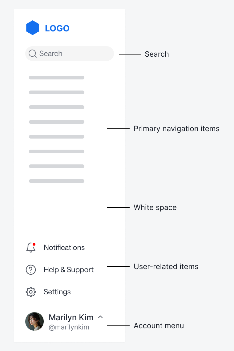
Other user-related actions, such as notifications, help, and settings, can fit above the account menu. Keep some white space between these items and the primary navigation items. If you have a search bar, you can place it at the top of the sidebar. In other words, the sidebar usually has enough room to house all the items from the navigation bar.
If your app’s primary navigation is at the top, it makes more sense to place the account menu in the top-right corner. A bottom account menu works better when the primary navigation is a persistent sidebar.
No matter what type of navigation you’re using, the principle remains the same: never mix global and page-level actions at the same navigational level. Keep them visually and spatially separate for a better user experience.
What if you don't have a sidebar? I think Reddit's top-right menu works well.