
The Right Way to Use Line Dividers and Containers
How to structure data in a layout
Organizing data on a screen is harder than it looks. Without structure, users will struggle to scan and process information efficiently. Most designers know this, so they add line dividers and containers to their design. However, they often misuse these elements, making their interface harder to read and understand.
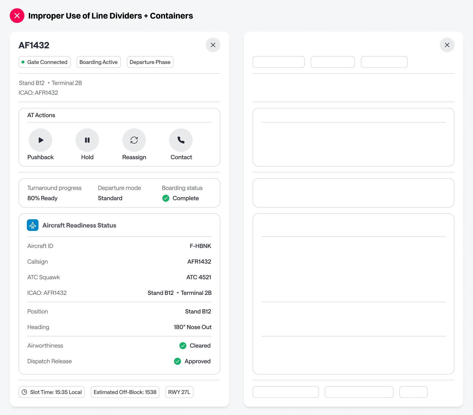
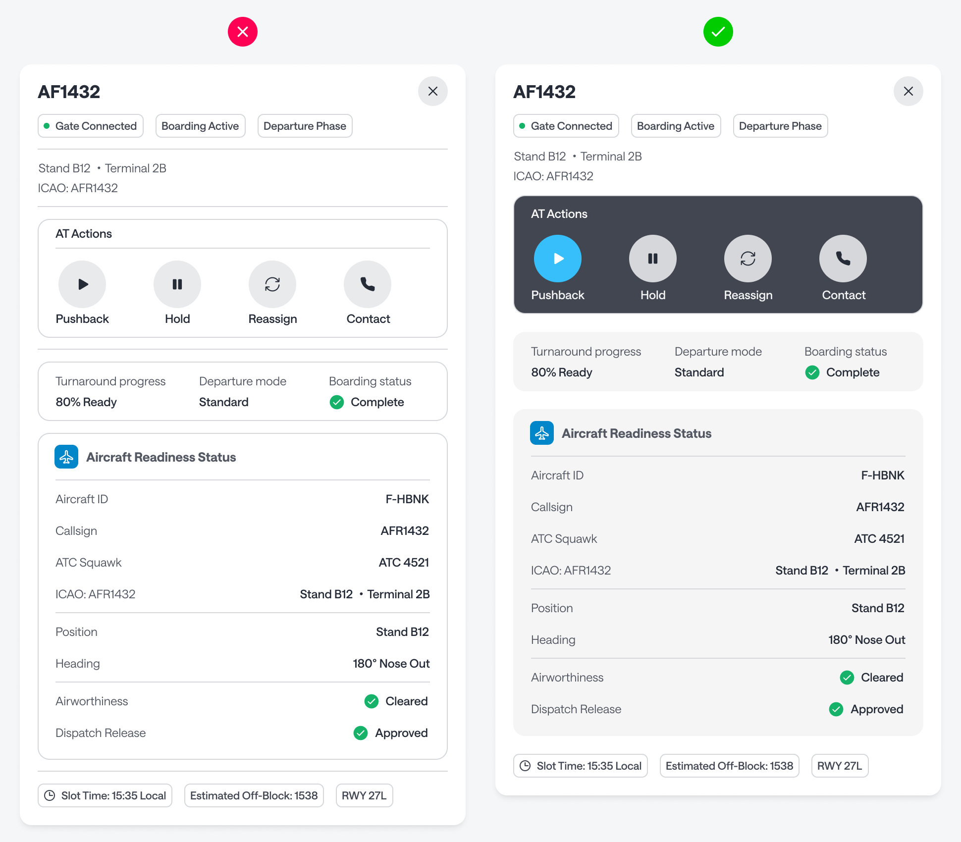
Look at how many dividers and containers can end up in a single layout. When there are almost as many structural elements as there are pieces of data, the result is clutter. Instead of guiding the eye, all those lines create visual noise that gets in the user’s way.
Cut Redundant Dividers
A common mistake is placing line dividers beneath elements that already have borders. Chip buttons, for example, have their own borders that act as dividers, especially combined with surrounding whitespace. Adding a line below them is redundant.
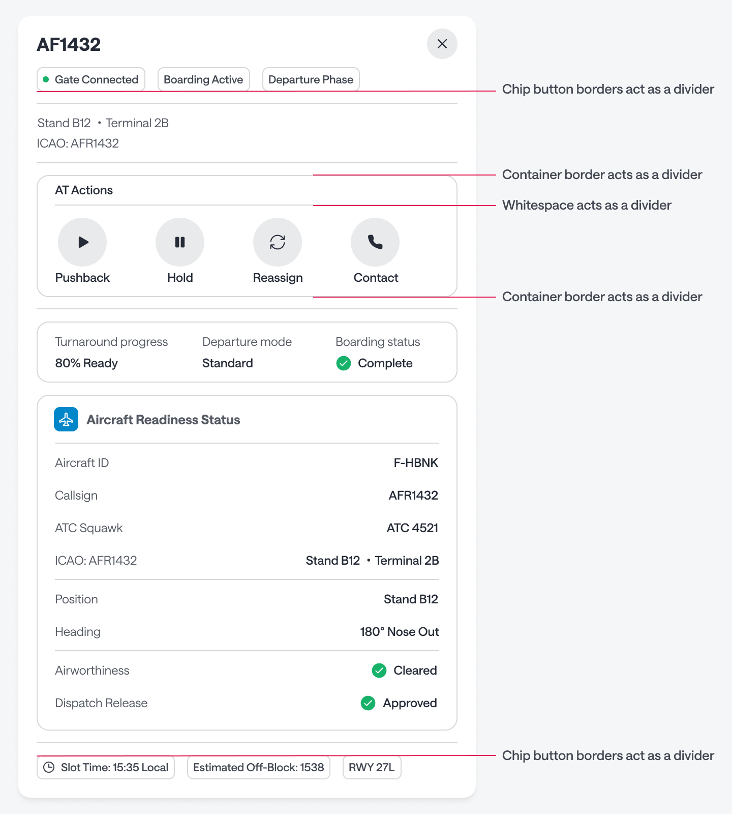
The same logic applies to containers. A container already has a border, so placing a line divider directly above or below it serves no purpose. As a rule, never use a line divider before or after a container. It only adds more noise.
You also don’t need a divider to separate a title from its controls. If there’s enough whitespace, the spacing does the job on its own. Once you strip out the unnecessary dividers, the improvement is immediate — more clarity, less noise.
Where to Use Dividers
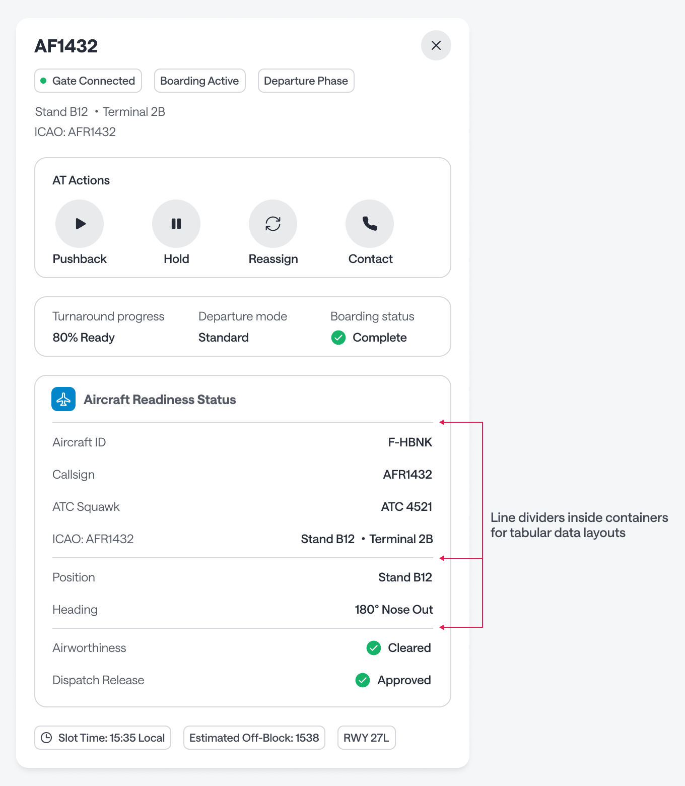
The one place where line dividers work well is inside containers to separate rows of tabular data. Think of a table where the label sits on the left and its value on the right—that’s the proper context for dividers. Outside of that, if you’re already using containers, you don’t need them.
Color Fill the Containers
Containers without a color fill can look too similar to dividers. More outlines floating on the page just adds to the noise. Adding a fill to the container distinguishes them and establishes visual hierarchy.
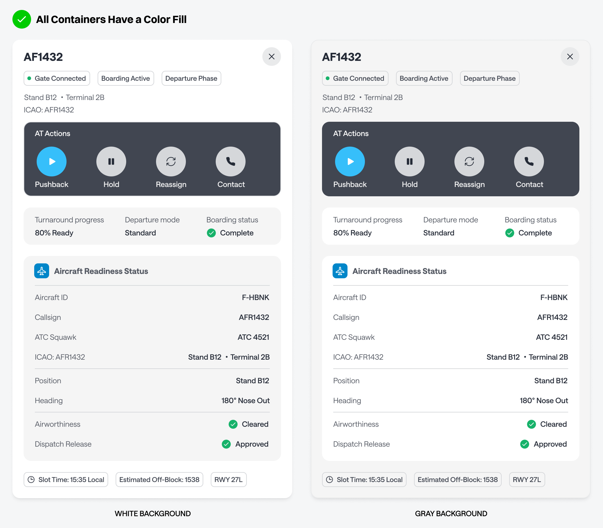
The most important container should have the strongest color contrast. On a light background, that means a darker fill; on a dark background, a lighter one. Less important containers should recede with a more subtle fill.
This way, the user’s eye is naturally drawn to what matters most, and the supporting information stays out of the way without disappearing. A simple starting point is to use light-gray containers on a white background, or white containers on a light-gray background.
Use line dividers sparingly. If you’re using containers, their borders already handle separation. Dividers become redundant everywhere except inside tabular layouts. An interface full of outlines but no color fill creates visual noise that slows users down. Color-filled containers reduce distractions, establish hierarchy, and guide attention along a clear path.