
The UX Problem with Muted Mic Buttons
How to prevent hot mic moments
Imagine you're on a video call with your coworkers and you're trying to mute your microphone. You turn the mic off and start talking to someone in the background. But what happens next has you embarrassed. The mic was actually on, and everyone on the call heard the entire conversation.
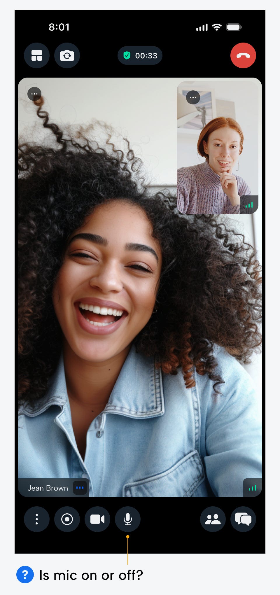
This accidental hot mic moment is the worst mistake a user could make. The UX design of a mic button should prevent these accidents. However, most mic buttons fail to do so because they have confusing and unintuitive on and off states.
Popular video calling apps, such as Google, Discord, and Zoom, all follow a common bad practice: highlighting the mic button when it's off, but not when it's on. In other words, even the top tech companies are getting this wrong.
On State (Mic Unmuted)
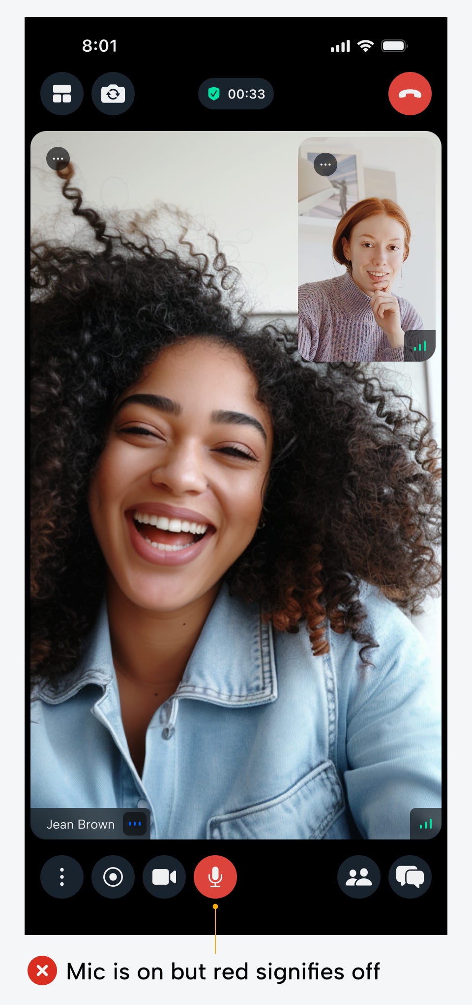
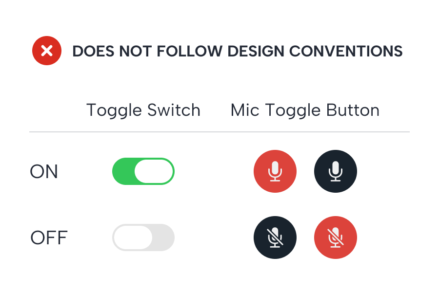
When the mic is on and the button is red, it alerts users that clicking the button mutes the microphone. However, it doesn't alert them that the microphone is already on. It requires an extra cognitive load to process that a red button indicates the mic is on, because red is commonly associated with the off state. When users see the red button, it's easy to assume the mic is muted when it's not.
Sometimes when the mic is on, the button is a neutral color. This isn't any better because users don't have a clear indication that their mic is hot. A neutral-colored button suggests that the mic is in an inactive or default state. However, the default state for a microphone is off, so this creates an inconsistency with user expectations.

Users need to know for sure that the mic is unmuted when it's on. A red and neutral-colored button fails to do this because of cognitive dissonance. To solve this, you must follow the design convention for toggle switches. A standard toggle switch displays a green cue when it's on and a neutral one when it's off. A red or neutral button to indicate the mic is on violates this convention.
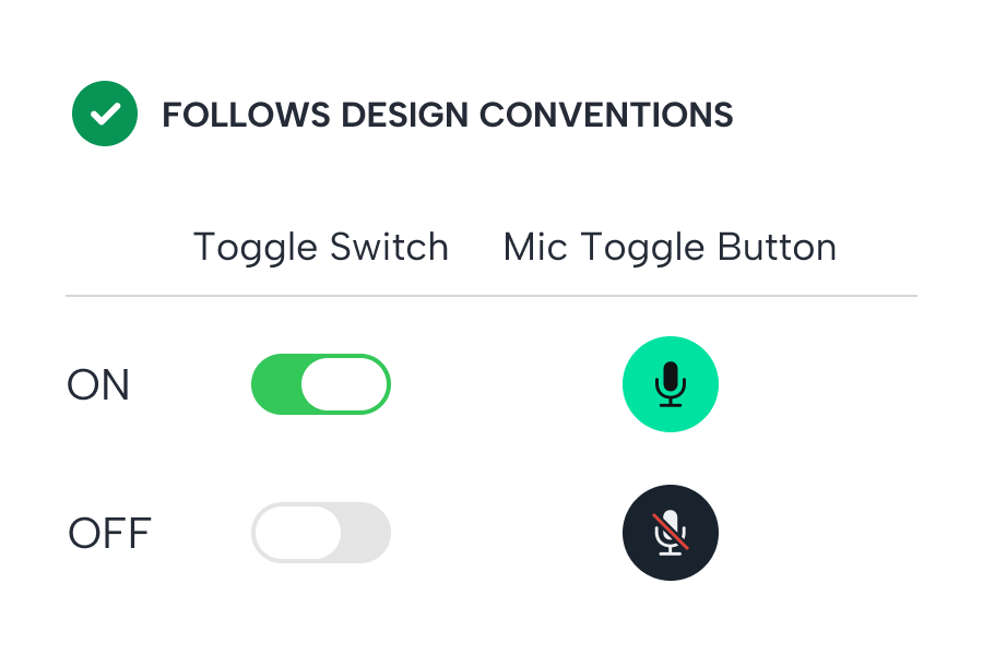
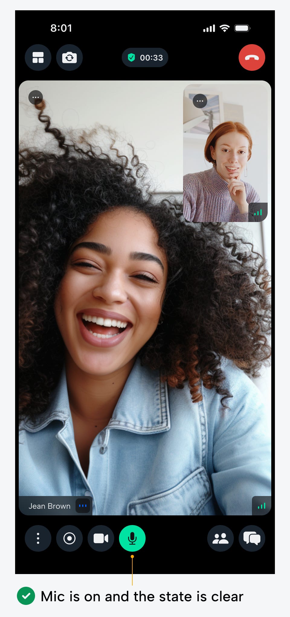
Therefore, the appropriate indicator for an unmuted mic that users expect is actually a green button. Not only does this follow the toggle convention, but it leaves no doubt in the user’s mind that the mic is on. The bright green button dominates the screen for faster state recognition. It only takes a quick glance for them to know whether they should speak.
Off State (Mic Muted)
The next question to answer is what the button should look like when the mic is off or muted. You might assume a red button would work well since it's the opposing color of green. However, this would present several UX issues.
For one, red buttons command the most attention because they have the longest wavelength in the visible light spectrum. As a result, it's competing with the on state and putting too much importance and attention on a muted mic.
It's more important for users to recognize when the mic is unmuted because the social consequences of speaking unintentionally are more serious. In other words, if the user accidentally speaks into the mic when it's muted, they can correct this mistake by turning it on and repeating what they said. However, if they speak out of turn, they can never retract what was said in front of others.
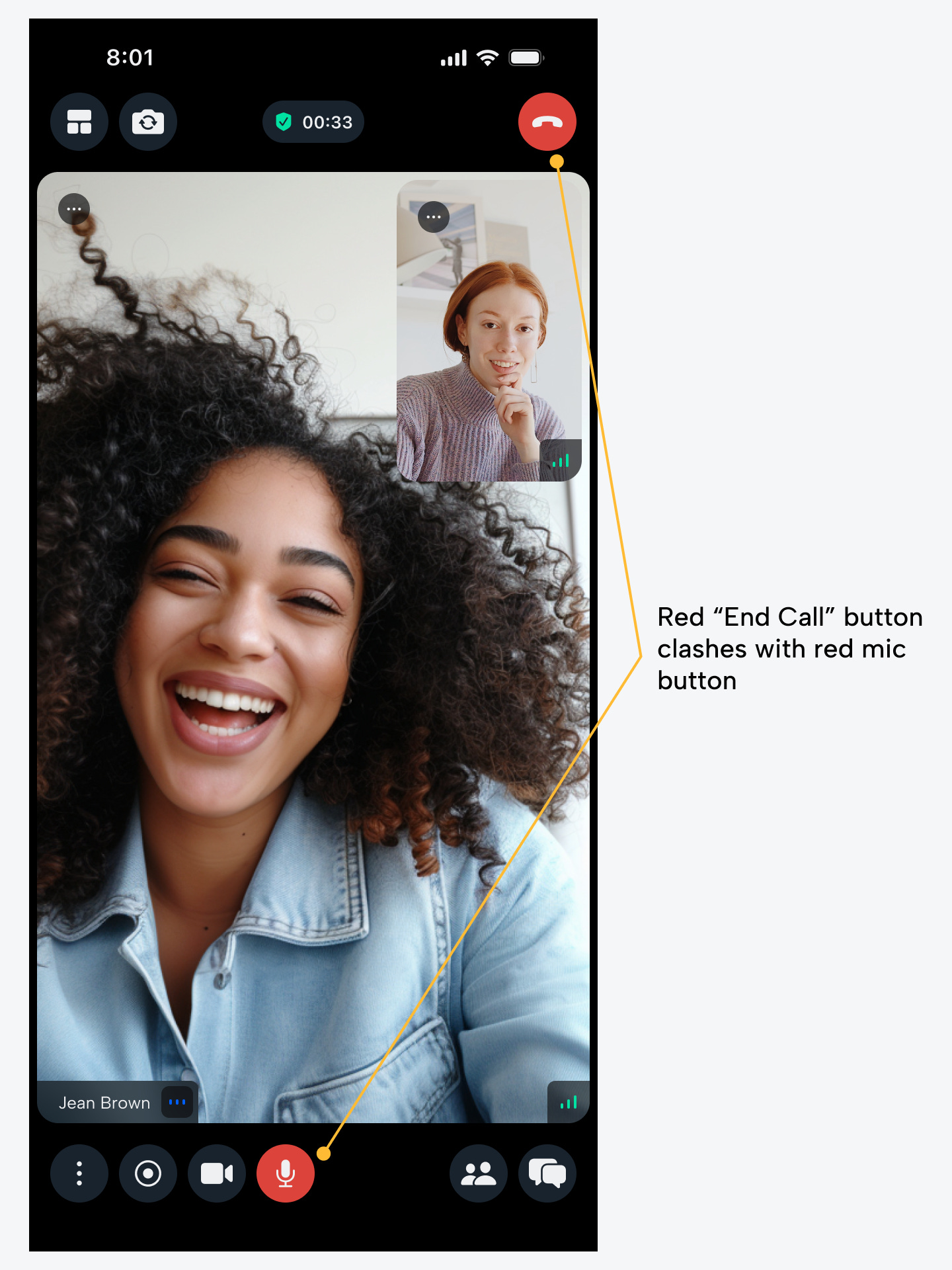
Another issue with the red button is that it clashes with the red "End Call" button. Users could easily mistake one button for the other and click the wrong one. The icons inside the buttons might be different, but users don't always notice minor details before they act.
The last issue with the red button is that some colorblind users are unable to distinguish between green and red. In their eyes, they see different shades of brown and can't tell the difference between an on and off state. For this reason, pairing green and red isn’t ideal for accessibility.

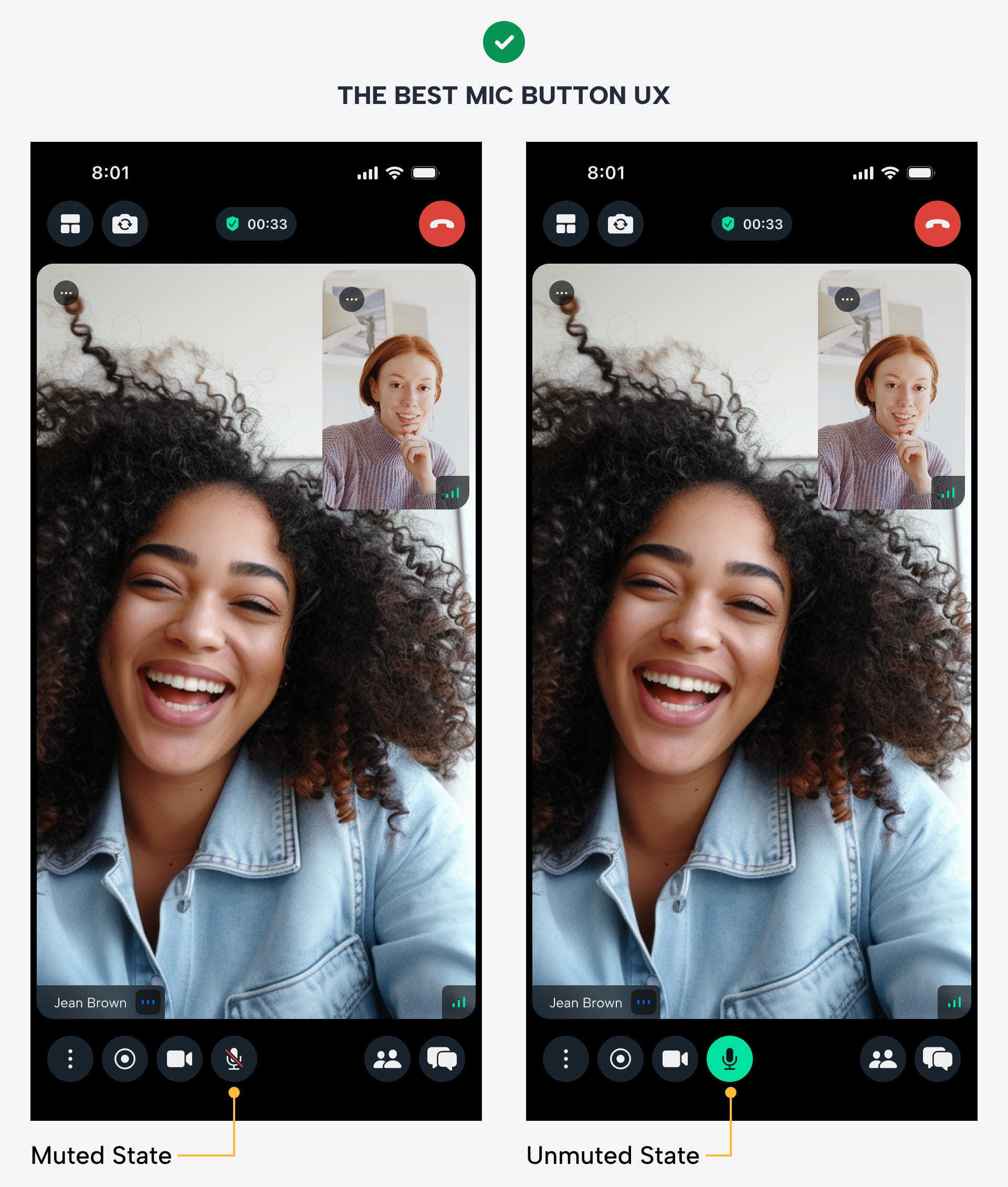
Instead of using a red button for a muted mic, use a neutral-colored button that blends in with the background. In addition, the mic icon should have a red slash over it to semantically indicate the off state.
The red slash is enough to make the state clear without dominating the visual space or clashing with the red "End Call" button. The white slash is hard to notice because the microphone glyph is also white. Users can miss this detail and mistakenly think the mic is on. For this reason, the red slash is essential to signify the clearest off state.
The best UX design for mic buttons prevents embarrassing hot mic moments and adheres to the design convention for toggles. Users should always be aware when their microphone is muted or unmuted. These best practices will ensure they never get confused again.