The Law of De-Emphasis for Clean UI Design
A technique to reduce visual noise
When you think of a “clean” interface, what comes to mind? People often associate it with a design that’s easy to use and look at. However, designers may find it challenging to create an interface that embodies this abstract concept.
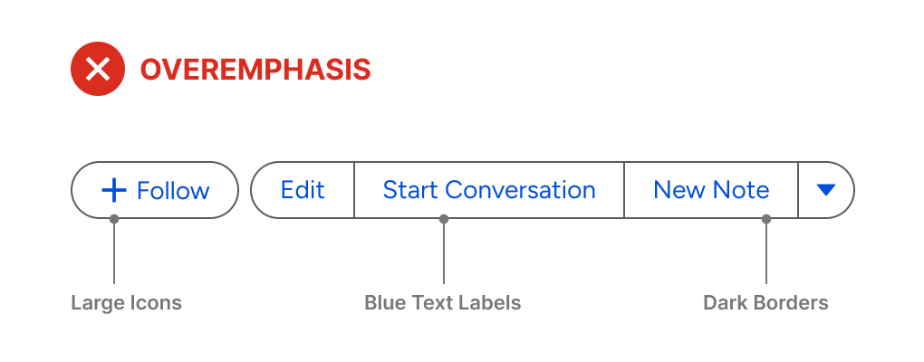
A truly “clean” design is achieved through the art of de-emphasis. Most designers overemphasize elements, resulting in a cluttered, overwhelming interface. The example below illustrates this perfectly.
There are only five buttons, but it feels like there are more. The buttons may work, but they aren’t pleasing to look at or use. The emphasis should be applied to the most important element, while everything else should be de-emphasized. Here, everything is emphasized.
The Law of De-Emphasis
For the most important element to stand out, everything else must fade back.
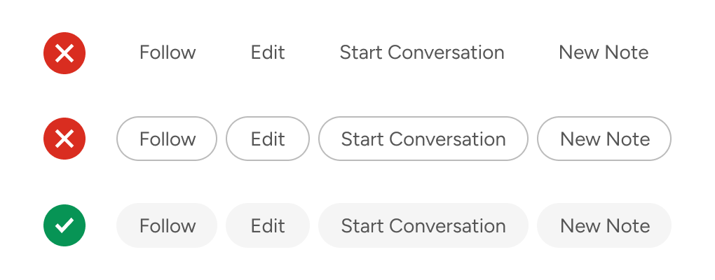
In this case, the text labels have the highest priority. If users can’t read them, they won’t click them, making the buttons unusable. To redesign the buttons, start with the text labels first and remove everything else. This means no button shapes, borders, or colors.
The text labels aligned in a horizontal row are a good start. However, there isn’t a visual cue to indicate the affordance. As a result, it’s easy to mistake them for plain text that runs together rather than clickable buttons.
Button borders are not a good option for this because they would overemphasize the elements. Remember, the goal is to emphasize the text labels over everything else, not create visual competition. Instead, use light and subtle button surfaces.
Additionally, apply a heavier font weight, such as a medium or semibold, to make the text pop to the foreground. Bold is sometimes too heavy, so make sure to find the right balance.
Adjusting font weights is a better approach to increasing contrast than enlarging text or darkening the shade. You won’t always have room for larger text, and a darker shade can create visual inconsistencies with other elements.
A light gray fill is the most common color for a button surface. However, this might not be ideal because it can make the button appear disabled. To avoid this, add a colorful tint to the gray. Now, it looks blue-gray rather than pure gray, eliminating the possibility that it’s a disabled button.
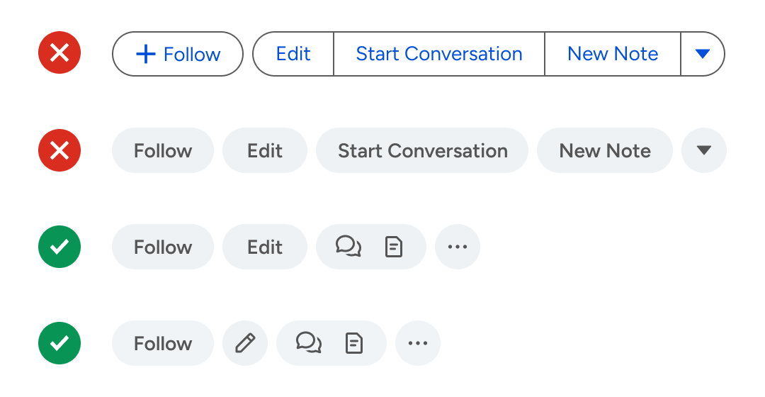
These buttons already look much better than the original design. However, you can also de-emphasize the quantity of text that’s displayed. With so many text labels, users will have to spend more time and effort reading them to ensure they click the right one. By de-emphasizing the heaviness of text, you allow users to make decisions via symbolic recognition.
The “Start Conversation” button can be represented by a speech bubble, and the “New Note” button can be represented by a document. Since both buttons create new data, they should be grouped on the same button surface. In general, similar actions belong together like siblings.
In addition, the arrow button from the original design uses a triangle icon that’s overemphasized. A better icon would be an ellipsis to represent “More Actions.” You can also use a pencil to represent the “Edit” action. However, leaving it as a text label is also fine since you have a balance between text and icons.
Sometimes you’ll have actions that can’t be well-represented by icons. For example, what icon would work well for “Follow?” Nothing concrete comes to mind. Therefore, it’s fine to use a text label for these rare cases.
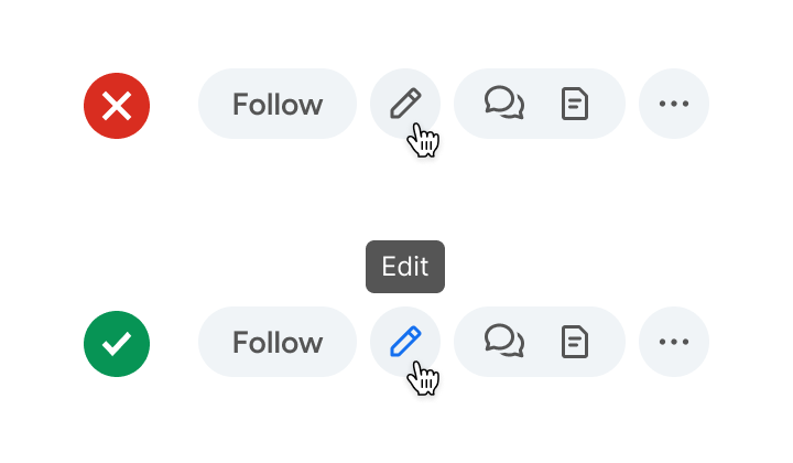
When using icons, it’s essential to provide tooltips for users who can’t recognize them initially. The labels appear when they hover their mouse over the icons. Over time, they’ll be able to recognize them with ease by symbolic recognition. In the long-term, this is much faster than reading text labels.
Conclusion
The path to a clean interface isn’t about adding more visual elements—it’s about knowing what to remove. De-emphasis requires restraint: resisting the urge to make every element stand out. When everything is emphasized, nothing is.
Clean UI design isn’t minimal for aesthetics. Instead, it’s minimal because it removes everything standing between the user and their goal. Follow the law of de-emphasis, and you’ll create interfaces that are delightful to look at and pleasant to use.


