
Rags and Runts: The Hidden Problem Hurting Your Text
The secret to better reading rhythm
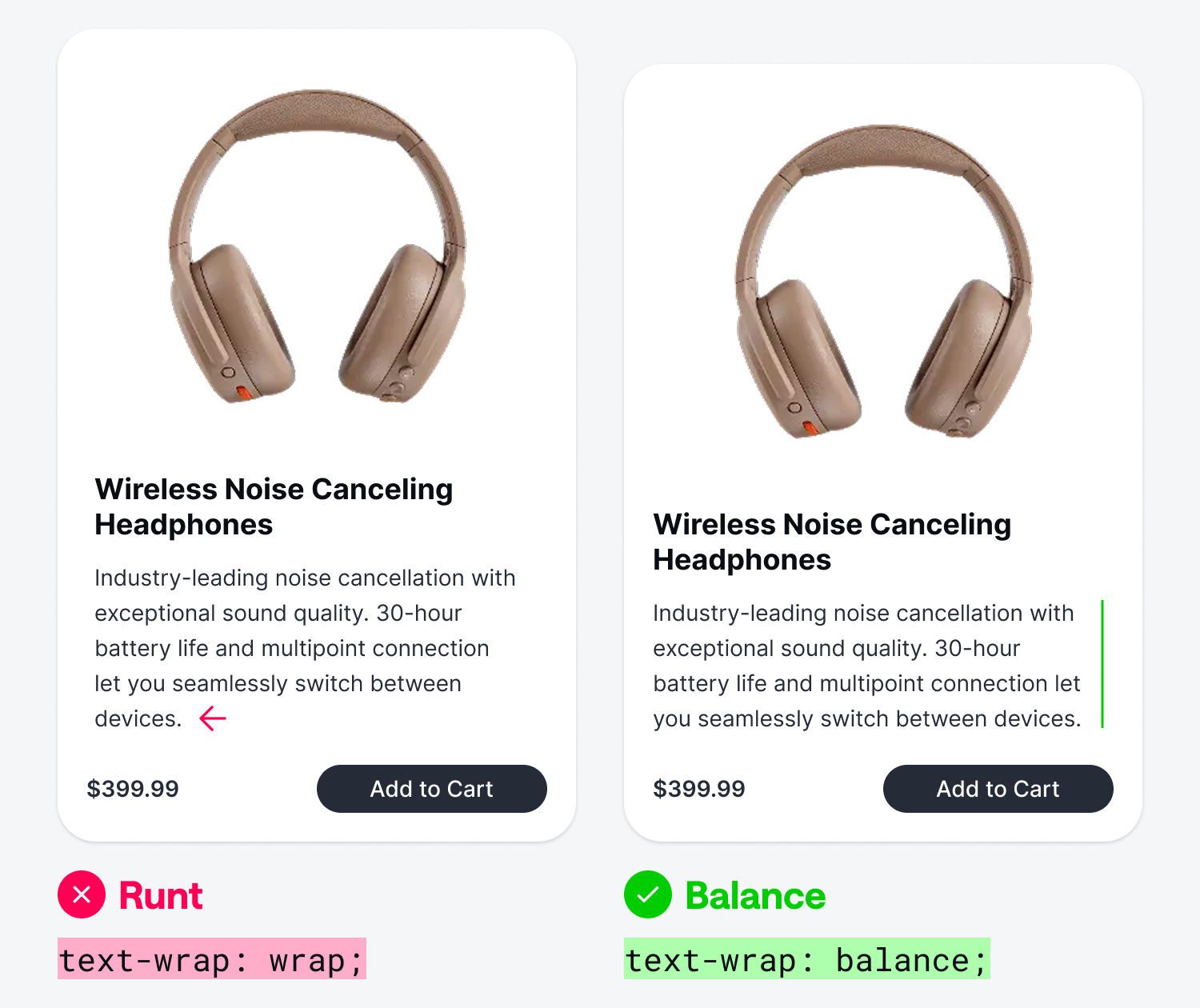
When users read your content, they develop a natural reading rhythm. However, rags and runts can disrupt it. A rag refers to the uneven, irregular edges of body text. A runt is a short line that appears at the end of a paragraph, typically just one or two words trailing off alone.
While rags and runts might seem like a minor detail, they create both visual and reading problems that affect user experience. As users read your body text, abrupt line breaks create an awkward pause in their reading momentum. When read aloud, this disjointedness becomes even more apparent.

Beyond the reading experience, rags and runts create a visual imbalance. They produce uneven right edges on left-aligned text, making paragraphs look asymmetrical. These irregular lines can also form distracting rivers of whitespace running down your page. Ideally, rags should vary subtly while maintaining consistent line length.
Use “text-wrap: balance”
One of the most powerful CSS properties for eliminating rags and runts is text-wrap: balance. Instead of letting the browser wrap text at whatever point it runs out of horizontal space,
text-wrap: balance
distributes text so that each line is roughly equal in length. This creates a symmetrical, visually harmonious block of text without any manual editing or tweaking.

Notice in the example how the rags disappear when text-wrap is set to balance. Both the heading and body text have straighter edges, making the card easier to read and the margins more aesthetically appealing.
However,
text-wrap: balance
isn’t a silver bullet for all body text. Since the browser has to calculate optimal line breaks across the entire text block, it can introduce a slight performance cost on very long paragraphs. This is why most browsers limit their effect to text blocks of six lines or fewer.
For longer body copy,
text-wrap: pretty
is a better alternative. It focuses specifically on preventing runts on the last line of a paragraph without rebalancing every line, making it more efficient for large blocks of text.
Best for Responsive Design
Smaller screen sizes are where rags and runts become most problematic. On desktop screens, wider text columns give words more room to distribute naturally across each line. But as screen width shrinks on tablets and mobile devices, text columns get significantly narrower. This forces the browser to break lines more frequently and at less ideal points.
By applying these two properties to your body text and headings, the browser automatically calculates cleaner line breaks across all screen sizes. For responsive designs that serve users across a wide range of devices,
text-wrap: balance
and
text-wrap: pretty
deliver the biggest returns on smaller screens.