
Inline Cards: Better Data Display Without Modals
The best way to manage version history
Many designers default to modals when they need to display supplementary information or edit data fields. However, this pattern often harms the user experience by causing context loss and interruptions to the task flow.
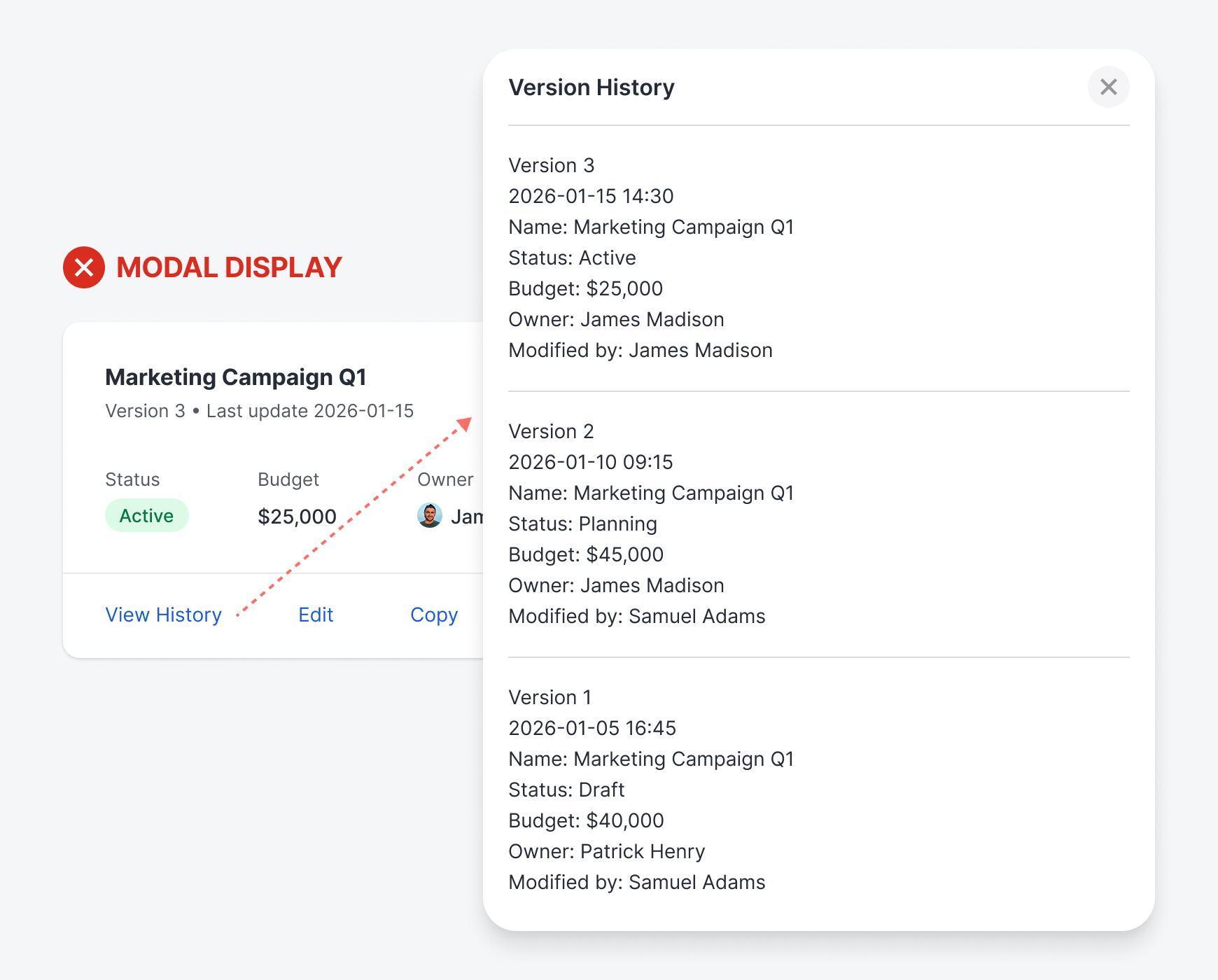
When a modal appears, it obscures the very information users need to make informed decisions. For example, viewing version history in an overlay prevents users from comparing changes against the current state. Instead of seeing all the information they need, they must hold it in their working memory.
Not only that, but editing in a modal also means losing sight of the surrounding data that provides essential context. This modal interruption slows down the user’s workflow and creates friction between them and the data they’re editing. When it comes to editing, they can’t afford to make costly errors.

The human working memory is notoriously limited and unreliable. Our brains are not designed to hold too much information at once. Research suggests we can handle a few chunks, but even that capacity degrades under cognitive load, stress, or distraction. Therefore, it’s not ideal to force users to use their working memory on tasks.
The problem compounds when tasks require comparing or synthesizing information. If a user needs to check whether their edit conflicts with another field’s value, or verify that reverting to a previous version won’t disrupt current work, they’re juggling multiple pieces of information simultaneously.
Each additional item pushes working memory closer to its breaking point. Details get fuzzy, confidence wavers, and users resort to inefficient workarounds, such as opening and closing modals repeatedly or giving up on thoroughness.
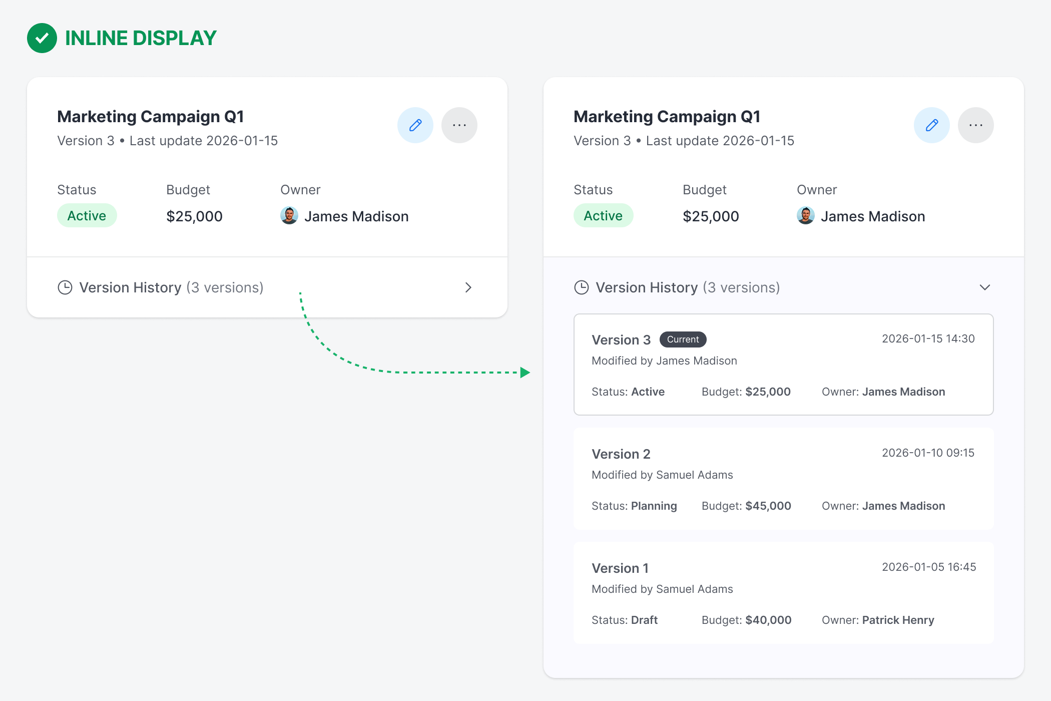
Inline cards offer a more intuitive approach that keeps the context fully visible. The version history expands below the card when users click on it. The expansion feels natural, like unfolding another section rather than being taken elsewhere. Because context remains intact, users can make informed decisions with less cognitive effort.
When a user clicks the edit button on an inline card, the card transitions to reveal the edit fields in place, replacing the read-only display. The transformation is immediate and spatial—users see where their edits are because they happen in the exact location they just clicked.
It’s important to note that the edit state should not cover the version history section, as users may need to view it while editing. The edit state should only cover the read-only data above the version history section.
All surrounding elements remain visible and accessible, preserving the full context. To complete the interaction, users must either commit their changes with the “save” button or abandon them with the “cancel” button, both of which return the card to its default state.
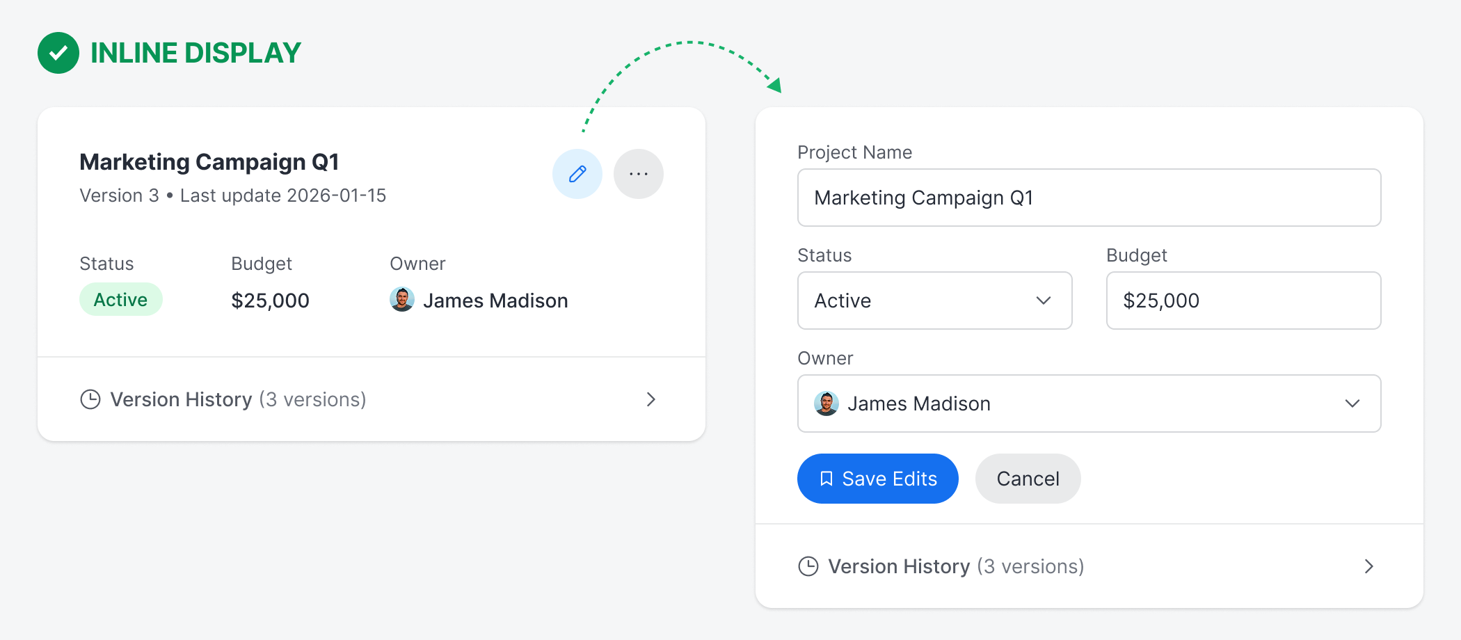
The edit state itself becomes a temporary yet stable workspace where users can reference adjacent information and make changes without the pressure of a modal demanding their immediate attention. Users can see related fields and maintain their spatial orientation within the current context.
Inline cards represent a fundamental shift in how to think about data management. It’s not always necessary to disrupt the user’s workflow with a modal display. Doing so will only cause context loss and increase cognitive load.
Instead, opt to maintain the user’s spatial orientation, context, and continuity for a more seamless experience. For tasks that involve editing, comparing, or interacting with surrounding data, the better design choice is inline cards.
I'm not sure I completely agree with the author regarding the paradigm shift from viewing to editing in the same place. I think these are two very different activities, and in my opinion, this should be reflected in the UI.
However, I myself apply the ideas presented here when it comes to ‘expanding’ the data displayed by a card with a certain degree of conciseness.
I really liked the idea of displaying the extended data in a panel with a slightly different background color, especially when it comes to parent-child information.
Other readers have pointed out that when this extra information is very long, the system can become a problem. And yes, it is a problem. In these cases, if my experience is of any use, I add a pagination buttons at the base of the accordion..
This is great. However, this depends on context. If the avg frequency of users version history is 40+ or larger number, the accordion style would be problematic as interaction cost and cognitive effort would be increased. In that scenario I believe, a modal could be used with essential info abstracted for cognitive continuity and context loss prevention.