
Jointed Fields: How to Simplify 2-Column Forms
Conjoining fields via data relationships
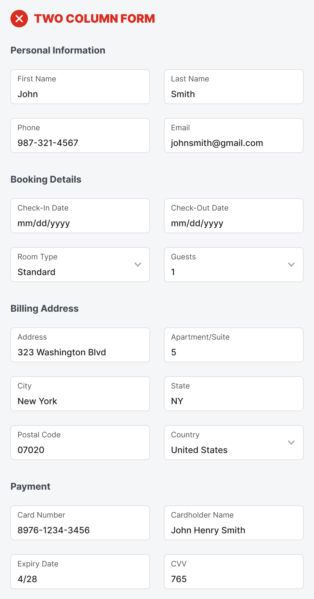
A form with eighteen fields and two columns is a dreadful sight to see. It’ll send users running for the exit and abandoning your app. What looks overwhelming to them isn’t only the number of fields, but the multi-column layout.
With two columns, users have to scan vertically and horizontally to fill out the form. The fields are overpopulated on the left and right sides. It’s almost as if they have to fill out two forms in one. In their minds, they think this is going to be a lot of work, and they don’t have much time. As a result, they change their mind about completing the form, and you lose another customer.
If you don’t want to lose more customers, stop displaying your fields in a multi-column layout. Instead, start using jointed fields. Jointed fields conjoin two related fields and remove the margin between them to create a stronger relationship.
Designers often use a double-column layout because certain fields go better together in the same row. Stacking them vertically would not indicate their relationship. Therefore, they’ll stack them horizontally so users can associate the two as siblings.
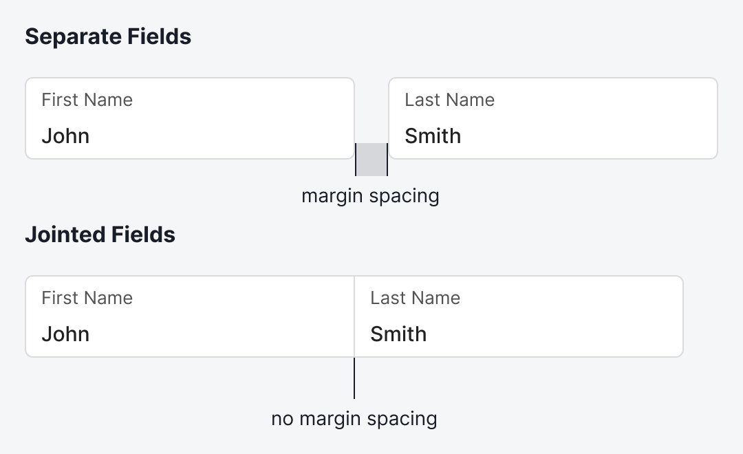
For instance, the First Name and Last Name fields work better in the same row. Instead of displaying them as separate fields, display them as jointed fields that share a common border. This removes the margin spacing and brings them together for a stronger visual relationship.
The benefit is that users won’t see these as two fields anymore when they glance at the form. It’ll look like a single field, which is far less overwhelming when you have multiple rows stacked.
If you examine the two-column form, you’ll notice that every field in the same row is put there because they share a data relationship. Yet this relationship isn’t clear to users when they look at the form. Only by using jointed fields can you make the relationship apparent.
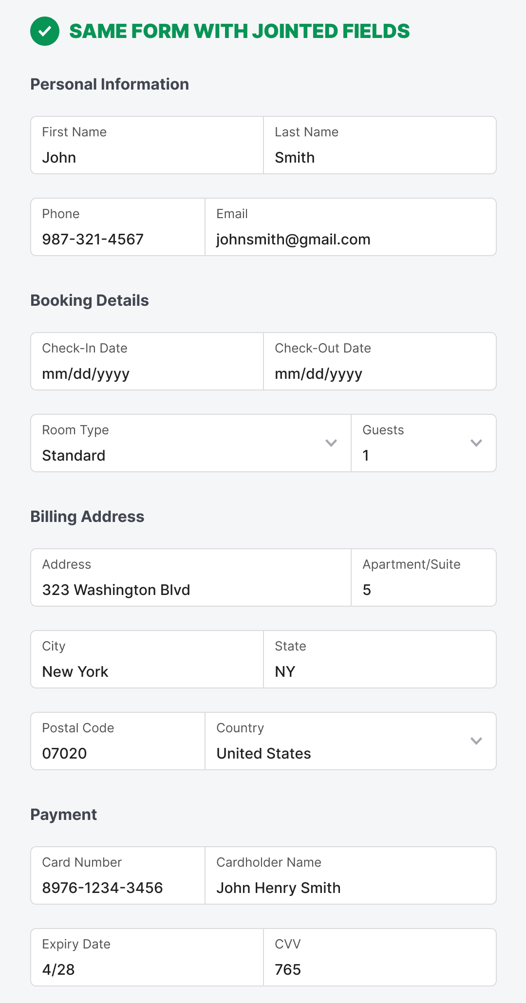
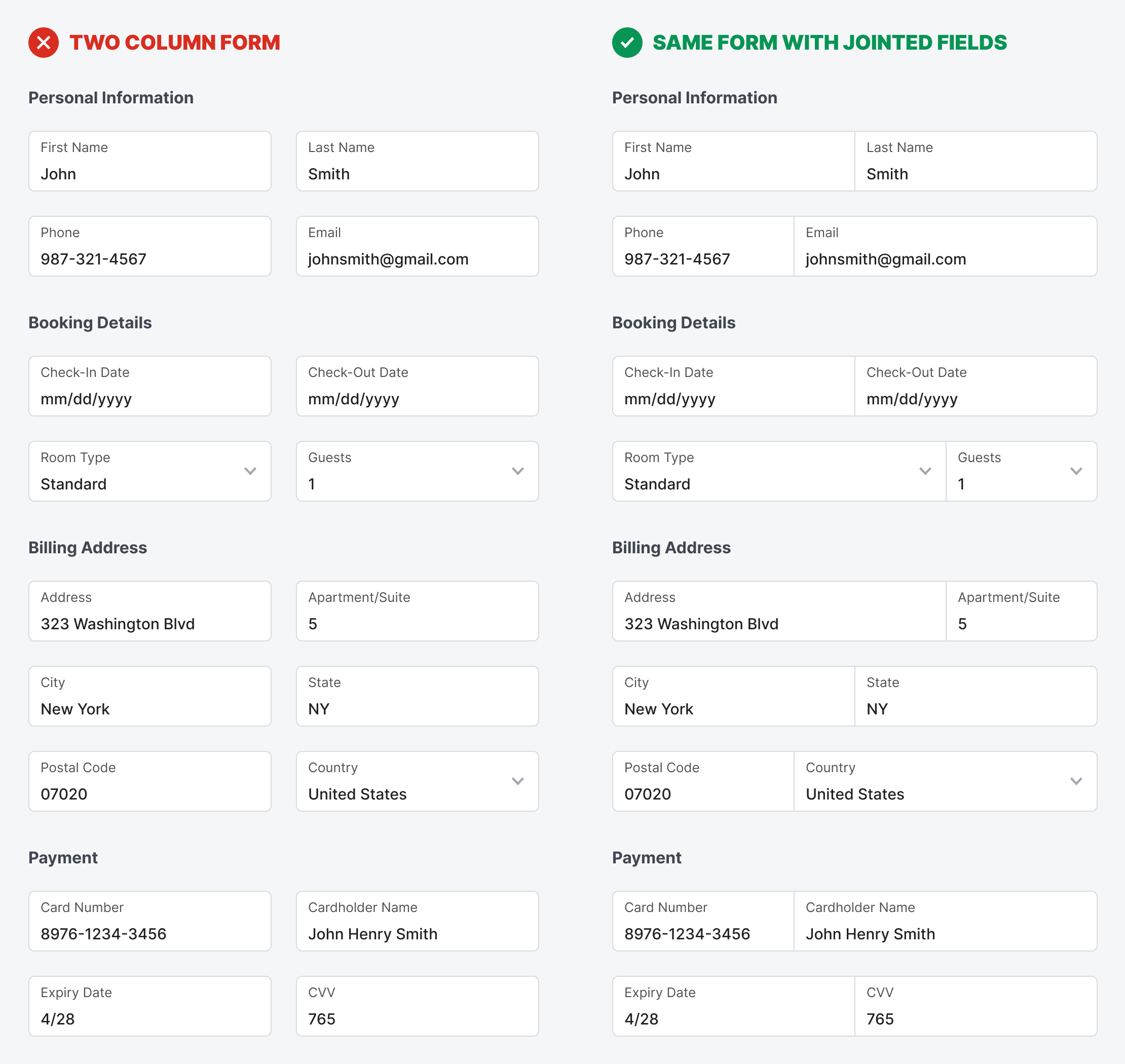
Above is what the two-column form looks like with jointed fields. It displays the same number of fields, but they no longer overwhelm users. The data relationships are distinguishable as you scan each row. The result is a lower cognitive load to complete the form.
Notice that a jointed field doesn’t have to be split equally. It’s better to reduce the field width for shorter input strings and increase it for longer ones. If both strings are similar in length, you can split the jointed fields equally.
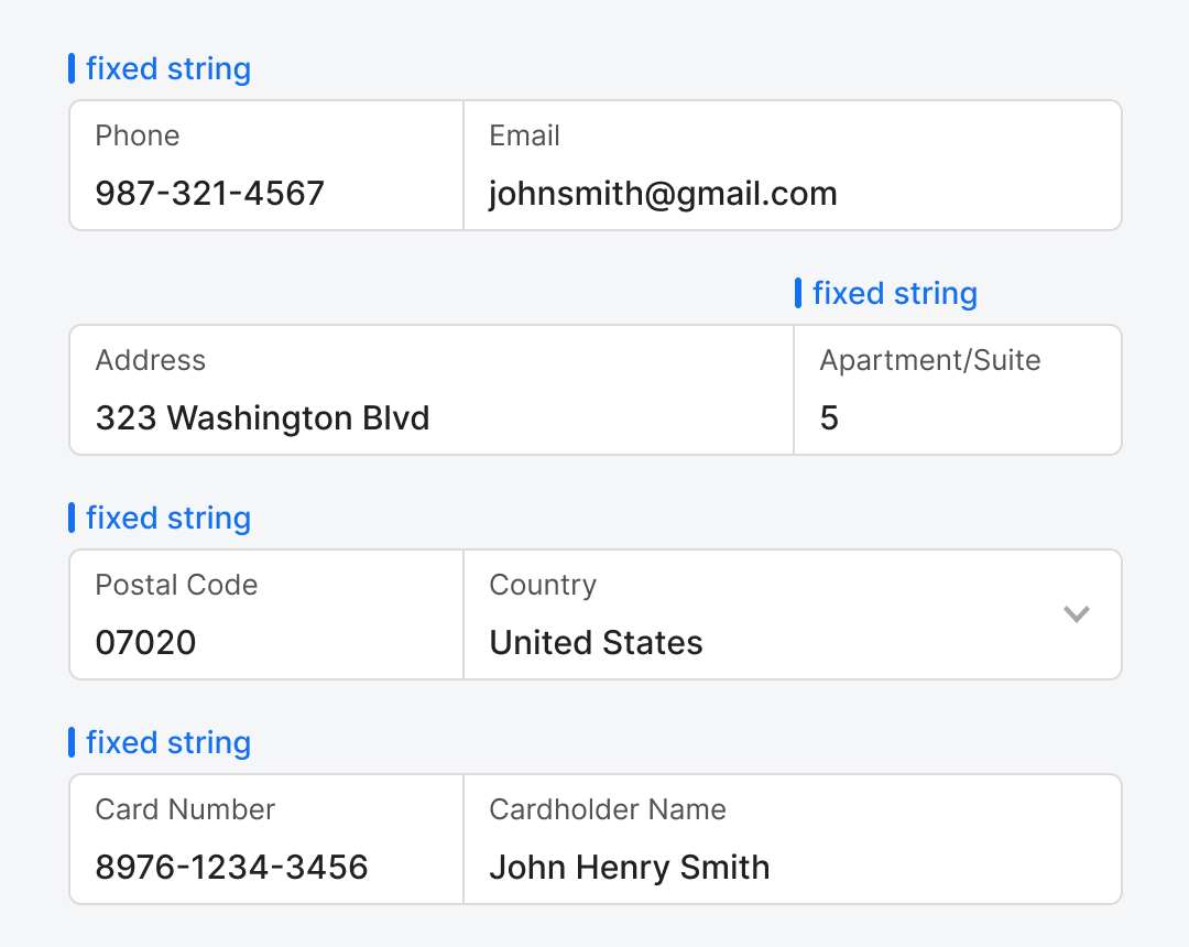
There are specific data fields that have fixed input strings. Those are the field widths you can reduce. For instance, phone numbers, postal codes, apartment numbers, and card numbers all have fixed input strings. By reducing the field width, you give the adjacent field more space to accommodate longer and variable input strings. The different field widths also help users recognize specific data more easily.
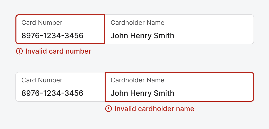
Although jointed fields look like a single field, they are basically separate fields with no margin spacing between them. Therefore, validation should work separately for each field. You would highlight the erroneous field and display an error message below the offending field.
Jointed fields are a simple and effective concept and technique. You want to strengthen sibling relationships and reduce perceived data density. The margins separating these fields are what’s preventing users from making this cognitive connection. What started as 18 fields now feels like 9, a significant change that affects user perception and behavior.
blody smart!