
How to Simplify a Hefty Select Menu with 147 Options
Reduce long menu scrolling
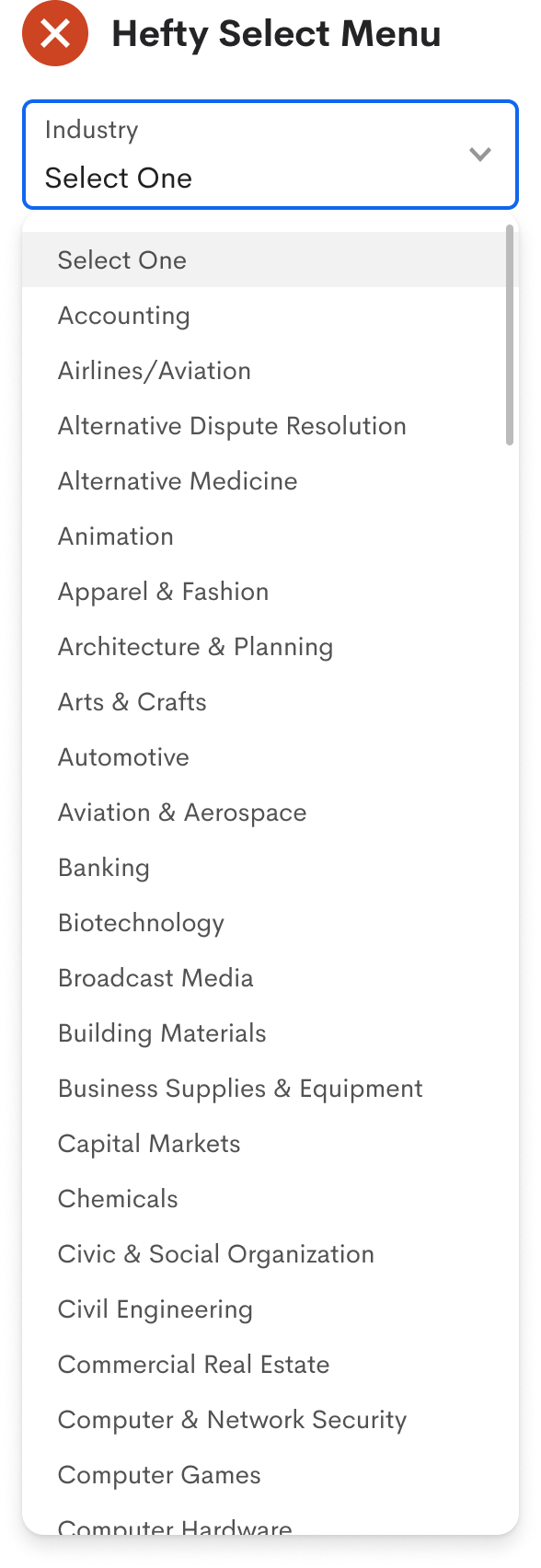
Imagine filling out a form and coming across a select menu with a hundred options. Now, you must scan and scroll through it to find the right option to select.
You scroll down the list but accidentally scroll too far. Now you scroll back up but overshoot. While scrolling, you lose focus on the option and scan the list again. Finally, you find and select it. That took more work than any of the previous fields you filled out.
Many users experience this when they run into hefty select menus. As a UX designer, you must reduce the time and effort to choose an option. Scrolling through a long menu list isn't going to cut it.
Menu Search
In most cases, the user knows what their selection input is. The only issue is recognizing it in the list. Scanning and scrolling through the menu is what adds more and more time to their task.
Therefore, you need to reduce scanning and scrolling by implementing a menu search. This function would significantly narrow down the options based on what the user types in the search field.
An “Industry” select field has 147 options to choose from. Typing a single letter reduces the list to display options that start with that letter. The more the user types, the more the list dwindles. Notice how typing "C" reduces the list from 147 to 15 options. If the user types "Computer," the list reduces to only five options—no scanning or scrolling necessary.
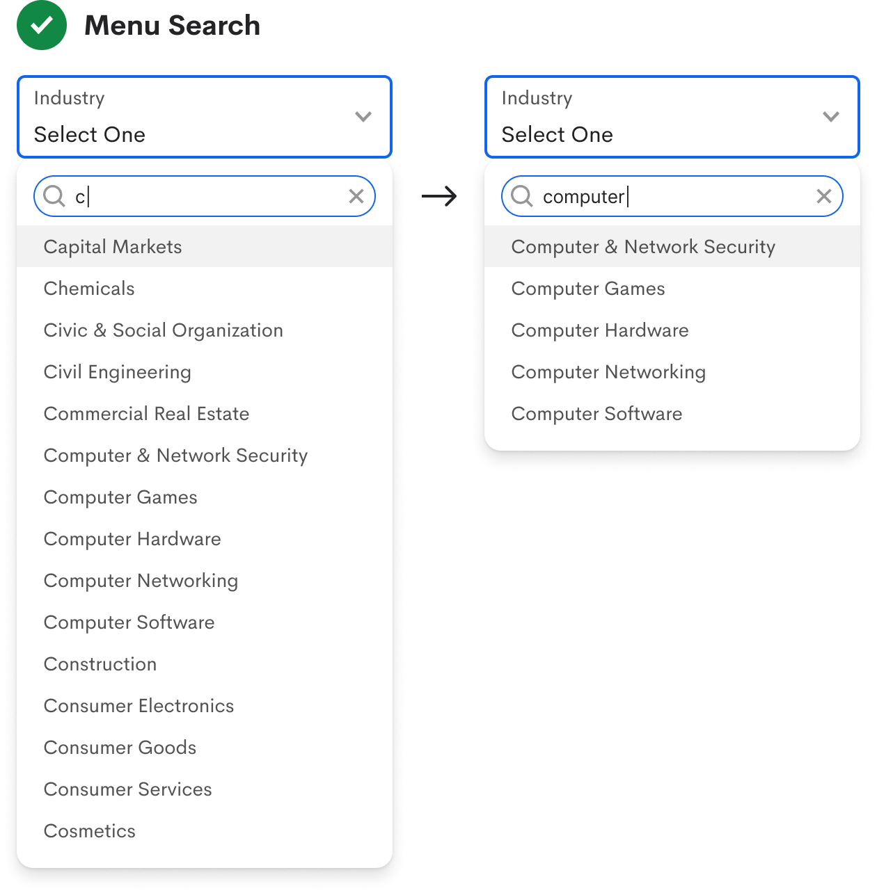
A menu search is effective because the user already has an inkling of their input. Without that, they wouldn't know what to type in the search field. Therefore, you should only use a menu search when the user's input is known.
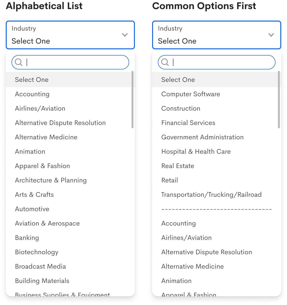
Even though most users know their input, you must account for the chance when some don't. Therefore, you should display the options in an alphabetical list to give them some order they can use to scan the menu.
In addition to an alphabetical list, you can make the most common options easier to access by placing them at the top of the menu. The example displays the eight industries with the highest employment rate above the others. As a result, this allows the majority to select their industry without scrolling or typing.
Default Behavior
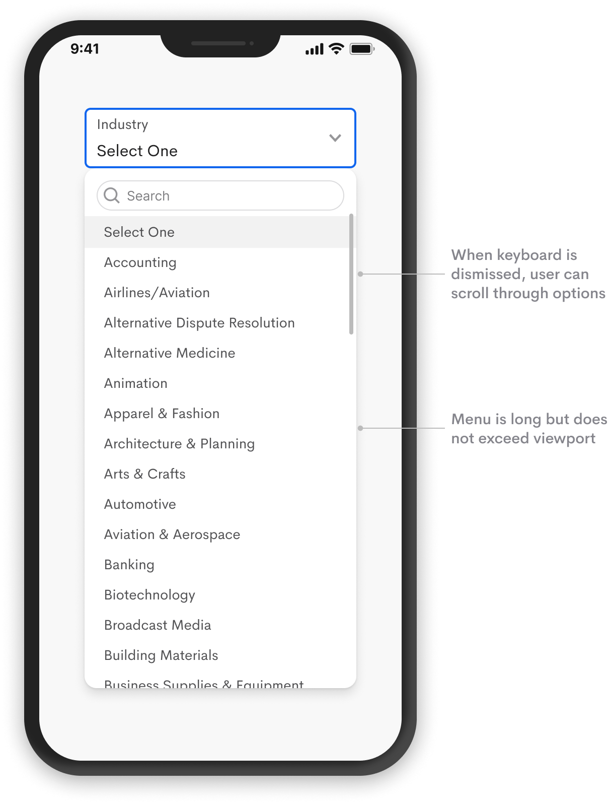
It's necessary to ensure the menu reveals enough options by default so the user can view more at a time without as much scrolling. You can make the menu longer on a desktop screen, but it should fit within the viewport of a mobile screen and never go below the fold.
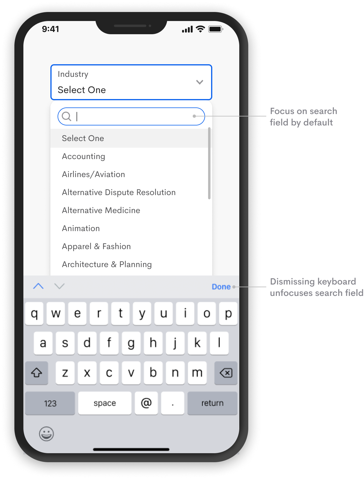
Once the menu opens, the search field should have the focus by default. An immediate focus allows users to begin typing to search for their input without clicking the text field. This default reduces that extra step for a faster search and selection.
On a mobile device, the keyboard will automatically pop up on focus. The user can dismiss the keyboard by tapping the “Done” button to select from the menu. However, the menu search should always have priority since the user already knows their input.
When users enter a search term that doesn’t exist, you must indicate an empty state so users know that no results match their input. A message in the menu such as “No results. Enter a new search.” would suffice.
It’s also helpful to provide a button in the search field to clear incorrect input denoted by an ‘X’ icon. Highlighting and deleting text with a mobile keyboard is hard so mobile users will appreciate this the most.
Simplifying any hefty select menu requires implementing a menu search. It doesn’t matter if you have 100 or 1000 options. As long as the user knows their input, searching for an option is always faster and easier than scrolling for it.
Hey , to avoid having a search bar inside a selector, you can use autocompletion directly in the input field.
In our case, we have an overlay with lots of chips (Country selection) - so what should we do in this case? Use a dropdown instead with a search field?