
How to Simplify a Massive Form With Over 100 Fields
UX techniques for super long forms
There are long forms, and then there are massive forms. A form with over a hundred fields is a different beast because you can't divide them into pages and call it a day. Additional UX techniques are necessary to make the form faster and easier to complete.
For instance, this loan application form contains 104 fields on one page. Splitting the fields into several pages is only the first step. Then, you must make it easy for users to navigate the pages, save their progress, and track it.
Tracking Progress
Tracking progress is essential for a multi-step form. Users need to know what page they're working on, which pages they've worked on, and how many they have left at all times. A row of chips above the form is an effective way to indicate this.
The active chip indicating the user's current step should have a polarizing contrast. Light text on a dark background distinguishes it from the other inactive chips with dark text on a light background.
Since you'll have several chips to represent the pages, you need to make the chip labels as short as possible to fit them all horizontally. Wordy labels can cause the chips to expand past the page width and break the layout.
You won't be able to fit the chips horizontally on a mobile screen. Therefore, you should use a chip variant that displays a menu list of all the pages. Users can see upcoming steps but cannot navigate to them until they complete their current one.
Saving Progress
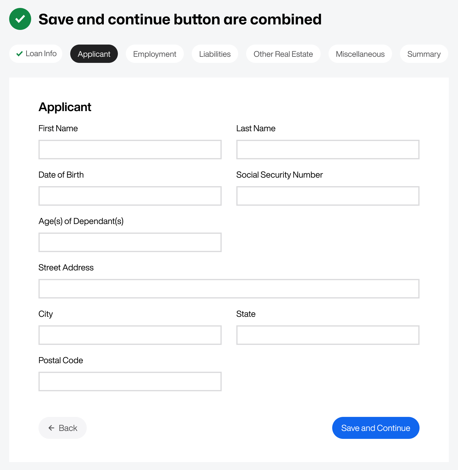
Saving progress is just as important as tracking progress. The wrong approach is to separate the "Save" button from the "Continue" button. Doing this forces a high cognitive load onto users because they have to remember to click "Save" before moving to the next page, or they'll lose their progress.
Instead of separating the two buttons, combine them into a single "Save and Continue" button. Every time the user continues to the next page, it'll save their progress because both buttons are one.
Once the user saves and continues to the next step, the chip for the previous step should indicate saved work and completion with a green checkmark. Notice in the example how the "Loan Info" chip now has a green checkmark after the user clicks the save button.
Paginize Long Steps
It's challenging for users to save and continue if the current step is quite long. Users may want to save their progress halfway through but won't be able to until they finish filling out the entire step.
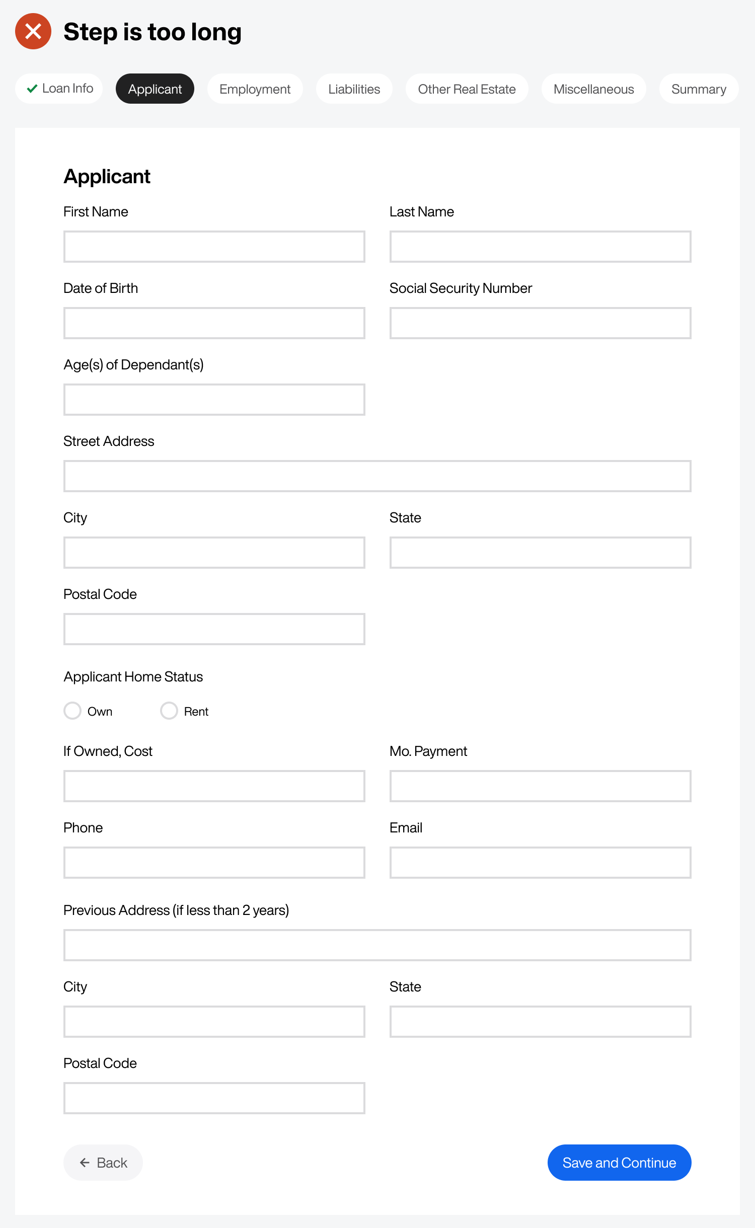
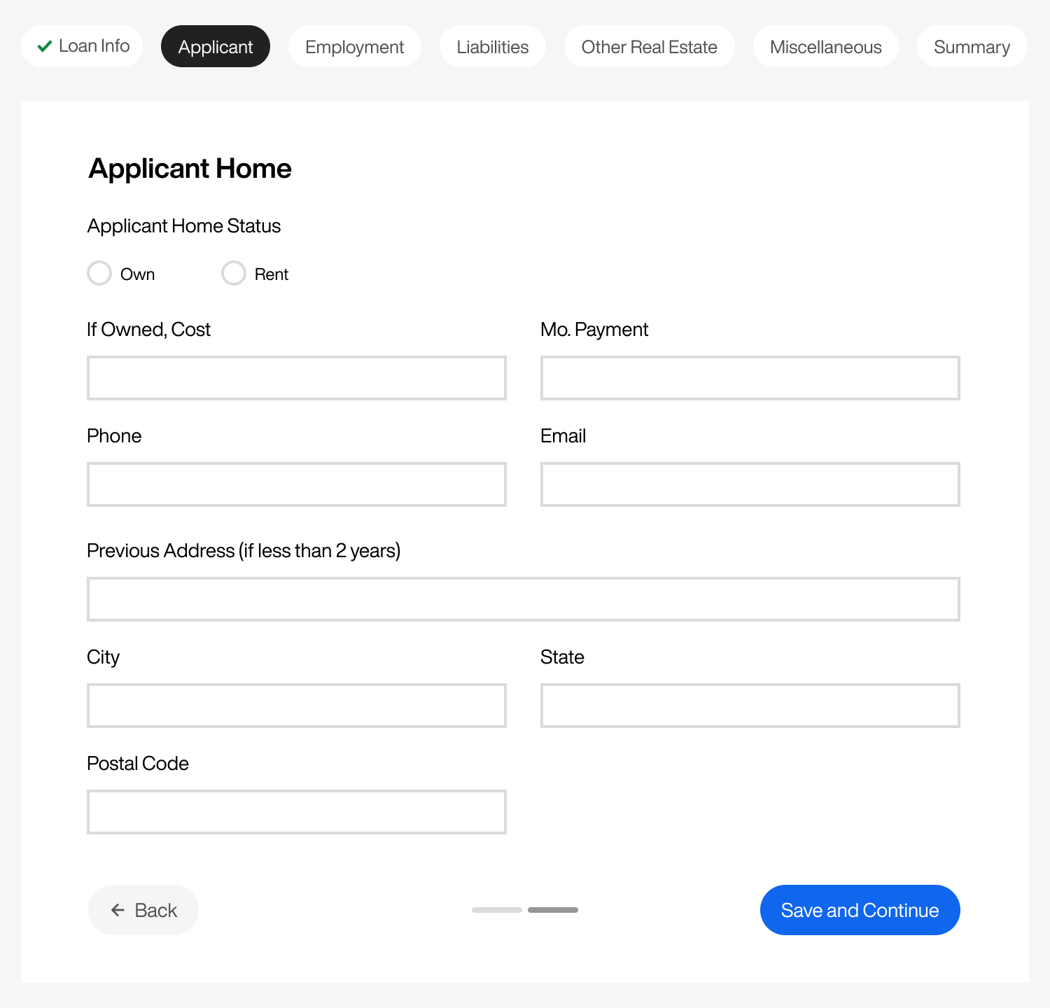
For this reason, you should paginize long steps. In other words, break them into subpages within the primary step. In the example, the "Applicant" step has 18 fields. Instead of displaying them all on one page, they’re divided into two pages.
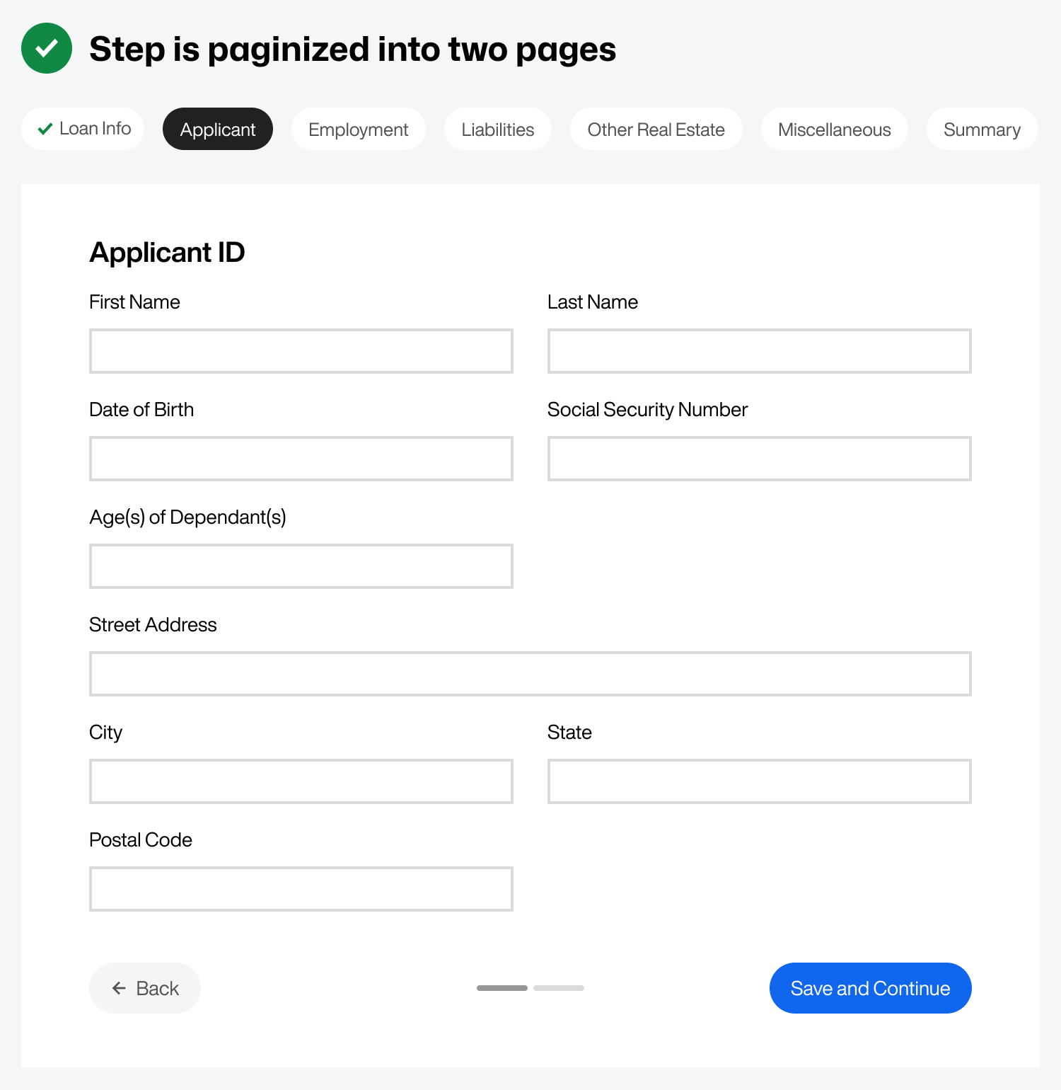
The first section could be "Applicant ID," and the second could be "Applicant Home," all within the "Applicant" step. You can indicate that there are two subpages within this step by using pagination segments. Place them at the bottom between the buttons for visibility.
Hide Conditional Field Groups
You can simplify your form by hiding conditional field groups. There are many opportunities to hide a field group on this massive form. For instance, if the user only has one mortgage, you don't need to display the "Second Mortgage" fields. Therefore, hiding that field group based on a condition is better.
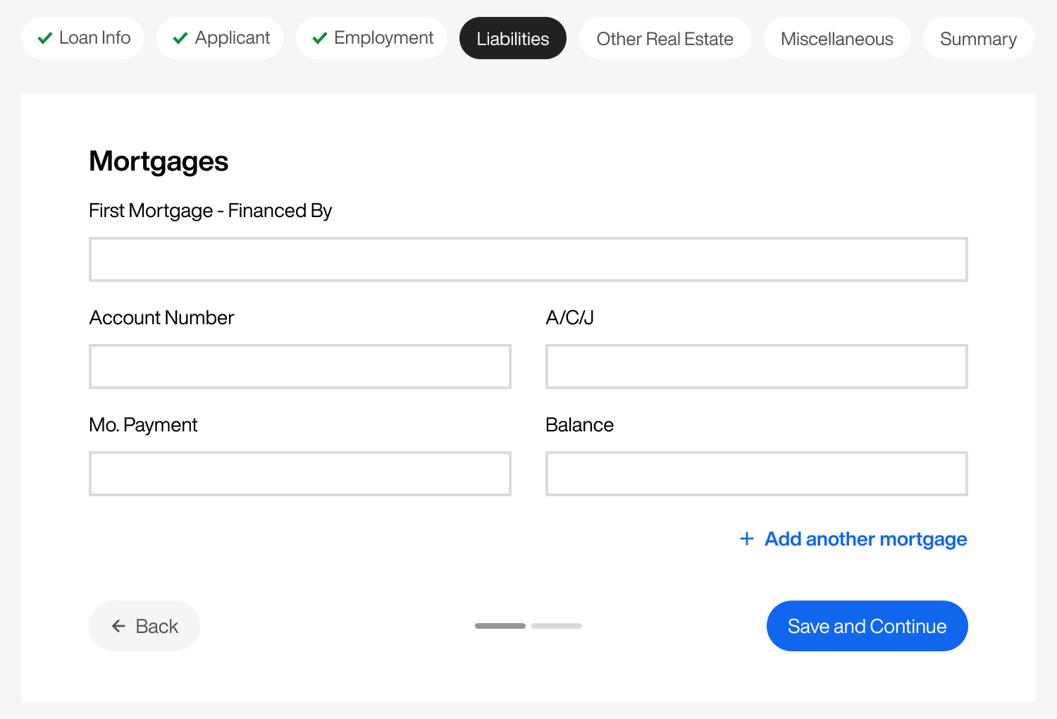
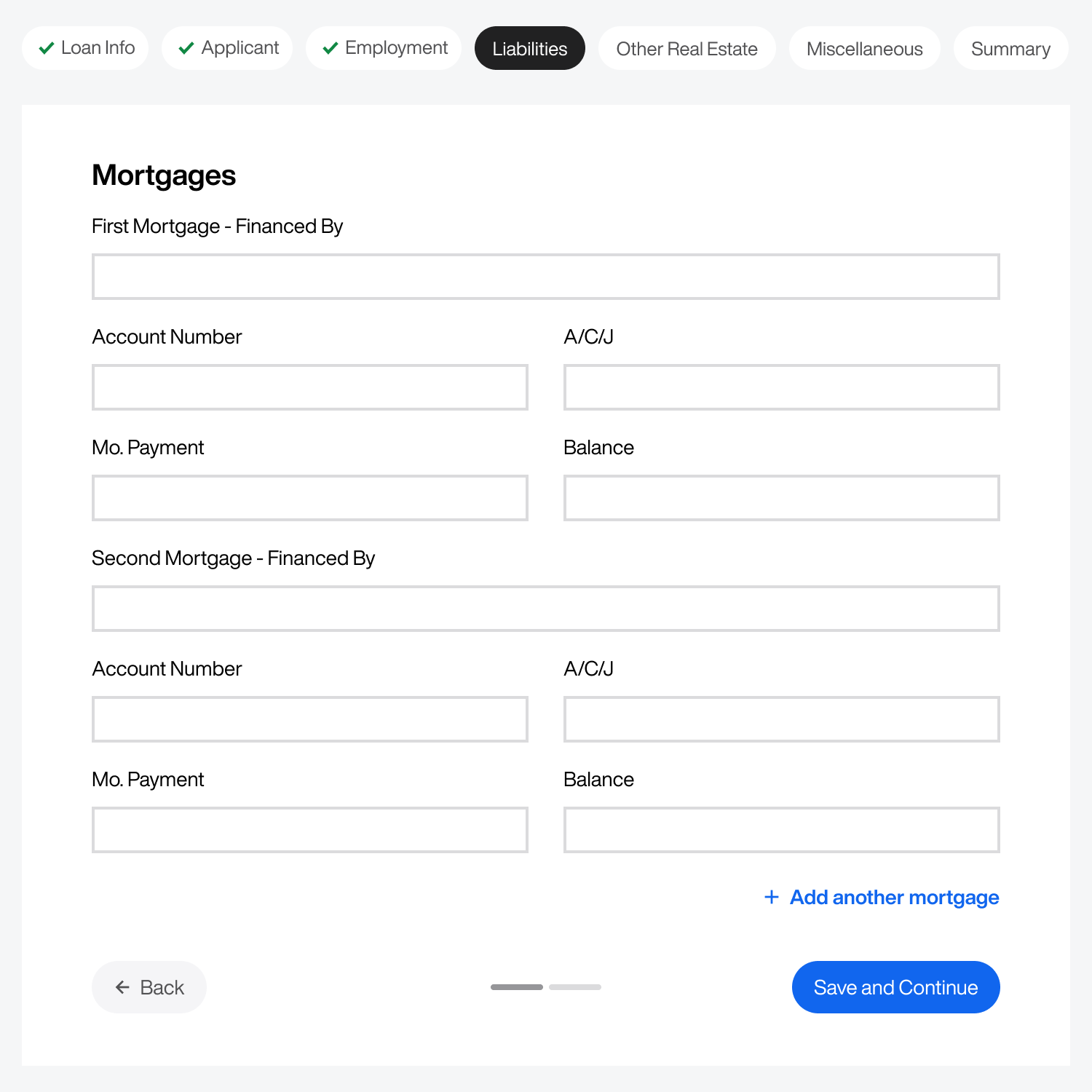
As a result, the page will display the "First Mortgage" fields by default with an "Add another mortgage" button. If the user has a second mortgage, clicking the button would display another field group. Clicking the button again would display another field group for a third mortgage.
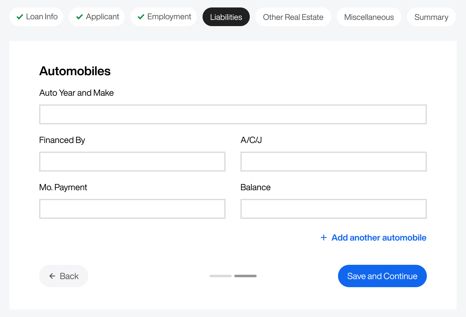
Another instance of hiding condition field groups is the "Automobiles" page under the "Liabilities" step. Instead of displaying multiple field groups for automobiles, allow users to click the "Add another automobile" button if they need to add more than one. Doing this reduces the form length significantly.
There's a high chance you have many conditional field groups on your form. They often disguise themselves as optional fields. For example, the "Other Real Estate" step only contains optional fields. It doesn't make sense to dedicate an entire page to optional fields if they are conditional.
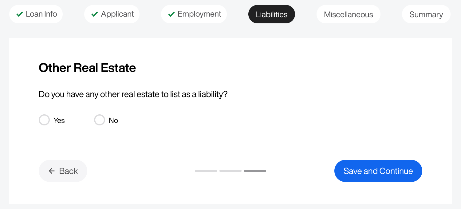
Since the user may not have other real estate to list as a liability, it’s unnecessary to display those fields by default. Instead, asking users if they have more real estate is the better approach. Doing this eliminates the "Other Real Estate" step and adds it as a subpage to the "Liabilities" step.
Answering "Yes" displays the field group for adding another property. If users answer "No," they won't see the fields and can continue to the next step. This approach reduces the number of fields and steps in the form for a streamlined experience.
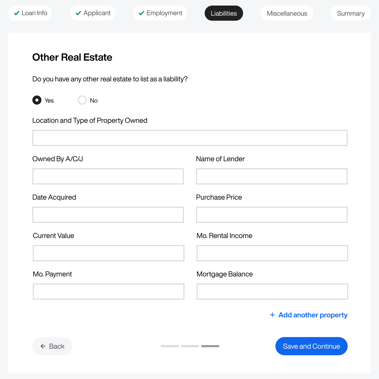
Table of Contents Menu
Although users have a row of chips to navigate the form steps, they still need a quicker way to navigate to any page or subpage globally. For this reason, it's important to offer them a table of contents menu.
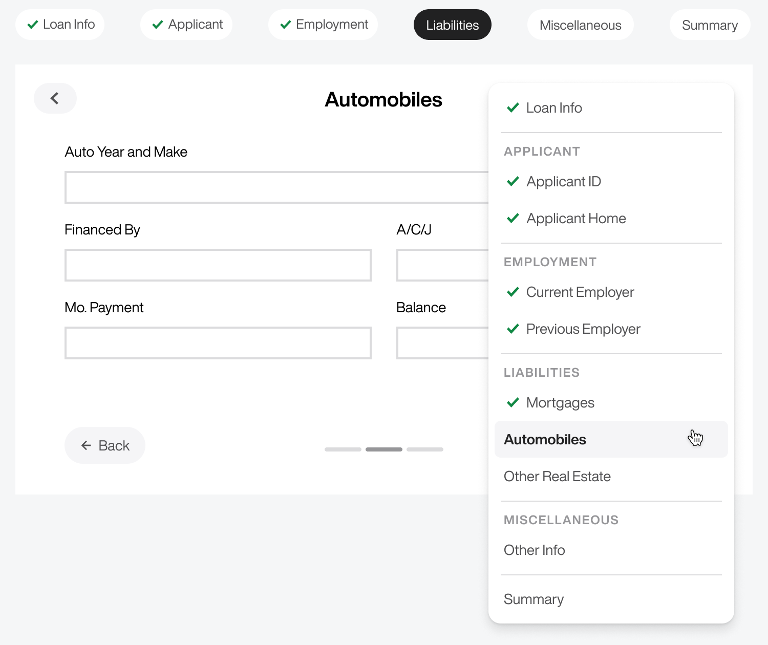
The table of contents menu is a complete list of all pages and subpages. When users open the table of contents menu, they'll see a visual hierarchy with checkmarks next to saved and completed pages. They can navigate to any previous subpage quickly without clicking the back button repeatedly.
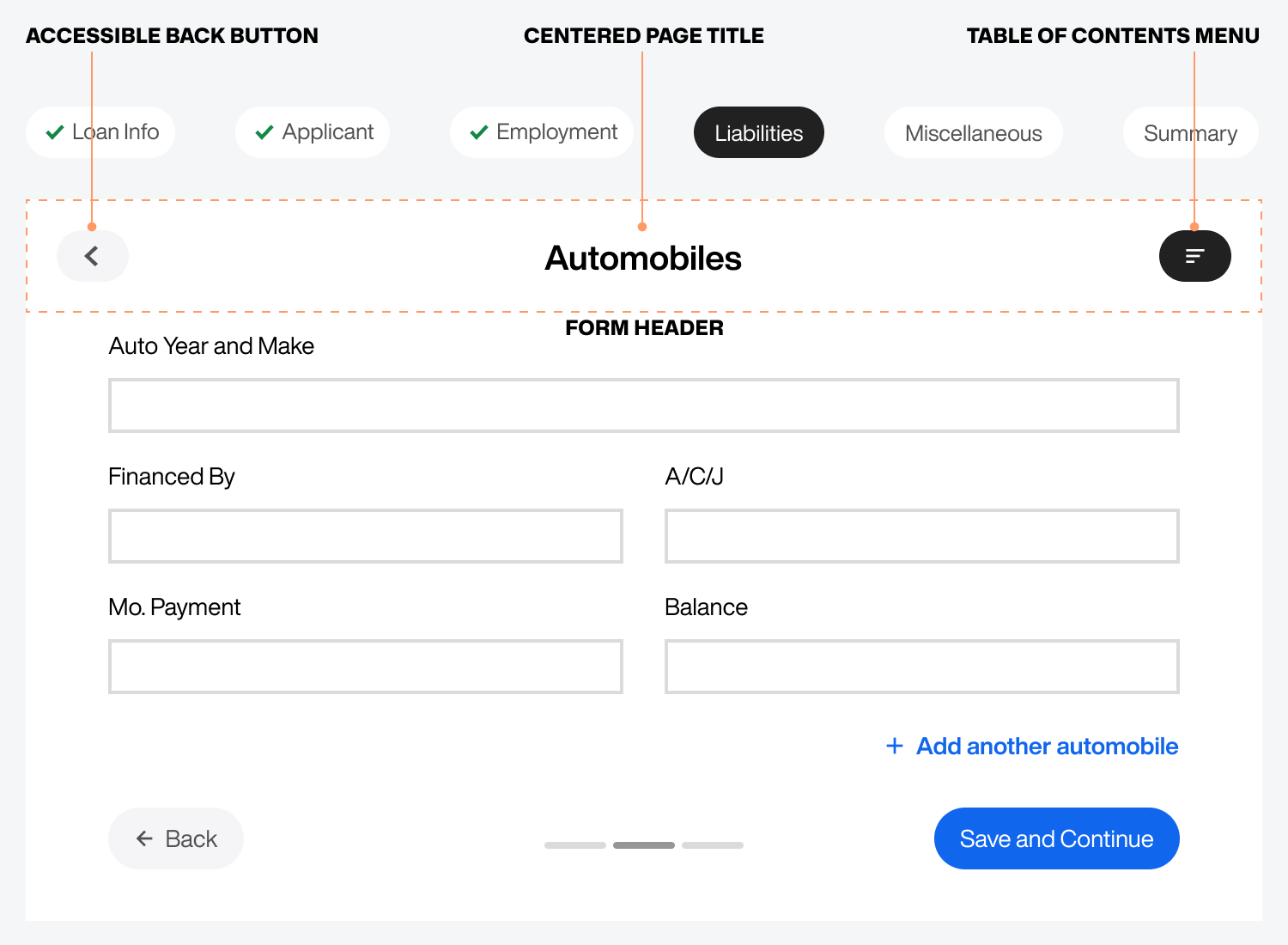
The table of contents menu is affixed in a form header at the top right corner. This header would also improve the layout, make the back button more accessible, and allow the page title to stand out.
A center-aligned page title makes it easy for users to recognize the page they're on without the distraction of other form elements. Not only that, but the accessible back button in the top-left corner enables users to navigate faster without scrolling to the bottom of a long page in search of the primary back button.
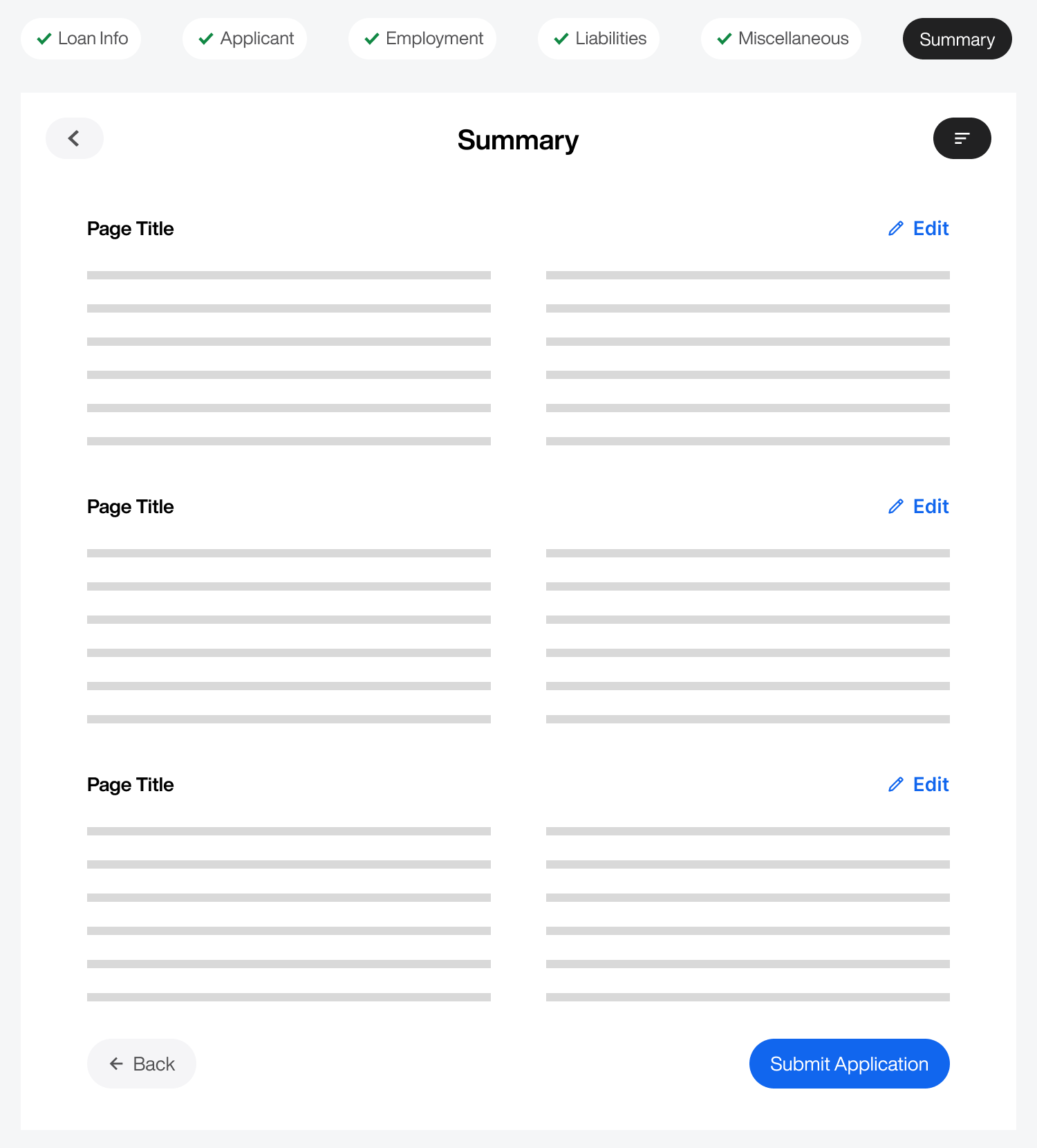
Summary Page
Lastly, your form must have a "Summary" or "Review" page at the end that lets users preview how their information will look when they submit it. This page should display all the field labels with the user's input in plain text for each step.
Next to each page title, you should include an edit button that takes users back to that page for context if they need to correct their input. Avoid using single-field inline edits when there are this many steps and pages to manage.
Massive Forms
A massive form with 100+ fields requires more UX techniques than a long form. You need to go the extra mile to ensure users can track and navigate pages and subpages efficiently.
You must also identify conditional field groups and hide them until users ask for them. There's almost always an opportunity to reduce the number of steps and pages. Seize these opportunities, and your massive form will succeed.
Isn't it generally better to have one input field per line?
Thank you for the article, great tips! Would you mind clarifying why there are two back buttons? The top one labelled as accessible back button and the bottom 'Back' button.