
How to Simplify a 46 Item Mega Menu
A design pattern for faster navigation
Mega menus have become the default solution for complex navigation, but they often create more problems than they solve. When users hover over a category, they’re suddenly hit with a grid of dozens—sometimes hundreds—of items. This cognitive overload violates a fundamental principle of good UX design: reducing the burden on the user’s working memory.
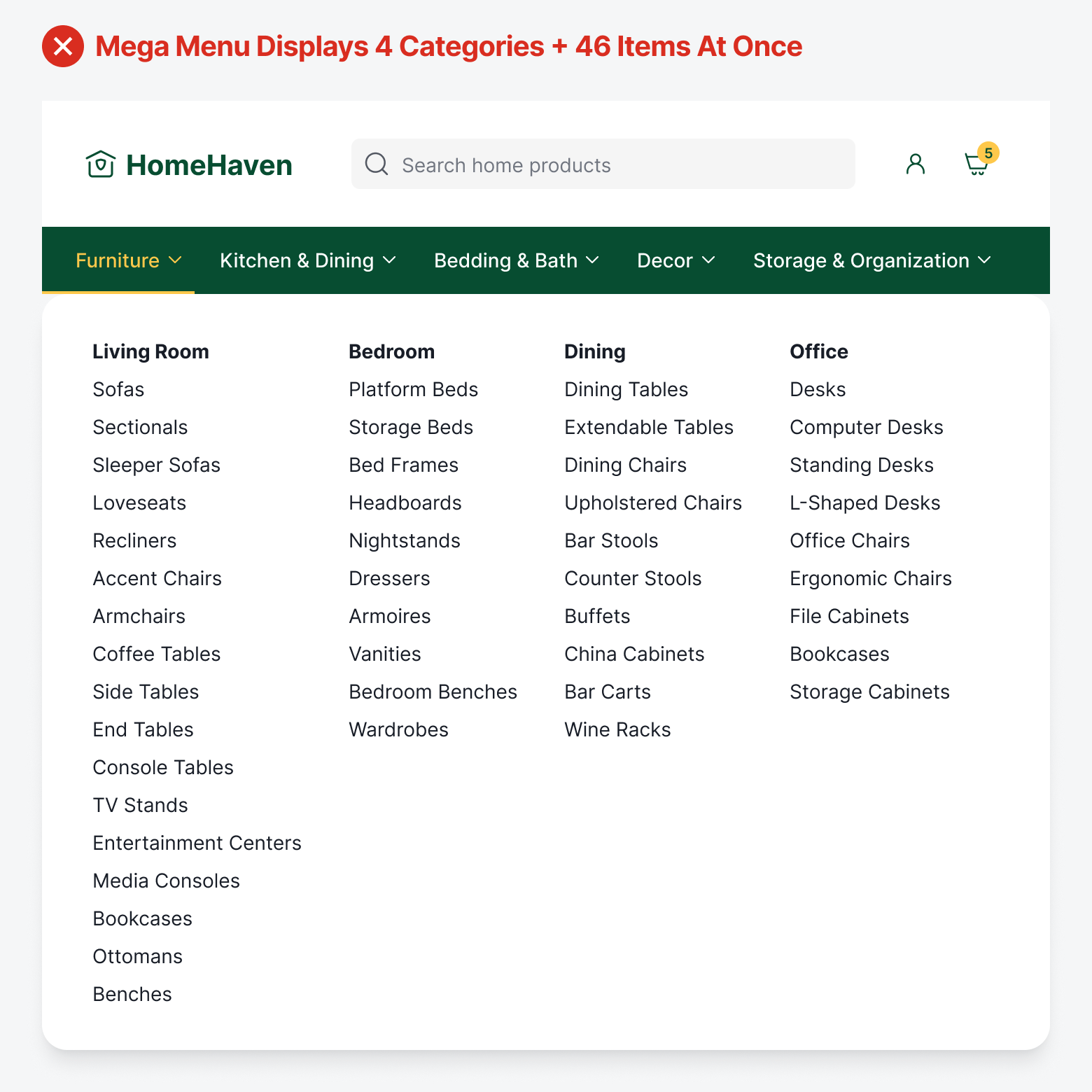
Imagine being confronted with 46 items organized into 4 columns. When users open the mega menu, they're trying to hold too many things in their working memory: the item they’re looking for, the category labels they're scanning, and their current position in the navigation structure. The result is working memory overload, where they feel overwhelmed, make slower decisions, or simply give up.
Users often do double work because they must constantly re-scan options they’ve already seen when they can’t remember what was in the previous column, or which items they’ve already dismissed. In other words, there’s no scanning structure to follow because the mega menu dumps the entire site architecture onto users at once.
The Accessibility Burden
A heavy cognitive load isn’t the only issue. Mega menus are also a burden on accessibility. Screen reader users must tab through every single focusable element to reach their desired link. If their target is the 46th item in the menu, they need 46 tab presses. If they accidentally tab one too many times and leave the menu, they have to start over from the beginning.
When a sighted user sees a mega menu, they can quickly scan the visual layout, ignore irrelevant sections, and jump directly to what they need. But screen reader users experience mega menus sequentially—they must listen to every single link announced, one after another, often with no clear indication of when one category ends and another begins.
Progressive Disclosure Menu
Progressive disclosure menus solve the cognitive overload problem by breaking navigation into manageable steps that align with how working memory actually works. Instead of presenting all 46 items simultaneously, users first see only the top-level categories: Living Room, Bedroom, Dining, Office.
Once they select a category, they see only the items within that section, reducing their immediate choices to a digestible number. This approach respects the natural order of human decision-making: make one choice, see the results, then make the next choice. It dramatically reduces cognitive load because users only process information relevant to their current step in the journey.
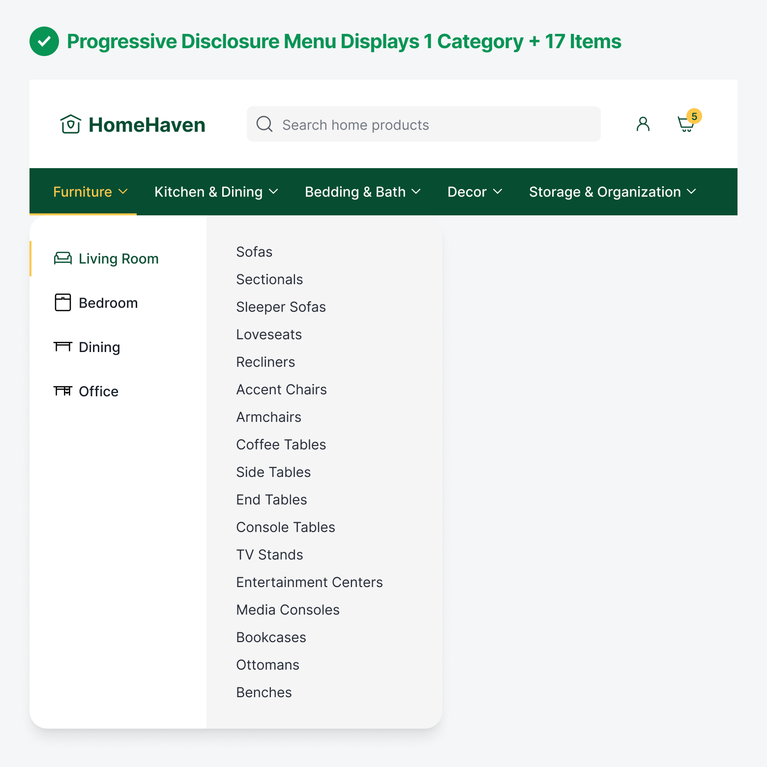
For screen reader users, this is transformative. Instead of listening to 46 links announced sequentially with unclear boundaries between sections, screen reader users hear 4 category options, make a deliberate choice, and then encounter only the 10-15 relevant items within that category. This transforms navigation into a logical progression that’s easy to follow.
If they realize they’ve chosen the wrong category, backing out and trying another doesn’t mean they have to restart from scratch. Instead, they return to those same 4 category options they’ve already visited. After each selection, screen reader users receive confirmation of where they are before hearing the next set of options. Users know they’re moving forward through a structure rather than lost in a list.
Adaptable Menu Size
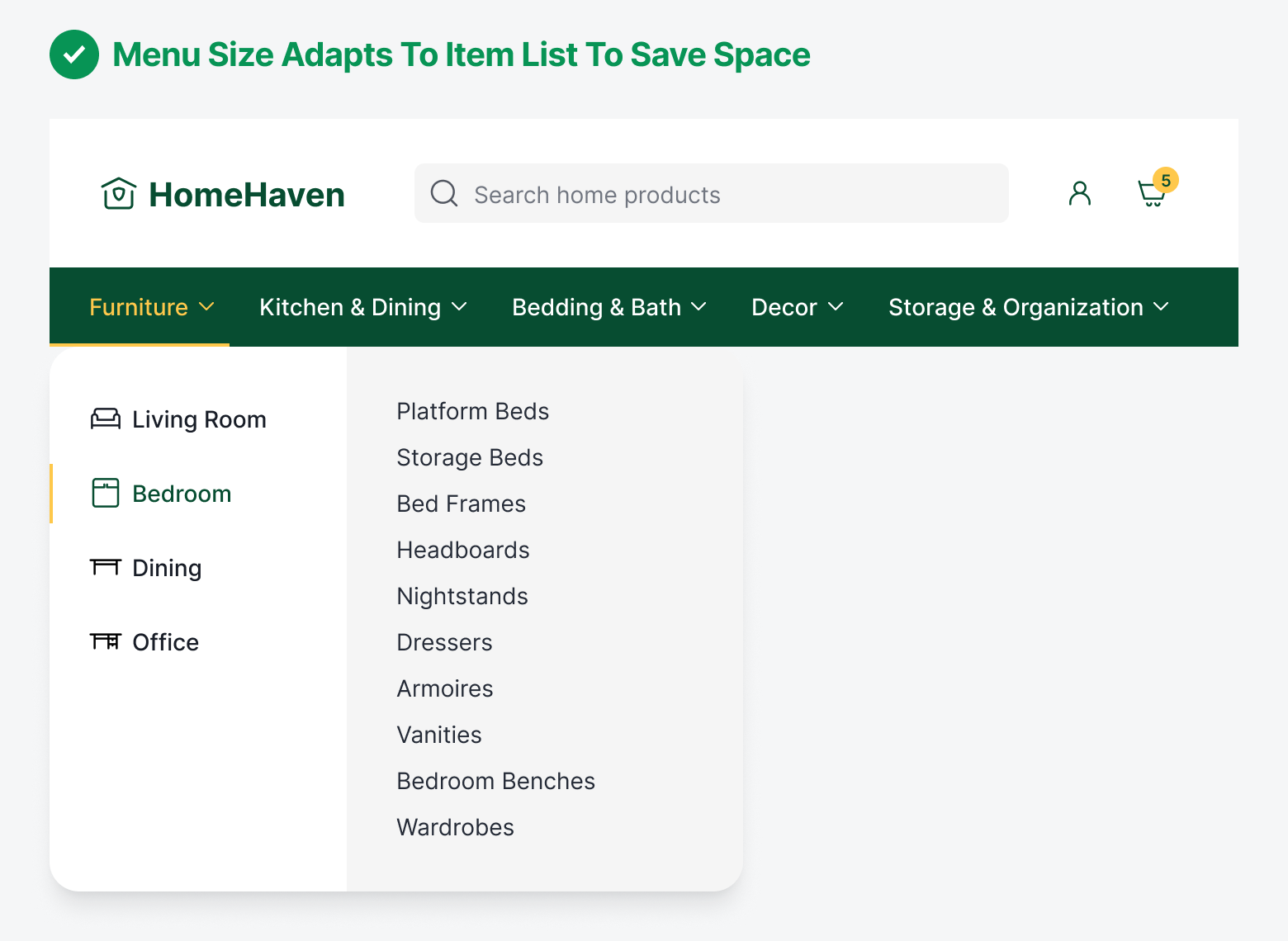
Mega menus display a single menu in a large size to fit every category and item list all in one space. Progressive disclosure menus save more screen space than mega menus because they can adapt to the size of the item list. Since each category has their own item list size, you don’t have to use a large menu for smaller lists. You can use a smaller menu to display a smaller item list.
Scanning Structure
Mega menus don’t provide users with a controlled scanning structure. Users can start scanning from anywhere and end up anywhere, which can cause them to re-scan the same items. On the other hand, progressive disclosure scanning is more controlled. Users will consistently scan the categories on the left first before moving to the items on the right. This reduces randomness and chaos during scanning, which improves navigational efficiency.

Conclusion
The best menu navigation doesn’t show users everything at once. It guides them toward what they need, one thoughtful step at a time. For screen reader users, this cuts navigation time from minutes to seconds and eliminates the cognitive exhaustion of processing endless lists.
Stop defaulting to mega menus because that's what you've always done. The evidence is clear: progressive disclosure reduces cognitive load, improves accessibility, and helps users complete tasks faster. Choose navigation that serves your users, not navigation that burdens them.