How to Revive Dead Content with This Card Layout
Good vs Bad Card Design
Do you struggle getting users to view and understand your content? A common culprit of this is the layout. Your layout determines how easily users can find and process information. By improving it, you can dramatically enhance the user experience and bring your content to life.
Most apps contain dead content that users don't even want to look at. Instead of exploring the different pages and categories, they prefer to use the search bar. One reason for this is that the layout is too challenging to scan and visually unappealing.
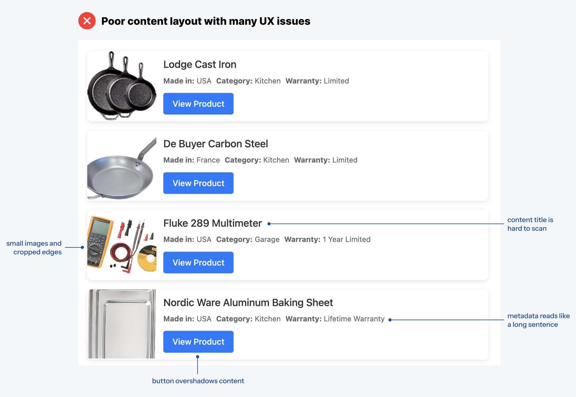
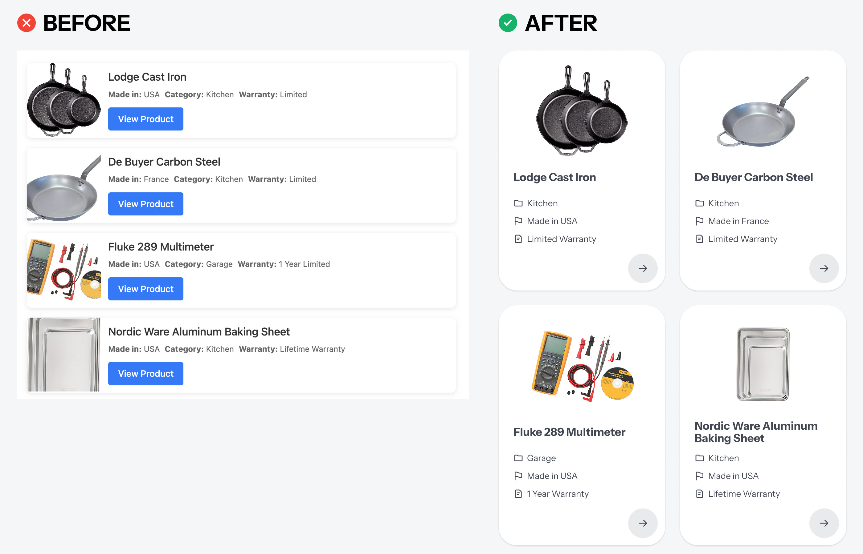
Without a proper card layout, your content will continue to suffer. Here's an example of how not to design a card layout. Notice how the button dominates the visuals and overshadows the information. The thumbnails are small and cropped on the edges. The title is difficult to scan, and the metadata reads like one long sentence.
A proper card layout solves all these UX issues. Your card should be a vertical rectangle, not a horizontal one. This allows the images to shine over the text. The thumbnails you use shouldn't be cropped on the edges, but rather show the entire object in the top-center area.
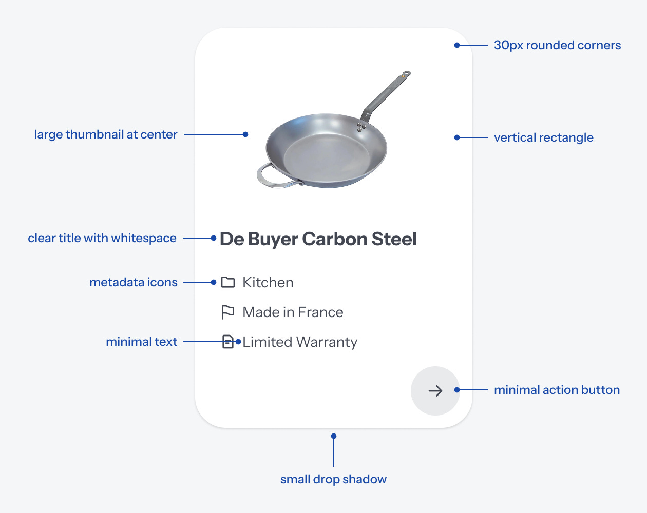
The card should have rounded corners to make it easier on the eyes, along with a small drop shadow to illustrate depth. The content title should be displayed clearly with ample whitespace around it.
Also, the metadata text should be minimal. In other words, try to convey the information as concisely as possible. Placing relevant icons next to them can help with this.
Last but not least, the action button shouldn't dominate the visuals. This creates visual noise that distracts from the content. Instead, use a circle button with an icon that represents the action. For instance, an arrow is a fitting icon and cue that signifies the action for "View Product."
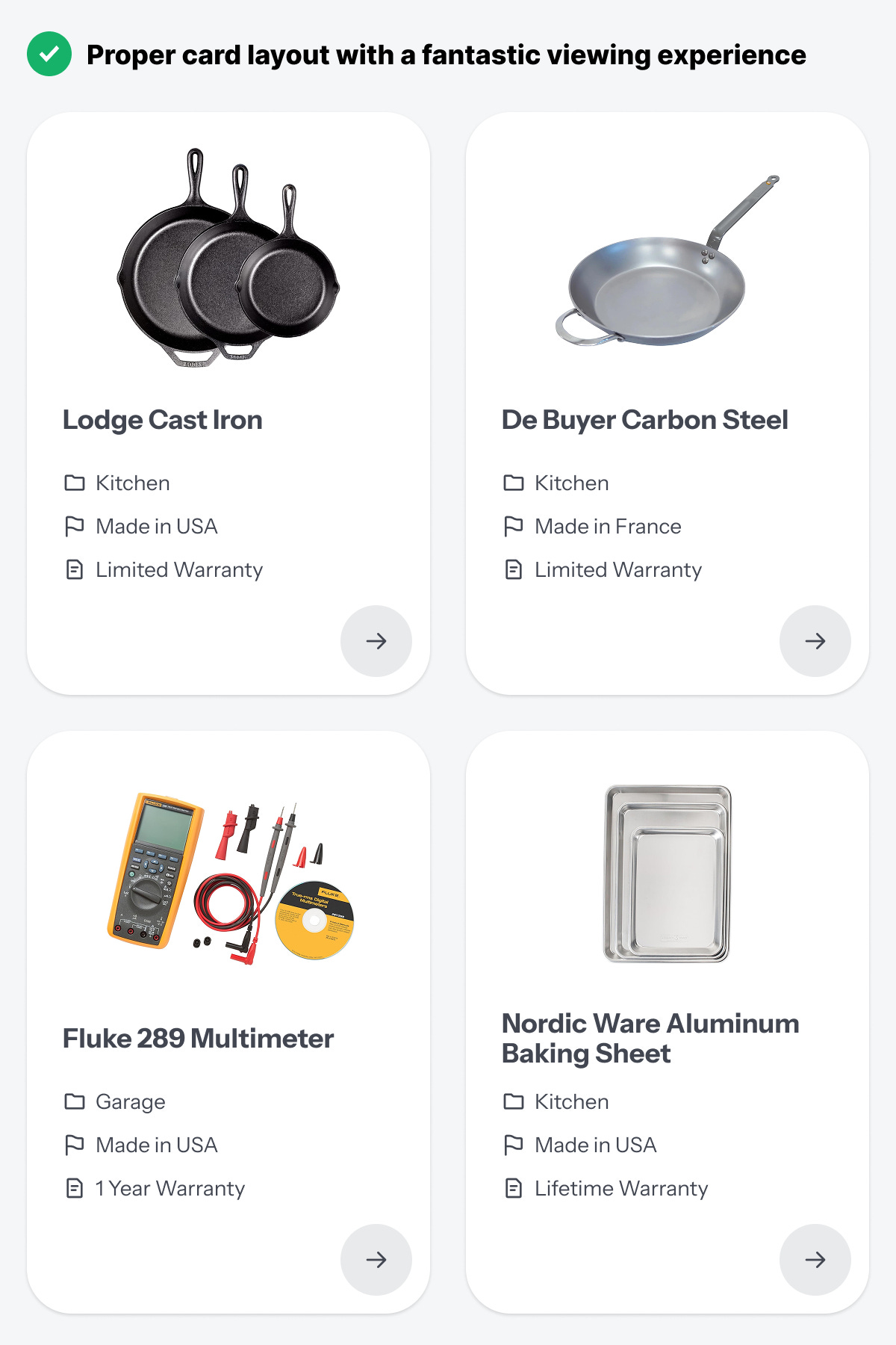
Placing the circle button in the bottom right keeps it out of the way of content, so it doesn't distract the user. Additionally, it offers a seamless tapping experience for mobile users.
When you compare the original layout with this card layout, the difference is night and day. The image is the superstar that shines. The text is easy to scan and doesn't run together like a paragraph. The action button doesn't create visual noise that dilutes the signal.
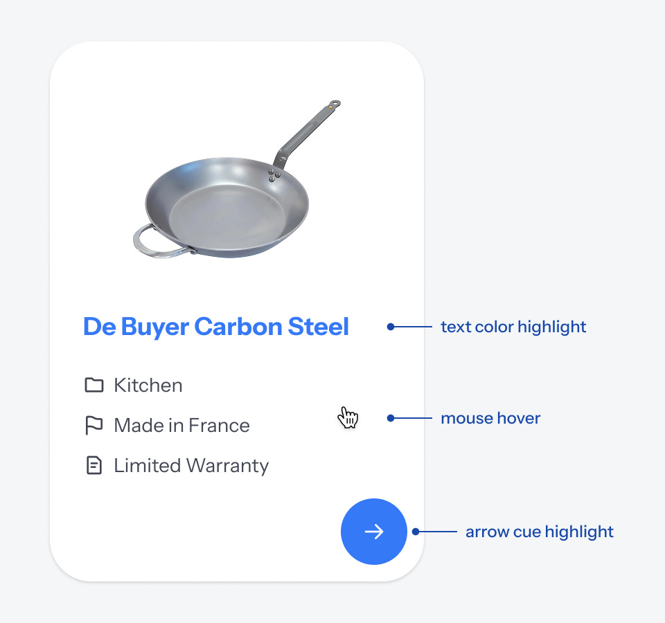
What your cards also need is a hover effect that indicates to users when they are over the target and can click. The entire area of the card is usually the target. When the mouse cursor is over it, the button and title should highlight with an accent color.

You don't always have to use an arrow icon for the action button. Instead, choose an icon that complements your content well. For instance, if users shop on your app, consider using a cart icon. If they download data, consider using the download arrow.
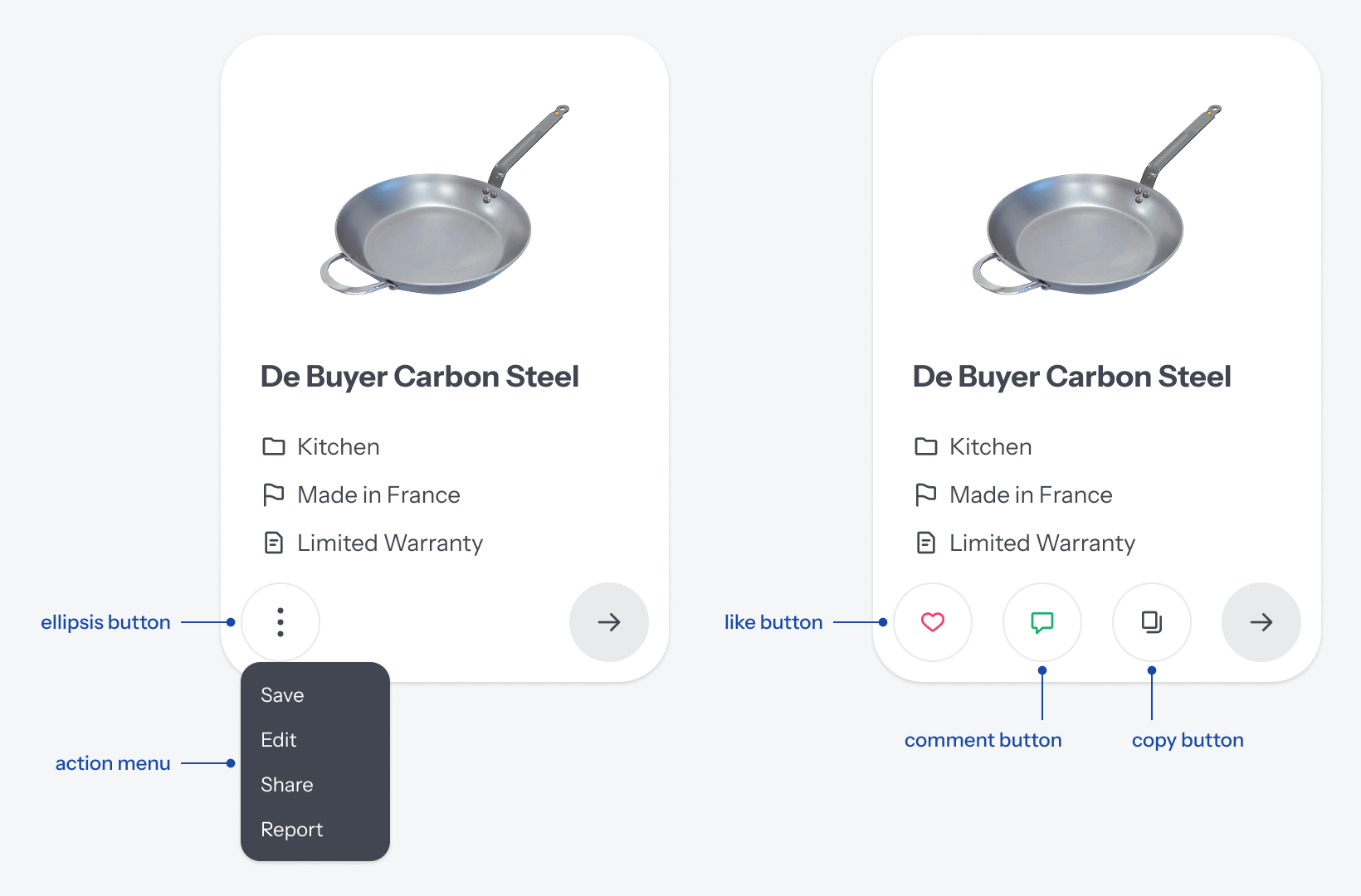
You can add other buttons to your card if necessary. If you have several actions to provide, you can display them with a menu in an ellipsis icon. You can also add actions that modify the card's state, such as "Like," "Comment," or "Copy" buttons. The footer of the card provides sufficient space for this.
How you display your content is as important as the content itself. You can transform your UX with this card layout design. It'll revive dead content and breathe new life into your app. The before and after will be elegantly indescribable.