
How to Make Users Fill Out the Longest 13 Field Form
A compelling form completion
Many websites attract users to their home page but lose them on the form. Low conversation rates occur when there are too many fields to fill out. Users don’t want to spend that much time and effort without getting an equal exchange in value.
Most companies need to get the necessary information from users, so reducing the number of fields isn’t always an option. What else can you do to make users complete a long, complex form?
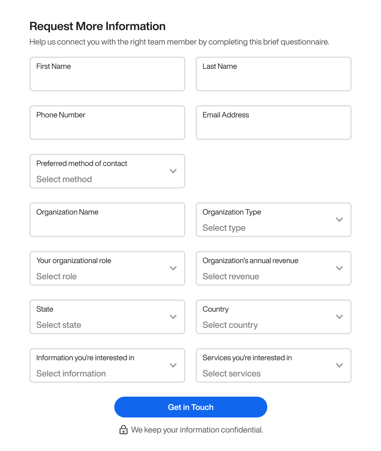
Fortunately, there’s a way you can compel users to fill out every field, no matter how long the form is. For example, this 13-field form contains several select menus that look overwhelming and intimidating. Most users would abandon this form and exit out of the website.
However, a research study found that how you frame your form significantly impacts whether users complete it. If you frame your form steps or sections conversationally, users are more likely to fill out every field. ( source ).
The study reported a 109% lift in conversion rate with this new approach. But the most surprising result was that every user who landed on the form filled out every field, including the six optional fields.
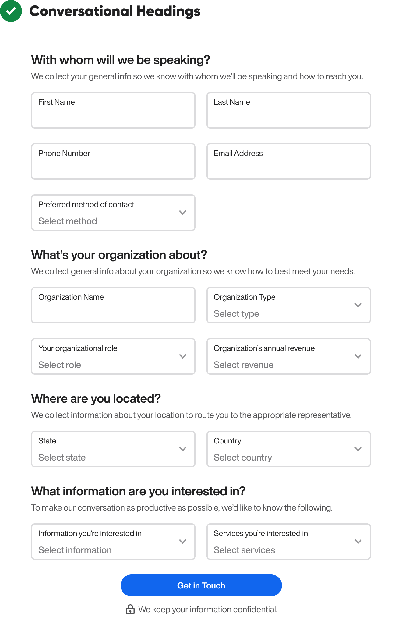
When you divide a long form into steps or sections, don’t use regular headings with a matter-of-fact tone. This approach doesn’t compel users to want to fill out the fields. Instead, it’s better to use headings that have a conversational tone.
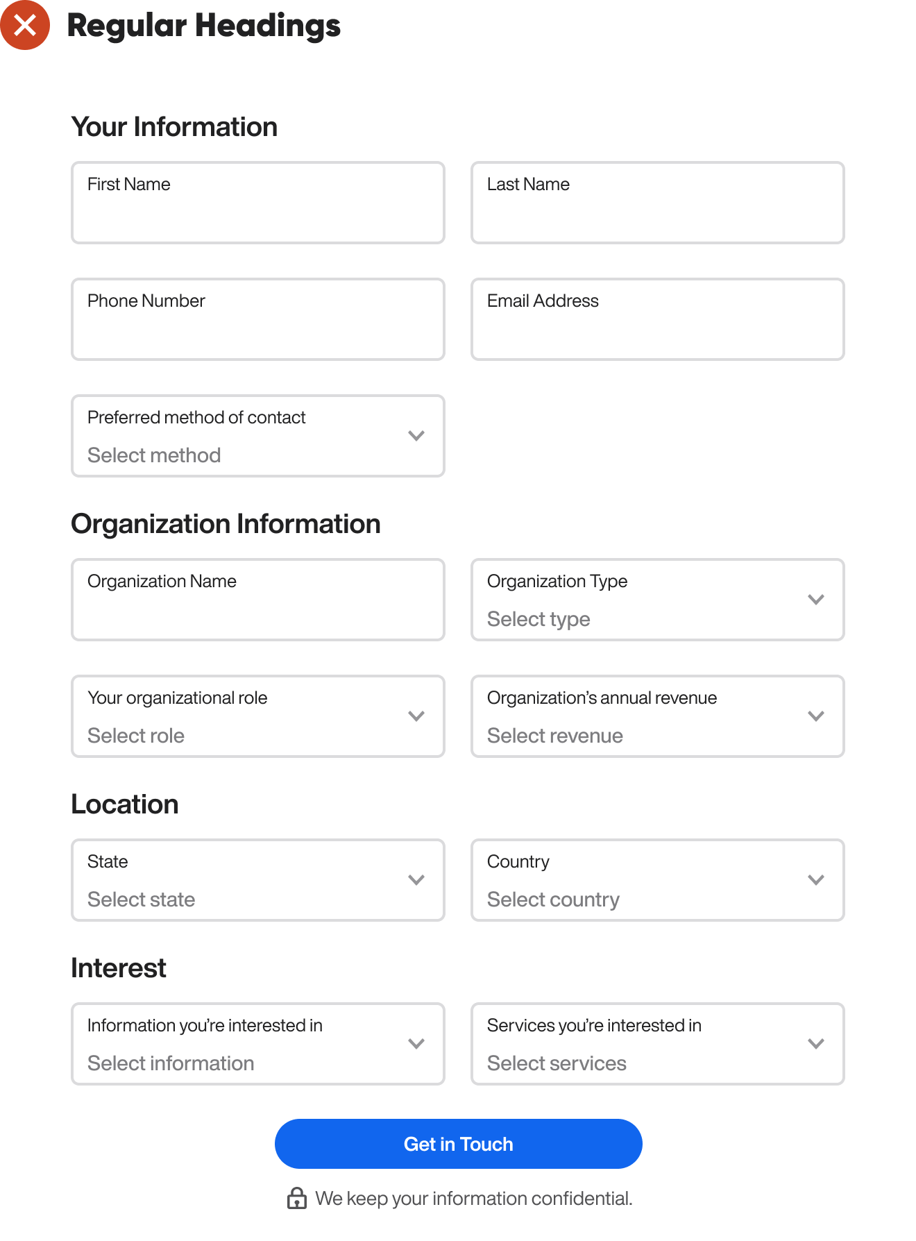
Notice how each heading is a question that asks for information like an actual company representative would. It’s more friendly and human than regular headings. You also have the option to add a supplementary subheading below the heading to explain why you’re asking for the information.
Conversational headings aren’t the only way to make your form more human. You can also add a friendly photo of a real or mock representative to the header. This way, users will feel like they’re talking to an actual representative when filling out the form.
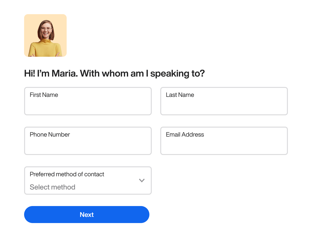
The person in the photo should look attractive and professional and have a smile on their face. The headings should also sound extra conversational. In the first heading, the representative should introduce themself. For instance, “Hi! I’m Maria” is important to include.
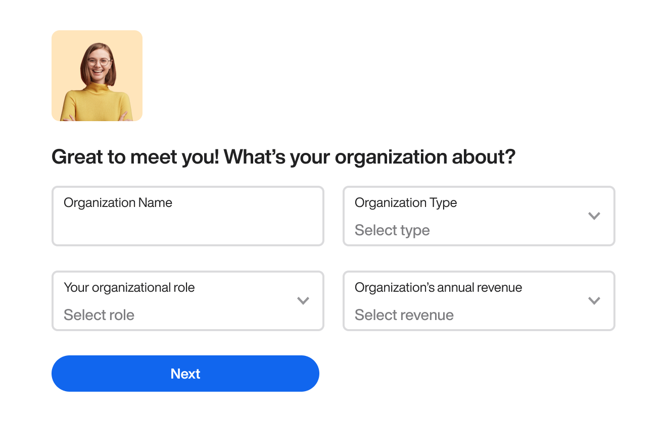
In the next step, you should add a conversational segue that leads into the primary part of the heading. By including “Great to meet you!” in the heading, you make the tone more natural and friendly.

This heading adds “Interesting!” as a conversational segue before asking where they’re located.
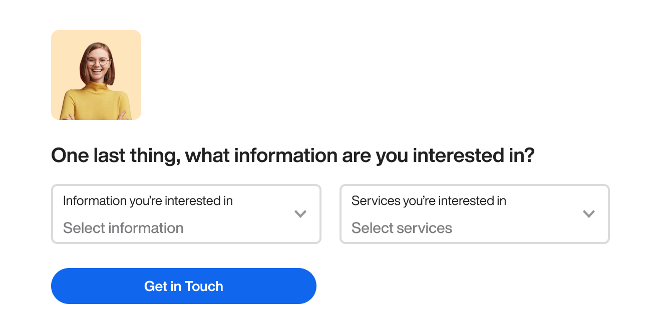
This heading includes “One last thing…” as a conversational segue before asking what information they’re interested in.

Finally, the user gets a conclusive message at the end that sends them off feeling happy about their form completion.
The secret to making users fill out every field is to add a conversational tone to your form rather than a transactional one. When you do this, you don’t have to worry as much about the number of fields. Most users will feel more inclined to complete a form when they feel like they’re talking to an actual human.
The conversational tone is appealing! I have a small question: Sometimes, when you divide a form into multiple pages, users lose patience and exit the page after clicking "next" a few times. I think adding a progress bar to let users be aware of their progress would help encourage them to complete the form. What do you think?
I like the conversational tone :) In my work I'm facing longer forms. For example the creation of an employee in a HR web app, which requires about 40 mandatory fields currently distributed in a 5 steps form. I could split the cake in smaller pieces but it could become a very long sequence of steps. I wonder how you would manage such long forms.