
How to Fit Massive Menus on Mobile Screens
The drilldown navigation bar
Do you have a massive menu on your desktop app? Unfortunately, that navigation won’t fit on mobile screens. As a result, your mobile users won’t have a pleasant experience navigating your app.
A common approach is to allow menu items to bleed off the edges so users can scroll horizontally to navigate. However, this isn’t intuitive because not all users will perceive the horizontal scroll function and may only interact with the visible items.
Also, horizontal scrolling and scanning require more effort with the finger and eyes. It’s much harder for users to scan and scroll a list horizontally than vertically. The movement feels more awkward as it goes against the downward direction of the page flow.

Another approach is to hide all the items in a “hamburger” menu at the top. A problem with this is that users have to search for it among other icons. This might not require much effort, but it still creates some initial friction when you start navigating.
Not only that, but the icon is also in an awkward position at the top, requiring users to stretch their fingers to reach it. This isn’t a quick task that can be done with one hand. Instead, users have to use their other hand to click the menu button, further slowing them down.
Another problem with the “hamburger” menu approach is that it pulls users out of the page context. Instead of navigating a simple menu, it feels like they’re on a completely different page. They’ll experience this every time they open the menu to navigate.
A better user experience would be to turn the navigation bar into an all-inclusive drilldown menu. In other words, the bar itself becomes the menu. Instead of displaying the category items, you would display a label that encompasses all the items, such as “Shop Products.”
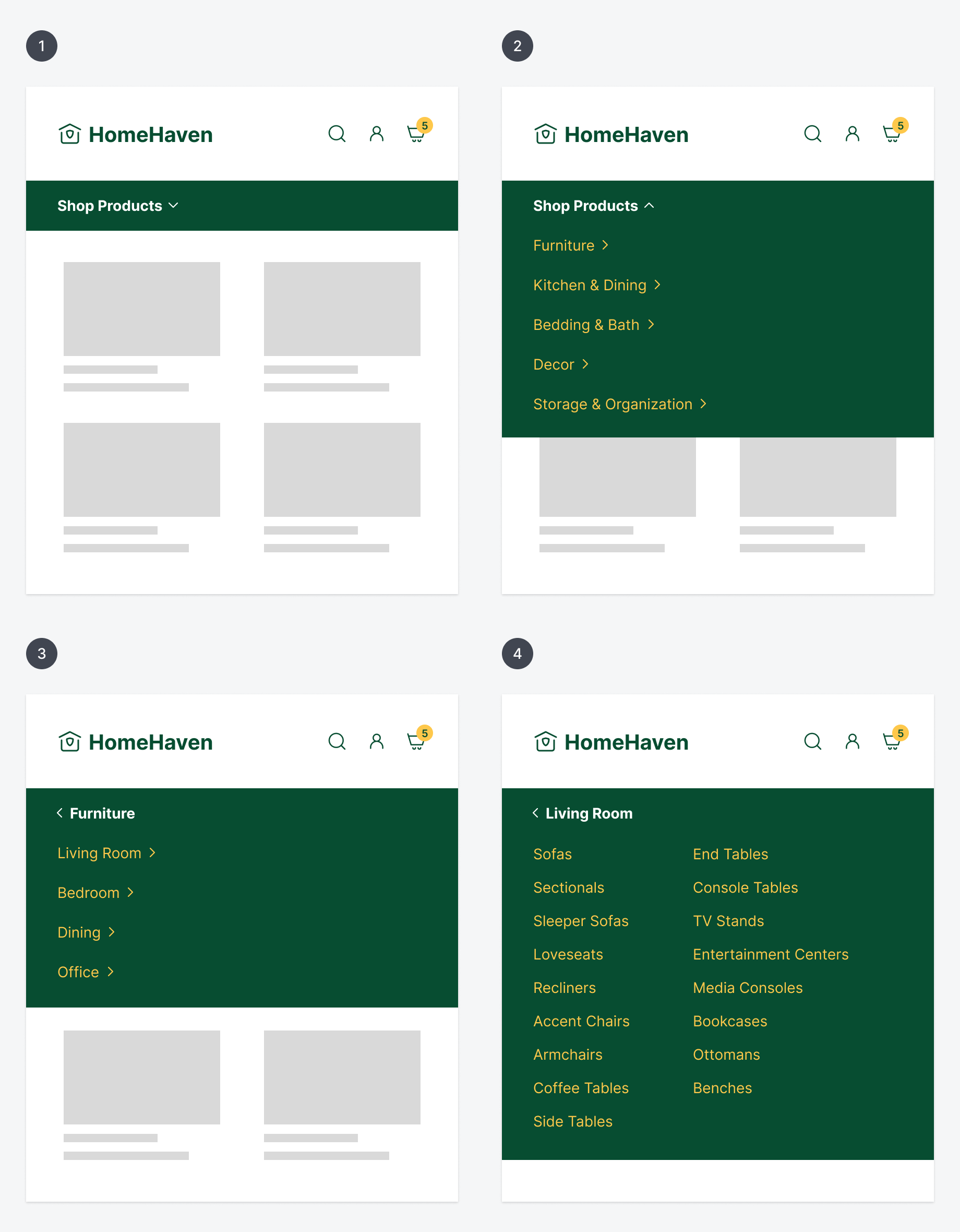
When users click the bar, it’ll drop down and display the main category items. As users click a category, the menu drills down to the next level of subitems, and so on until it can’t drill down further. If they navigate to the wrong level, they can click the back arrow button to reset.
The benefits of this approach are that users never lose sight of the page context, and interacting with it is fast and easy. They can easily accomplish this task with a single hand. It’s also easy to scan and scroll the item lists since they are displayed vertically.
For navigating large lists of item categories, this approach gives you the best user experience on mobile screens. The navigation bar is no longer crammed with multiple menus. Instead, it has become a single drilldown menu that’s faster and easier to navigate.