
How to Design the Most Intuitive Share Modal
A step-by-step guide to share modal UI
Sharing and collaboration are among the most powerful features in any SaaS application. It allows users to view, edit, and comment on the same document in real-time. However, designing it with an intuitive user experience is no easy task. There are many states, actions, and components to get right. This article walks you through how to design an intuitive share modal in thorough detail.
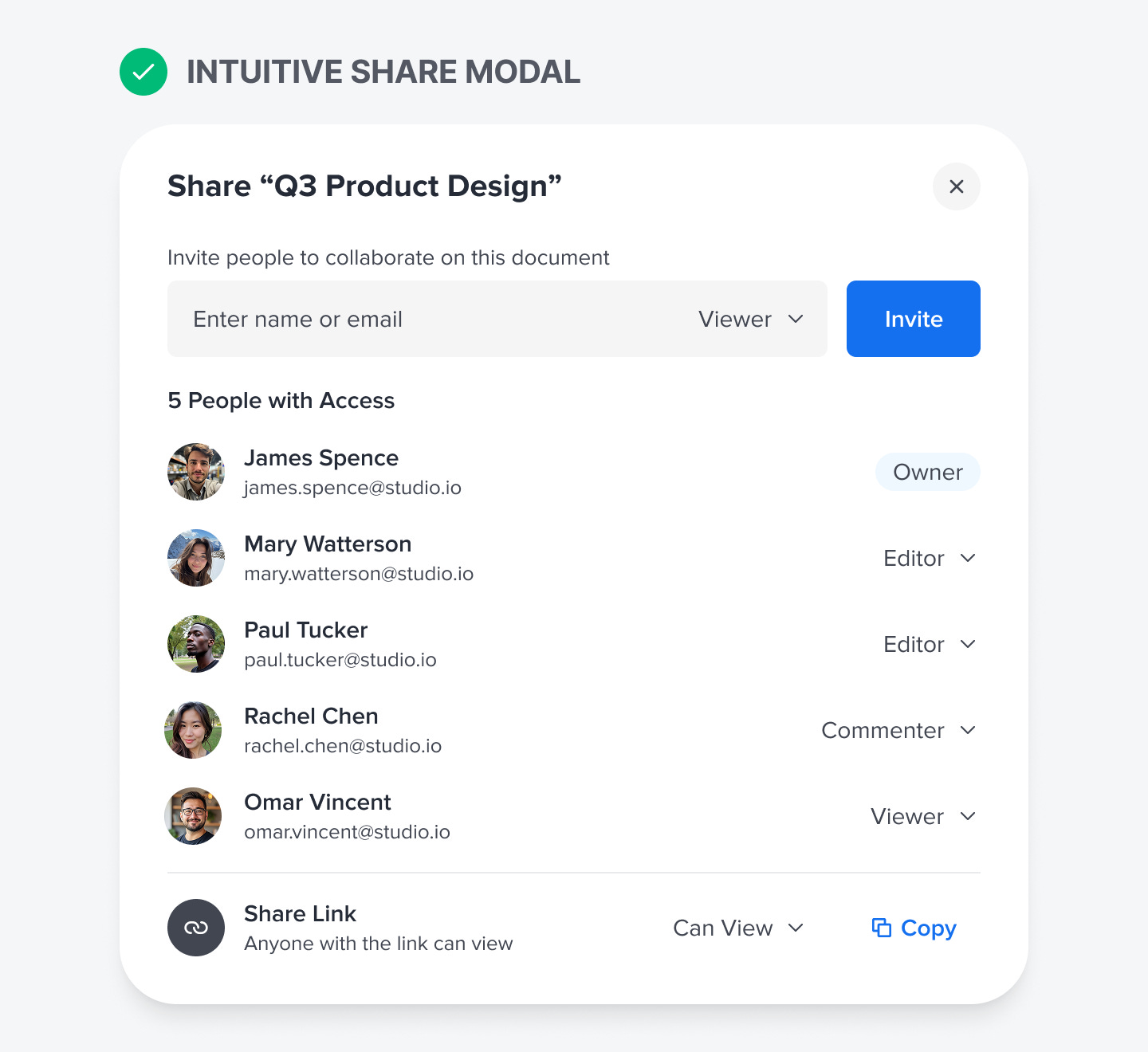
The first thing to consider is the user’s task flow and default state. They start by creating a document and clicking the “Share” button to collaborate. This action opens the “Share” modal, where they can invite people or share a link.
The modal’s title displays the document’s name. Below that is the “Invite” text field, which contains a permissions menu and an action button. Below the field is the “Share Link” section, which also includes a permissions menu and an action button.
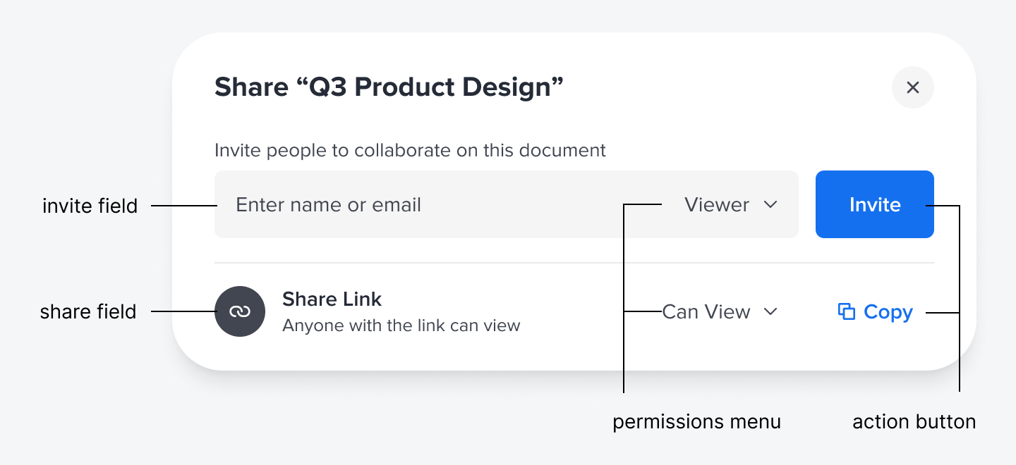
As you can see, there’s a design pattern here between the two, which means they need to share a similar structure. You have the field component on the left, followed by the permissions menu and the action button. Laying these elements out consistently makes the interface more intuitive.
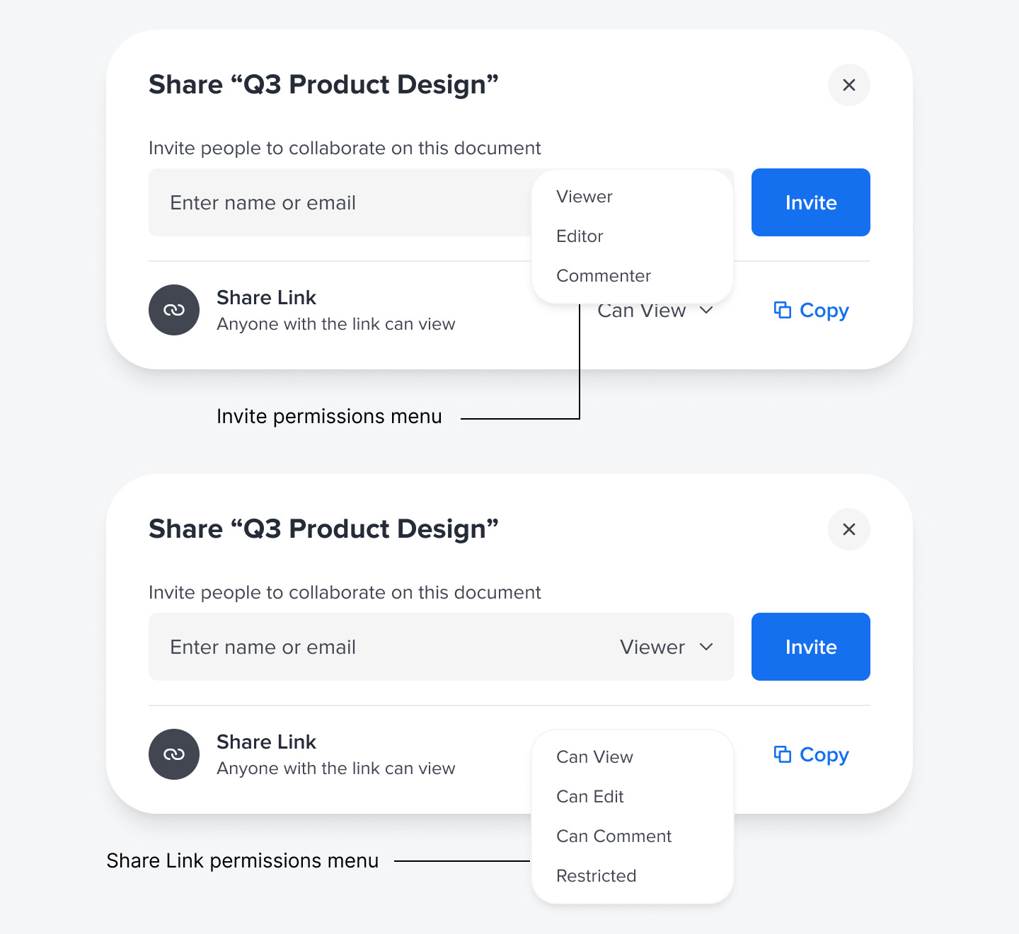
Opening the permissions menu for the invite field allows the user to assign a role to the person they invite: Viewer, Editor, or Commenter. However, the permissions menu for the link field differs slightly. Instead of role names, use “Can View/Edit/Comment” for clearer language. As the permissions change, the text indicating the state also changes: “Anyone with the link can view/edit/comment.”
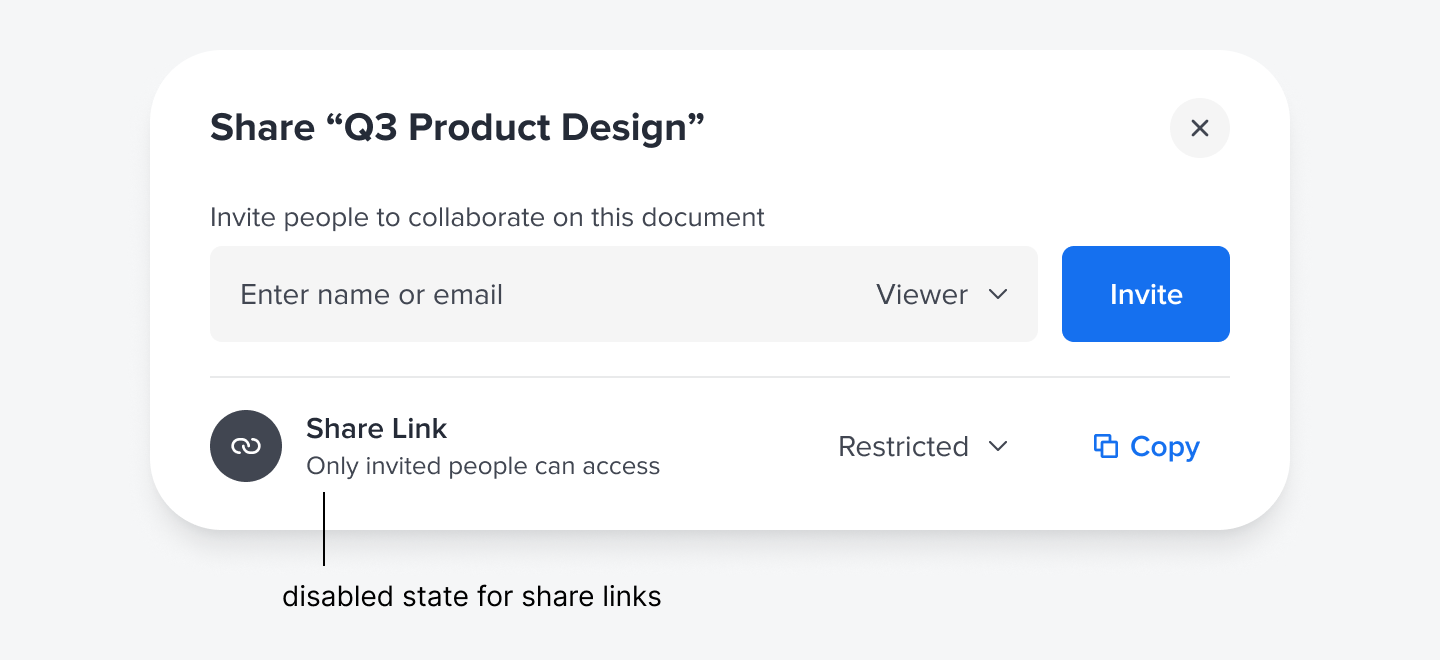
There is one permission that acts as a disabled state: the “Restricted” option. When that’s selected, the text indicates that “Only invited people can access.” In other words, the share link access will be revoked globally, and users will see an access denied page the next time they click it.
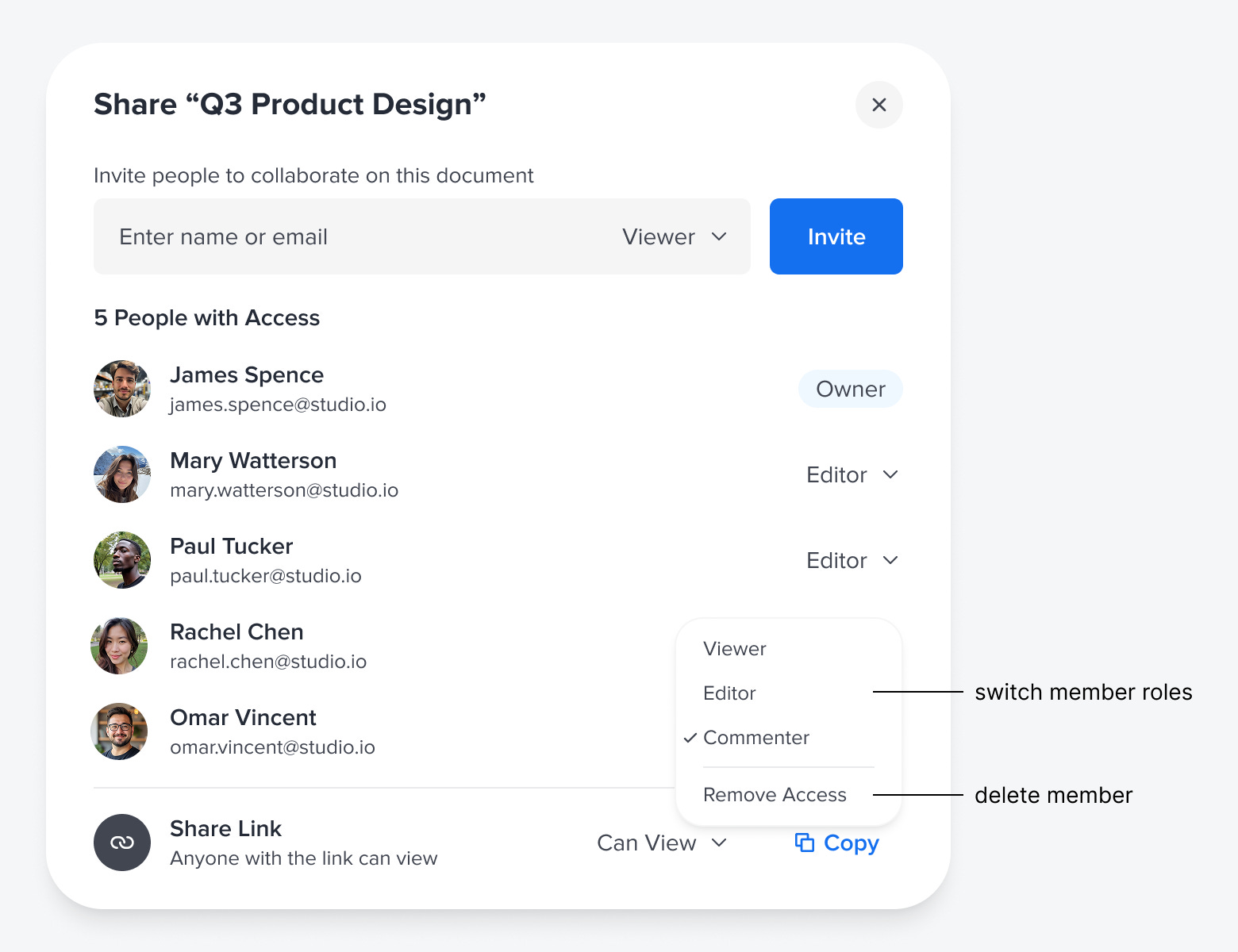
When people have accepted the invite, a list populates under the “Invite” field. The title displays the number of people who have access. The document owner is highlighted with an “Owner” badge. Each team member’s avatar, name, and email are displayed along with a permissions menu. The menu displays their current role. Clicking the menu lets you switch their role or remove their access.
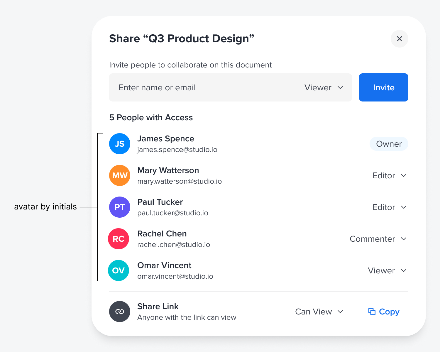
Your users might not always have an avatar photo uploaded. In this case, you can use a color fill with their initials for their avatar. This allows users to view each other as unique entities when their personal photo isn’t available.
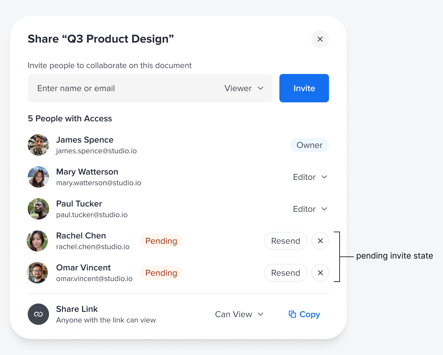
Another state to consider is the “Pending” state for people who have been invited but have not yet accepted. The badge indicates when people can or can’t access the document. It offers a “Resend” button to resend the invite if they didn’t receive it. There’s also an X button to cancel the invite if an issue occurs.
Designing a share modal that looks and feels intuitive requires careful thought and attention to detail. To do it well, you must consider the invite flow, permission changes, pending invites, and missing avatars. Getting these details right is what separates a frustrating sharing experience from a seamless one.