
A Better Way to Display Data Than "Field: Value"
How to think about data visually
How well do you display data to your users? If all you do is present it in a "Field: Value" format, you're not providing a pleasurable viewing experience. Instead, you're creating extra visual work that can cause them to misread information.
To illustrate, the example below displays data in a "Field: Value" format. Not only does every data point look the same, but you have multiple addresses and timestamps that look the same. As a result, it's easy for users to misread them if they're not careful.
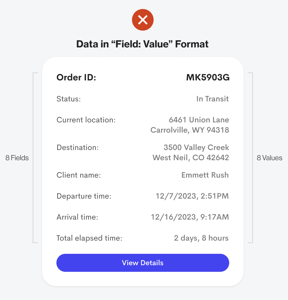
The difference between the "Current Location" and "Destination" data is minuscule. Both display addresses in the same format next to each other. Not only that, but there's also little difference between "Departure Time" and "Arrival Time." It's no wonder why users often misread data.
Think About Data Visually
Humans are visual creatures that can recognize shapes and symbols in as few as 13 milliseconds ( source ). Half the human brain is devoted to visual information processing ( source ). Therefore, you must think about your data visually to provide a better viewing experience.
Users are humans, not databases, so don't always display your data in a "Field: Value" format. Instead, look for ways to incorporate colors, shapes, and icons to help enhance the fields and values.
For instance, here's what the data from the previous example looks like in a visual format. Notice how every data point looks different and unique. As a result, there's less chance of users misreading any information.
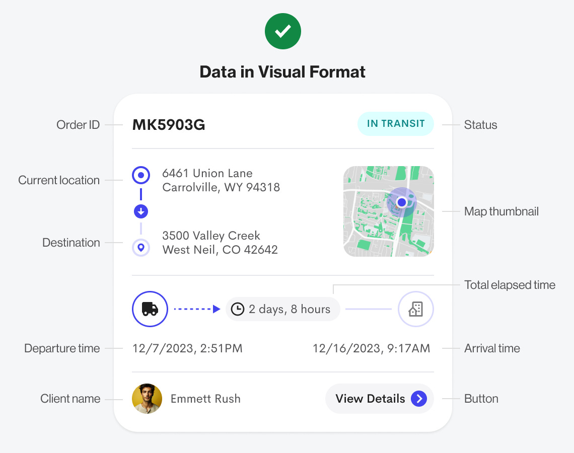
This design has far less text because the field labels aren't displayed. Notice how the terms "Order ID," "Status," "Current Location," "Destination," "Client Name," "Departure Time," "Arrival Time," and "Total Elapsed Time" have all been removed. They're unnecessary because the visual elements have replaced them and are now doing their jobs.
Every value except for "Order ID" is expressed with a visual element that enhances the data. You're no longer reading text but processing a deeper information layer communicated through visuals. It's not only more pleasant to the eyes but also to the brain.
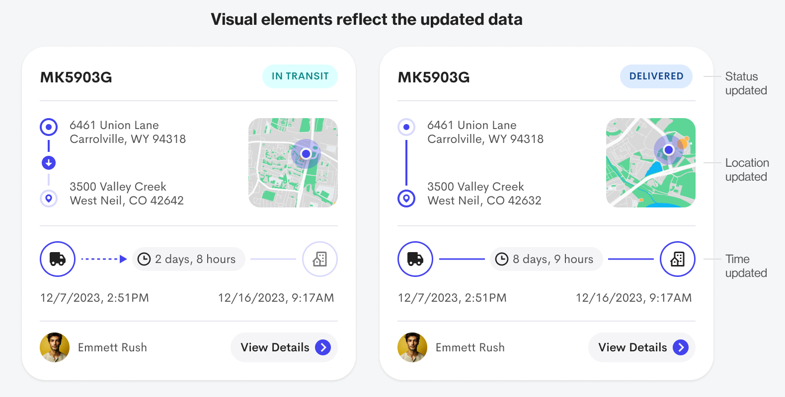
The visual elements are dynamic because they reflect the updated data. The status goes from "In Transit" to "Delivered." You can also see the time and location arrows expire, and the pathlines fill in with color.
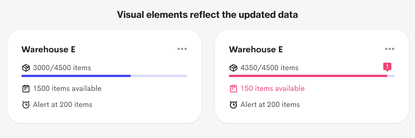
Below is another "Field: Value" format example. As you can see, there are only three values, but the information is still hard to process. However, when you display the data in a visual format, it becomes far easier to process.
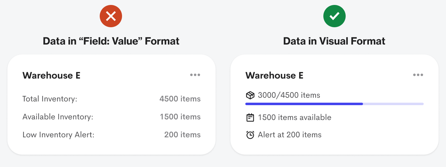
Users can quickly see how full the warehouse capacity is with the progress bar. They can also scan the available inventory space and low inventory alert value faster with the icons. Again, the visual elements enhance the information.
The visual elements reflect the updated data when the warehouse capacity triggers the low inventory alert. The progress bar and relevant text label turn red, and an alert icon sits at the end of the measurement. Without the visual elements, it's harder for users to process the item inventory.
You can see a significant difference when you juxtapose the "Field: Value" format with the visual data format. The former takes more cognitive effort to process, while the latter takes far less. On top of that, it's more aesthetically appealing to the eye.

Your goal should be to communicate the "Field" part of the "Field: Value" format in a visual way. When users can process the data values without any field labels, that's when you know your visuals are on point.
It's time to stop treating users like a database by displaying data in a "Field: Value" format. Users are humans who are hardwired to process visual information. Take advantage of this by using color, shapes, and icons to express your data when there's an opportunity.
Nice job.
I believe the "Delivered" should incorporate some green elements to represent the positive aspect of the process.
Also, how do you obtain avatars from clients? It stands out more than the "View Details" CTA.
👍